1 / 12





Project Details
The house, located in Subang USJ, spans approximately 2300 sqft and is a 2.5 storey link house, surrounded by a charming garden featuring 18-year-old landscaping. The house boasts a tropical vintage facade, with an original layout that have enclosed kitchens and rooms, an open-air courtyard connecting many of the bedrooms, terracotta tiles, painted timber ceilings, and decorative bathroom tiles from the late 80s. The primary goal was to open up the rooms, creating a spacious atmosphere and turning the courtyard into a statement piece that the client adored from the beginning.
The house are now owned by a couple, along with their four pets, two cats and two dogs. Upon visiting the house, it was apparent that the many walls made it feel cramped, with a corridor that ran alongside the courtyard. The courtyard, however, was a unique feature that we knew could be a statement piece, connecting all of the spaces.
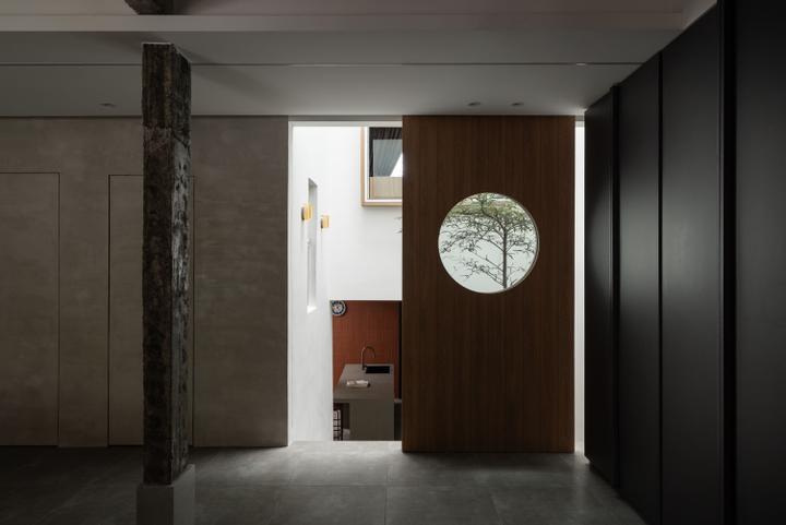
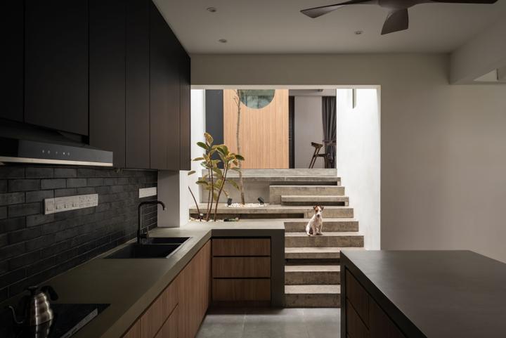
We segregated the kitchen – Guest area, living area, dining area with floors and stairs, with the primary objective of turning the courtyard into an interactive space instead of merely a spot for plants or trees. We came up with a plan to integrate the courtyard into the staircase that travels from the dining area to the kitchen and guest hosting area, adding tall trees to strengthen the relationship between spaces, and close up the existing staircase. Applying a lot of design philosophy from Carlo Scarpa, we created cantilever staircase steps with variations in length and form between bold and sleek.
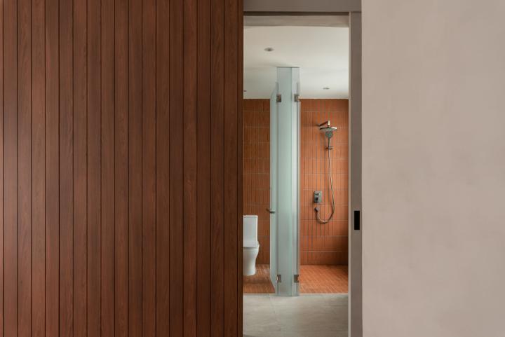
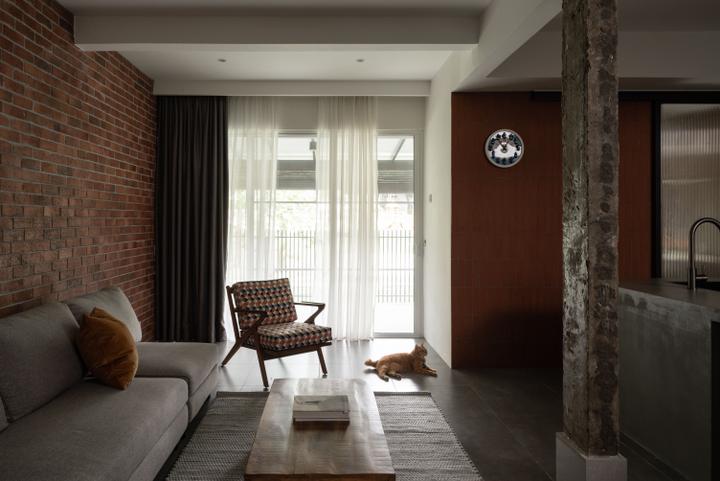
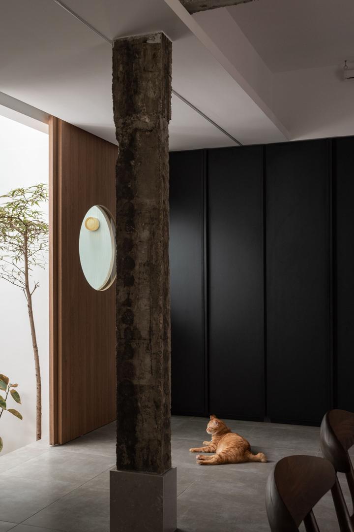
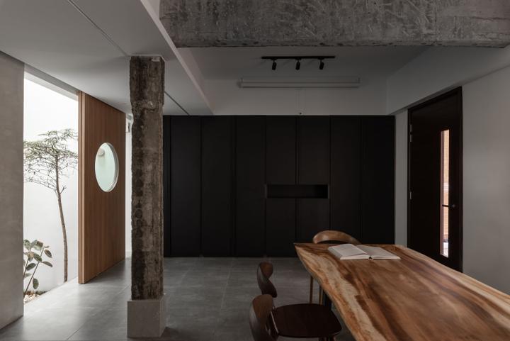
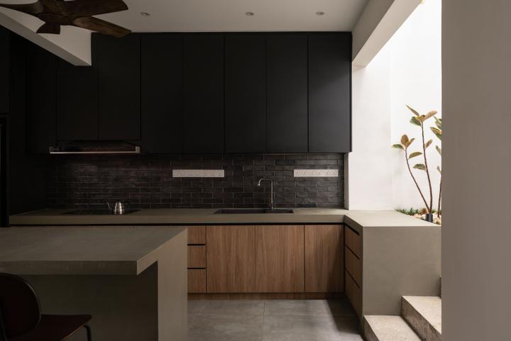
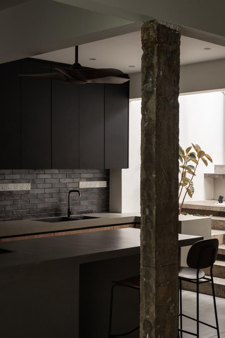
The client requested a modern design with touches of retreat, but there were many challenges during construction, such as the inability to remove columns that we had already decided to dismantle. We talked to the client, explaining that these columns could be another element that tells the house's story, and so we preserved them. To ensure these permanent structures blended with the new design, we introduced cast-in-situ concrete to the courtyard staircase, homogeneous tiles that resembled cement for the floors, dark-colored laminates for the cabinets, Japanese crafted wall tiles, and exposed brick walls to add a little vivacity to the monochromatic color palate.
We knew that the courtyard had to have trees, plants, and plenty of natural light, making it perfect for the users to prepare breakfast, host guests in the dining area, work in the living area, shower in the bathroom, and more. We convinced the client to make the courtyard the centerpiece of the design, and they loved it so much that they began hosting parties in the space.
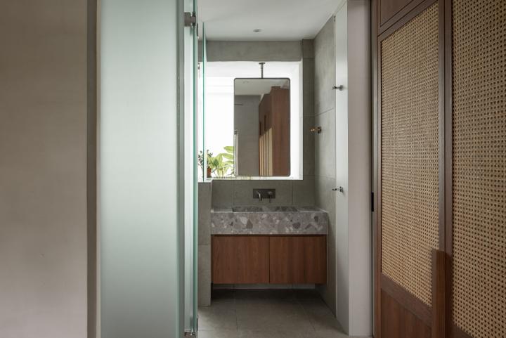
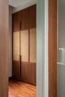
After completing the house, we visited it several times and realized that we had missed out on several details that could interact with the pets. One of the significant challenges was concealing exposed beams and columns from every perspective. We stayed on-site during the casting of the cast-in-situ staircase to ensure that every piece of step was proportional. The master walk-in wardrobe and bathroom were designed side by side, with only a screen of mirror and plants separating them from the courtyard.
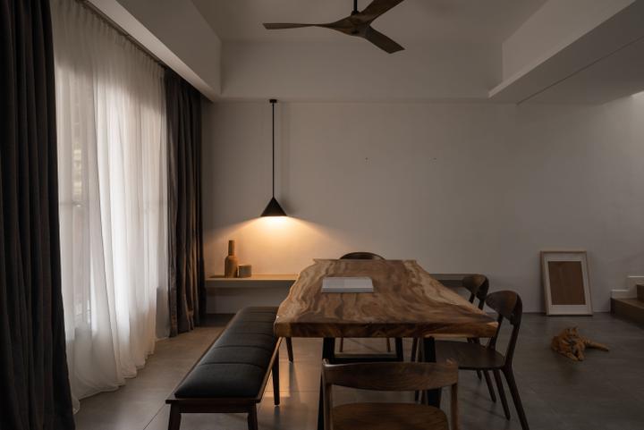
We sourced furniture from various places, such as King’s Living for the sofas, Nichris for the chairs, Recrofurniture for the armchairs, and Hooga for the rugs, and even incorporated a few items from the client's old collection. The clients adore the space and have hosted many parties in the house.
Now that the house is complete, we have started to receive many other revamp projects, but we are currently working on a few retail projects, including an aesthetic clinic, optical store, and several other residential designs.The house, located in Subang USJ, spans approximately 2300 sqft and is a 2.5 storey link house, surrounded by a charming garden featuring 18-year-old landscaping. The house boasts a tropical vintage facade, with an original layout that have enclosed kitchens and rooms, an open-air courtyard connecting many of the bedrooms, terracotta tiles, painted timber ceilings, and decorative bathroom tiles from the late 80s. The primary goal was to open up the rooms, creating a spacious atmosphere and turning the courtyard into a statement piece that the client adored from the beginning.
The house are now owned by a couple, along with their four pets, two cats and two dogs. Upon visiting the house, it was apparent that the many walls made it feel cramped, with a corridor that ran alongside the courtyard. The courtyard, however, was a unique feature that we knew could be a statement piece, connecting all of the spaces.
We segregated the kitchen – Guest area, living area, dining area with floors and stairs, with the primary objective of turning the courtyard into an interactive space instead of merely a spot for plants or trees. We came up with a plan to integrate the courtyard into the staircase that travels from the dining area to the kitchen and guest hosting area, adding tall trees to strengthen the relationship between spaces, and close up the existing staircase. Applying a lot of design philosophy from Carlo Scarpa, we created cantilever staircase steps with variations in length and form between bold and sleek.
The client requested a modern design with touches of retreat, but there were many challenges during construction, such as the inability to remove columns that we had already decided to dismantle. We talked to the client, explaining that these columns could be another element that tells the house's story, and so we preserved them. To ensure these permanent structures blended with the new design, we introduced cast-in-situ concrete to the courtyard staircase, homogeneous tiles that resembled cement for the floors, dark-colored laminates for the cabinets, Japanese crafted wall tiles, and exposed brick walls to add a little vivacity to the monochromatic color palate.
We knew that the courtyard had to have trees, plants, and plenty of natural light, making it perfect for the users to prepare breakfast, host guests in the dining area, work in the living area, shower in the bathroom, and more. We convinced the client to make the courtyard the centerpiece of the design, and they loved it so much that they began hosting parties in the space.
After completing the house, we visited it several times and realized that we had missed out on several details that could interact with the pets. One of the significant challenges was concealing exposed beams and columns from every perspective. We stayed on-site during the casting of the cast-in-situ staircase to ensure that every piece of step was proportional. The master walk-in wardrobe and bathroom were designed side by side, with only a screen of mirror and plants separating them from the courtyard.
We sourced furniture from various places, such as King’s Living for the sofas, Nichris for the chairs, Recrofurniture for the armchairs, and Hooga for the rugs, and even incorporated a few items from the client's old collection. The clients adore the space and have hosted many parties in the house.
Now that the house is complete, we have started to receive many other revamp projects, but we are currently working on a few retail projects, including an aesthetic clinic, optical store, and several other residential designs.Read MoreHide
Renovation Cost
RM350,000
Area Size
2300 sq. ft.
Year of Completion
2023
Interior Style
Modern, Minimalist
Works included
Carpentry
Furniture
Flooring
Hacking
False Ceiling
Painting
Plumbing
Feature Wall
Electrical Rewiring
Aircon
Tiling
Lighting
