1 / 13



Project Details
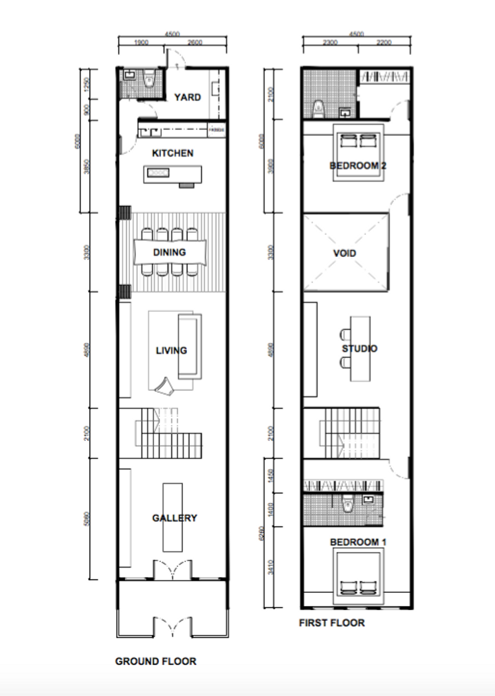
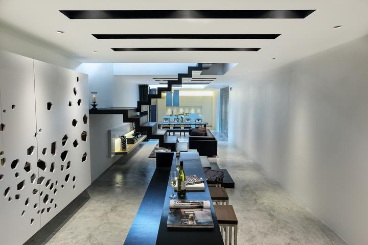
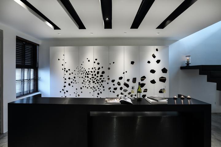
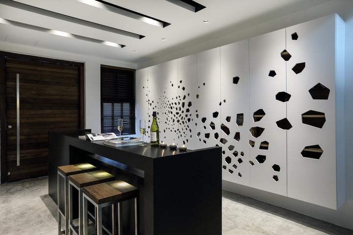
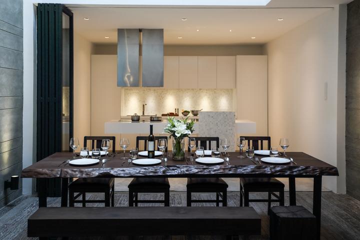
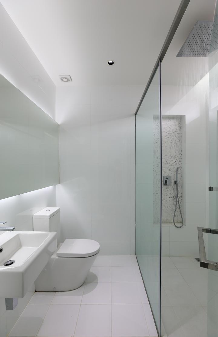
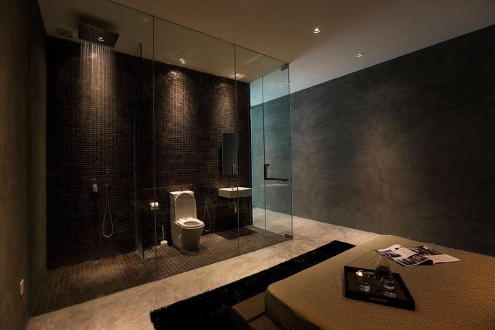
Typical pre-war link houses, with their deep and narrow spaces, are not usually known for their sense of spaciousness. But the designers behind this restoration project of their very own design studio carefully considered their growing needs within and seamlessly altered its interiors to create stunning, naturally-lit and spacious spaces to work and live in. Internal partitions are almost non-existent to create a continuous visual flow from the stylish gallery right to the kitchen area. In addition, the main staircase is brilliantly designed with stark geometric lines and acts as an eye-catching statement yet it doesn’t add bulk to the spaces. “The dining is definitely one of our most favourite spaces” . Indeed, the spectacular new dining area with its own skylight and plenty of raw elements has become the new heart of this home, where a dark hardwood feast table with modern chairs and reclaimed blocks of wood as benches, unfinished timber flooring and cement surfaces make a superb juxtaposition against the sleek glass-paneled folding doors and overall minimalist architecture. “We also love the minimalist kitchen.
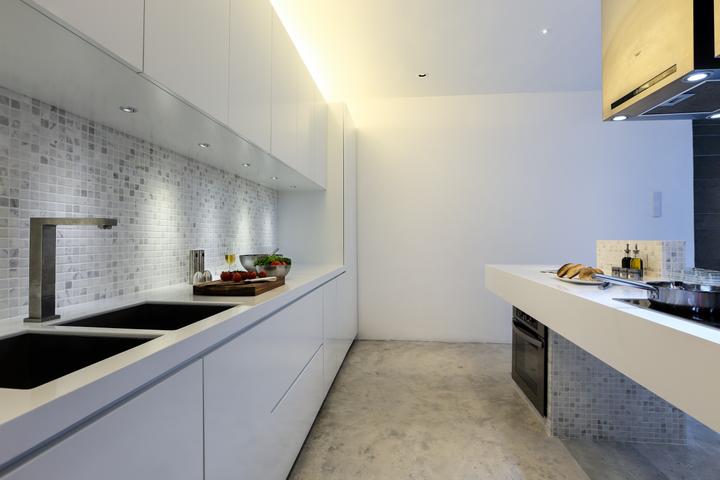
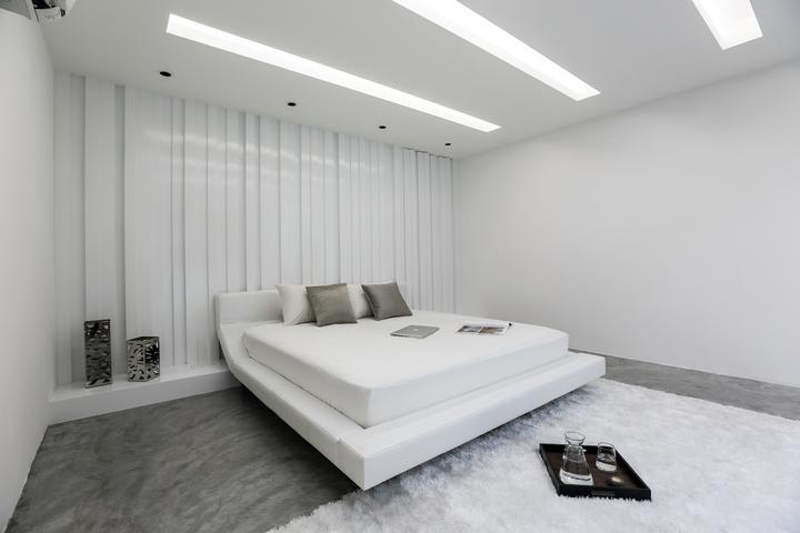
In fact, the whole house was an incredible experience for us,” . An amazing cantilevered countertop which also plays host to an induction hob, acts as a sculptural element against the raw concrete floor, immaculate white walls and a row of simple, chic white kitchen cabinetry. Bold steps were also taken in designing both the bedrooms where one is transformed into a cloud-like sanctuary of white shades while the other exudes a mysterious glow with its dark walls, gleaming concrete floor and sensuous lighting.Typical pre-war link houses, with their deep and narrow spaces, are not usually known for their sense of spaciousness. But the designers behind this restoration project of their very own design studio carefully considered their growing needs within and seamlessly altered its interiors to create stunning, naturally-lit and spacious spaces to work and live in. Internal partitions are almost non-existent to create a continuous visual flow from the stylish gallery right to the kitchen area. In addition, the main staircase is brilliantly designed with stark geometric lines and acts as an eye-catching statement yet it doesn’t add bulk to the spaces. “The dining is definitely one of our most favourite spaces” . Indeed, the spectacular new dining area with its own skylight and plenty of raw elements has become the new heart of this home, where a dark hardwood feast table with modern chairs and reclaimed blocks of wood as benches, unfinished timber flooring and cement surfaces make a superb juxtaposition against the sleek glass-paneled folding doors and overall minimalist architecture. “We also love the minimalist kitchen.
In fact, the whole house was an incredible experience for us,” . An amazing cantilevered countertop which also plays host to an induction hob, acts as a sculptural element against the raw concrete floor, immaculate white walls and a row of simple, chic white kitchen cabinetry. Bold steps were also taken in designing both the bedrooms where one is transformed into a cloud-like sanctuary of white shades while the other exudes a mysterious glow with its dark walls, gleaming concrete floor and sensuous lighting.Read MoreHide
Renovation Cost
RM650,000
Area Size
2799 sq. ft.
Year of Completion
2013
Interior Style
Modern
Works included
Carpentry
Flooring
Hacking
False Ceiling
Painting
Plumbing
Feature Wall
Electrical Rewiring
Wallpaper
Aircon
Tiling
Furniture
Appliances
