1 / 16


Project Details
< Redefine Spaces >
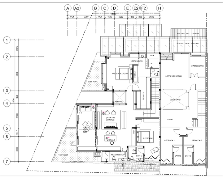
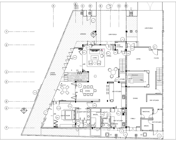
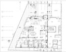
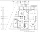
On the internal spaces, the original bedrooms walls are remained, while the rest of the spaces are totally redefined to allow flexibility in terms of function. Walls are taken down and replaced by layers of full height glass doors, making the new space flooded with daylight and allowing maximum air ventilation. Even portion of the upper floor slab is opened up to create a courtyard with a water pond and a tree planter, allowing the occupants to immerse in the outdoor environment without being physically out. Bringing the ‘outdoor in and indoor out’ and yet maintaining security to the indoors has always been tricky in home design and it has been achieved in this house.
Like any other typical linked terrace house, the original staircase of the house was dark and unpleasant. To tackle that a simple timber louvre window is created on the shared parti wall of the intermediate unit, and this allows not just daylighting in the stairwell but also provides view to the intermediate unit courtyard and allows the communications between the two houses.
Full height folding glass doors brings not just daylight into the house but also flexibilities to the spaces. The new semi outdoor patio can be turned into an extension to the living area, or the tea deck can an extension to the dining area.
The new floor finishes are minimal, with seamless white stone finish on the ground and light oak timber on the upper floor, integrating all the spaces and creating openness. On the upper floor, no definite walls to close up the library and reading area, instead bookshelves are used as screens to align the space.
On the contrary, the bedroom and bathrooms are finished with painted bricks, natural stones and louvres, furnished with textured soft furnishings together with dark grey metal and tropical timber, brings a lot feel of a ‘retreat resort’ and contrasts the contemporary ‘white and minimal’ space of the common areas.
< Partial Blank >
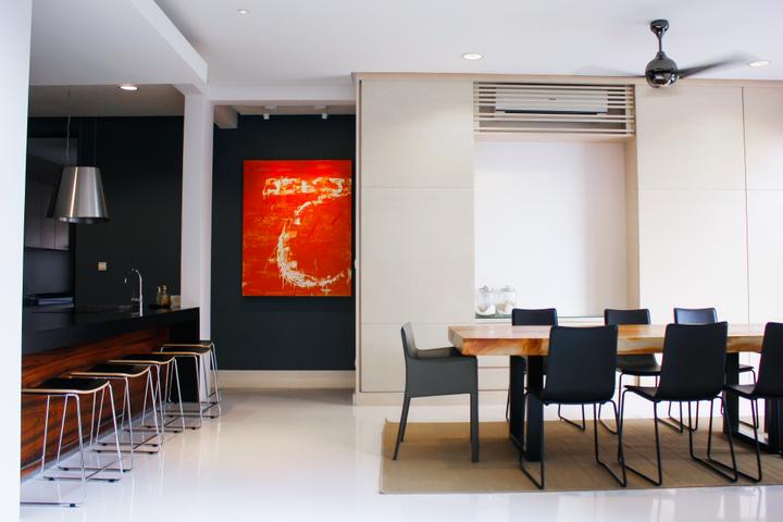
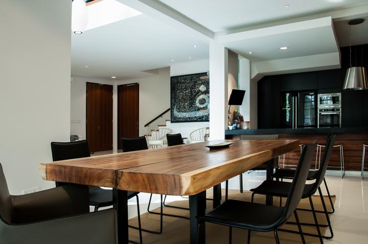
The finishing of the house are intentionally kept to minimal. There are parts meant to be left blank. In general, the ‘white’ dominates, with no wall coverings and limited to certain selected materials. Built-in cabinets are full height hide inside the walls while providing daily storage areas.
The furniture is carefully selected and strategically arranged to not hinder the openness, in return they poetically define the spaces. Artistic touch like Asian antique pieces displayed on shelves, contemporary artworks on the walls, texture and patterns of cushions on the sofa couch, adding intellectual, artistic and soft touches to the whole space.< Redefine Spaces >
On the internal spaces, the original bedrooms walls are remained, while the rest of the spaces are totally redefined to allow flexibility in terms of function. Walls are taken down and replaced by layers of full height glass doors, making the new space flooded with daylight and allowing maximum air ventilation. Even portion of the upper floor slab is opened up to create a courtyard with a water pond and a tree planter, allowing the occupants to immerse in the outdoor environment without being physically out. Bringing the ‘outdoor in and indoor out’ and yet maintaining security to the indoors has always been tricky in home design and it has been achieved in this house.
Like any other typical linked terrace house, the original staircase of the house was dark and unpleasant. To tackle that a simple timber louvre window is created on the shared parti wall of the intermediate unit, and this allows not just daylighting in the stairwell but also provides view to the intermediate unit courtyard and allows the communications between the two houses.
Full height folding glass doors brings not just daylight into the house but also flexibilities to the spaces. The new semi outdoor patio can be turned into an extension to the living area, or the tea deck can an extension to the dining area.
The new floor finishes are minimal, with seamless white stone finish on the ground and light oak timber on the upper floor, integrating all the spaces and creating openness. On the upper floor, no definite walls to close up the library and reading area, instead bookshelves are used as screens to align the space.
On the contrary, the bedroom and bathrooms are finished with painted bricks, natural stones and louvres, furnished with textured soft furnishings together with dark grey metal and tropical timber, brings a lot feel of a ‘retreat resort’ and contrasts the contemporary ‘white and minimal’ space of the common areas.
< Partial Blank >
The finishing of the house are intentionally kept to minimal. There are parts meant to be left blank. In general, the ‘white’ dominates, with no wall coverings and limited to certain selected materials. Built-in cabinets are full height hide inside the walls while providing daily storage areas.
The furniture is carefully selected and strategically arranged to not hinder the openness, in return they poetically define the spaces. Artistic touch like Asian antique pieces displayed on shelves, contemporary artworks on the walls, texture and patterns of cushions on the sofa couch, adding intellectual, artistic and soft touches to the whole space.Read MoreHide
Renovation Cost
RM1,500,000
Area Size
4402 sq. ft.
Year of Completion
2013
Interior Style
Contemporary
Works included
Carpentry
Flooring
Hacking
False Ceiling
Painting
Plumbing
Feature Wall
Electrical Rewiring
Aircon
Tiling
Furniture
Appliances
