Urban Hygienist Showroom, Penang
Designed by CreteArt Design Studio & Constructions Sdn. Bhd.
CommercialModern
1 / 25








Project Details
DESIGN VISION & CONCEPT
At the heart of Mattress & Co. lies a vision to create a modern haven that offers more than just a display of mattresses; it's a holistic experience designed to emphasise the importance of a clean and refreshing sleep environment. This isn't just a showroom; it's a place where visitors can immerse themselves in an atmosphere that resonates with the brand's focus on mattress cleaning products. The overarching design concept blends modern aesthetics with comfort, creating an inviting ambiance and promoting the brand's core message of cleanliness and rejuvenation.
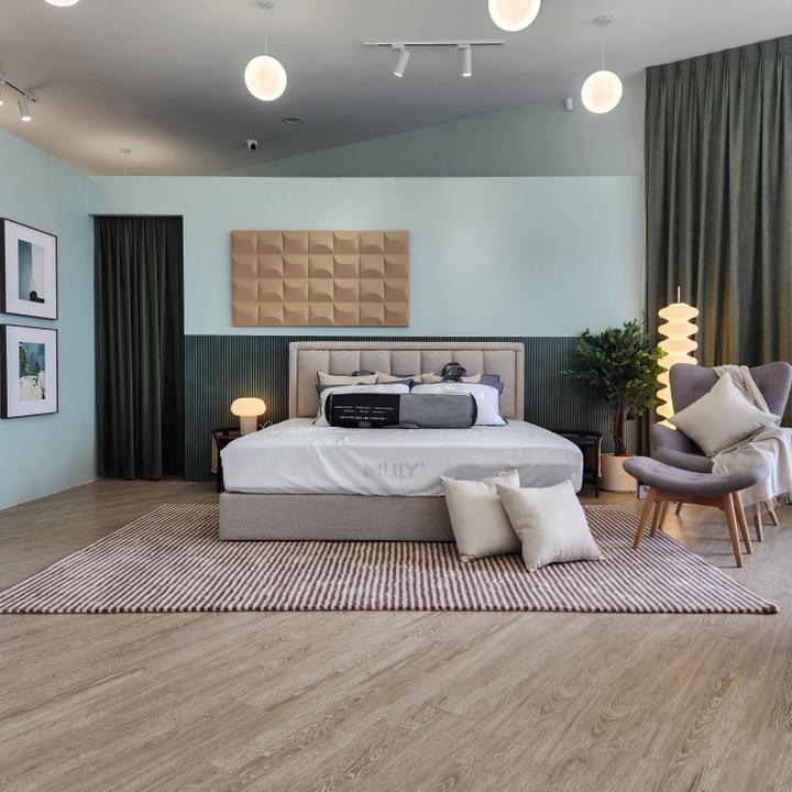
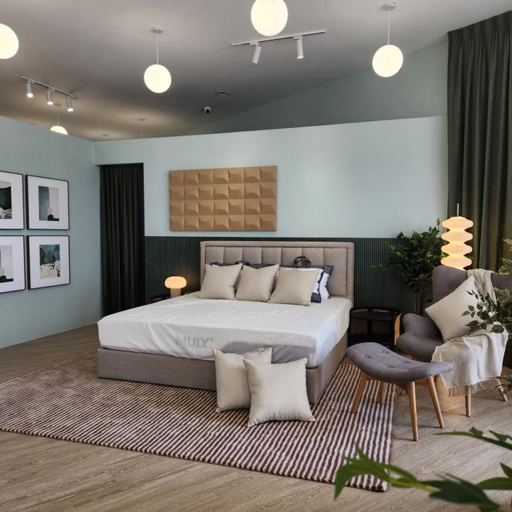
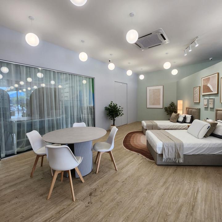
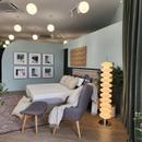
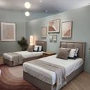
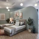
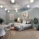
The core concept revolves around an ambiance that's both modern and profoundly welcoming. The idea was to encapsulate the cozy feeling of home and translate it into an enticing showroom. Mattress & Co. achieves this by showcasing different bed sizes, each with its unique atmosphere and vibe, ensuring that visitors can instantly connect with the distinct experiences offered by each mattress. The bed sizes on display range from the sprawling queen-sized bed, reminiscent of a spacious master bedroom, to the playful, child-friendly vibes of two single beds. At the heart of the design, this showroom captures the essence of modern design while delivering an atmosphere of freshness. This refreshing aspect was paramount because it beautifully aligns with the brand's focus on mattress cleaning products. Thus, every aspect of this showroom is carefully curated to reflect a perfect synergy between design and purpose.
AESTHETIC QUALITIES
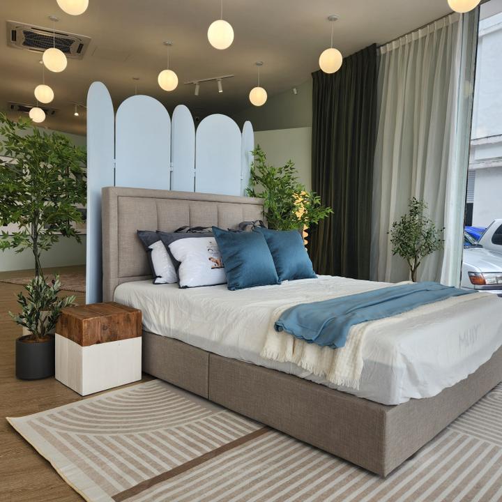
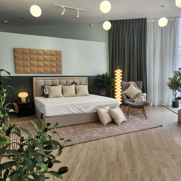
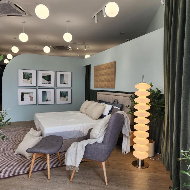
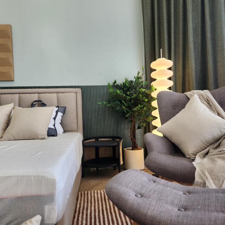
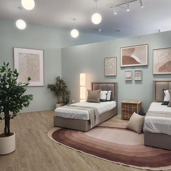
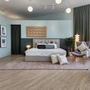
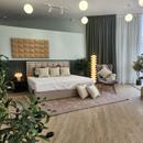
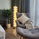
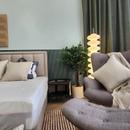
The colour scheme is a harmonious blend of wood tones and Morandi colours, including pastel blues, greens, and beiges. These shades were selected to align seamlessly with the company's corporate colors and branding. In this showroom, striking and overbearing colors have been intentionally avoided to ensure that the space exudes tranquility and comfort, echoing the very emotions one seeks in a mattress — rest and rejuvenation. Every detail within the showroom has been thoughtfully curated to provide a visual harmony that invites visitors to explore and experience the mattresses without feeling overwhelmed. From the gentle color palette to the minimalist yet highly functional furnishings, it's a space where aesthetics and functionality effortlessly converge, ensuring that the allure of the products remains the focal point. The design ensures that from the moment clients walk in, they feel at home, at ease, and stress-free, perfectly aligning with the essence of a clean, good night's sleep that Mattress & Co. represents.
FUNCTIONALITY & PRACTICALITY
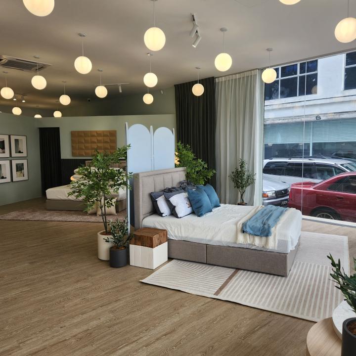
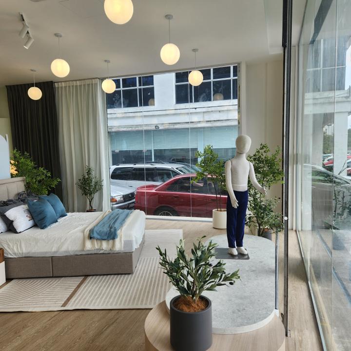
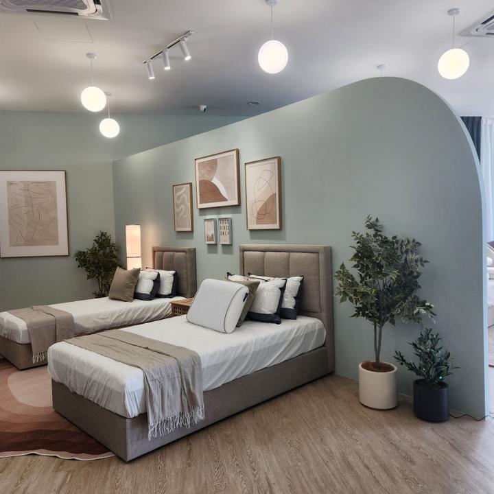
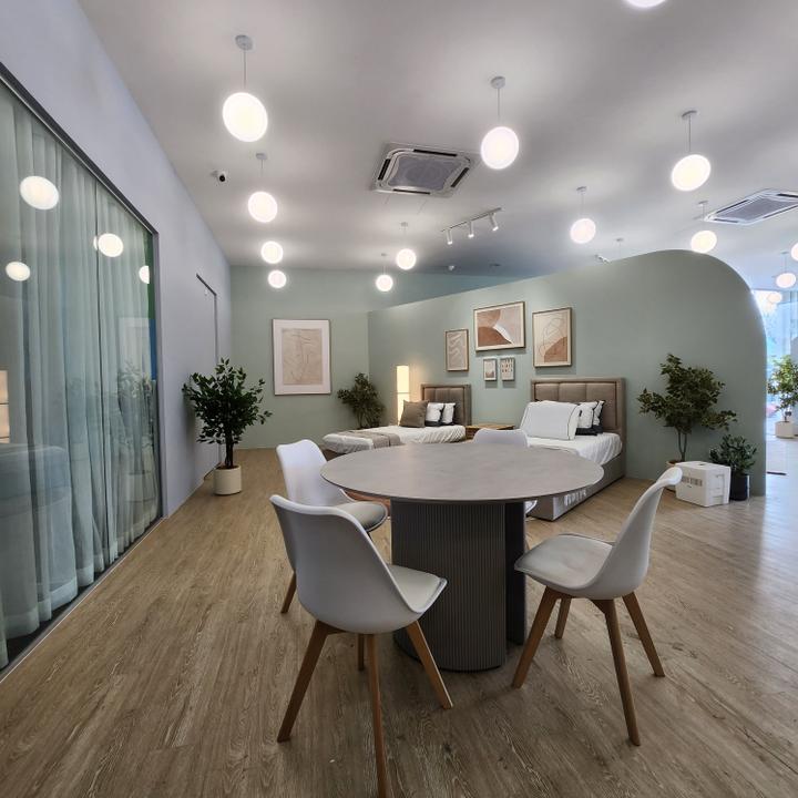
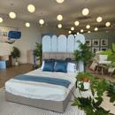
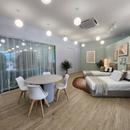
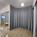
The glass walls lining the showroom's perimeter not only allow passersby to peek inside but also enable an influx of natural light. The glass acts as a window into an idealised home, guiding sunlight into the showroom and enhancing the atmosphere. Low-height dividers create a spacious and open feel, ensuring the view of each bed isn't obstructed. As you enter, the queen-sized bed is prominently displayed, with a glass wall acting as a window, seamlessly blending the indoor and outdoor spaces.
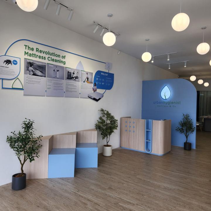
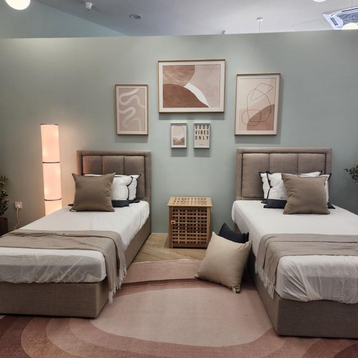
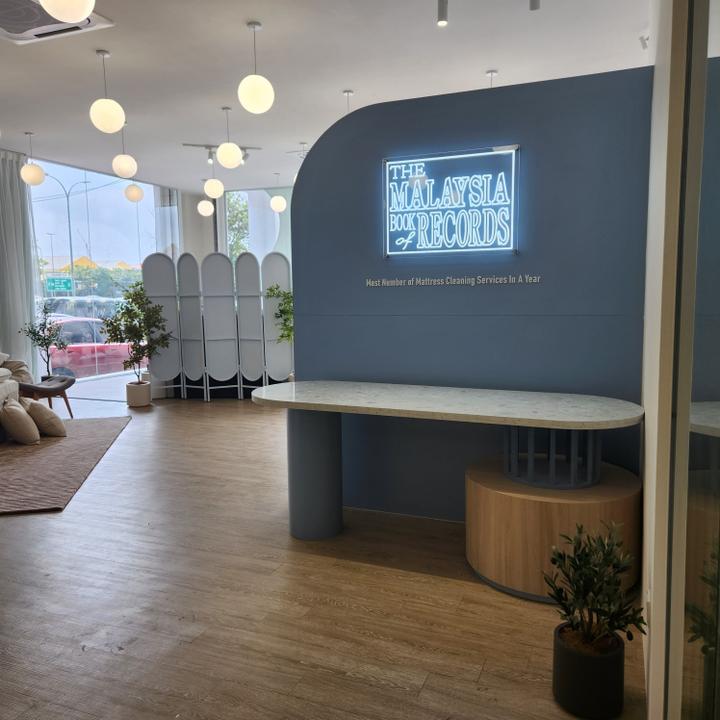
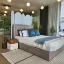
Furthermore, the entrance wall serves as a canvas to illustrate the brand's journey and values, cleverly intertwined with fixtures that incorporate the company's distinctive brand colors. Moving deeper into the showroom, the design shifts to accommodate different bed sizes, each evoking a unique atmosphere. The king-sized bed captures the essence of a master bedroom, with a simple yet inviting color scheme that mirrors the aesthetics of a modern bedroom. In contrast, the two single beds offer a whimsical ambiance
suitable for a children's room, complete with wall paintings. Plant elements are strategically placed throughout the space, emphasizing the brand's focus on mattress cleaning, while also enhancing the overall atmosphere.
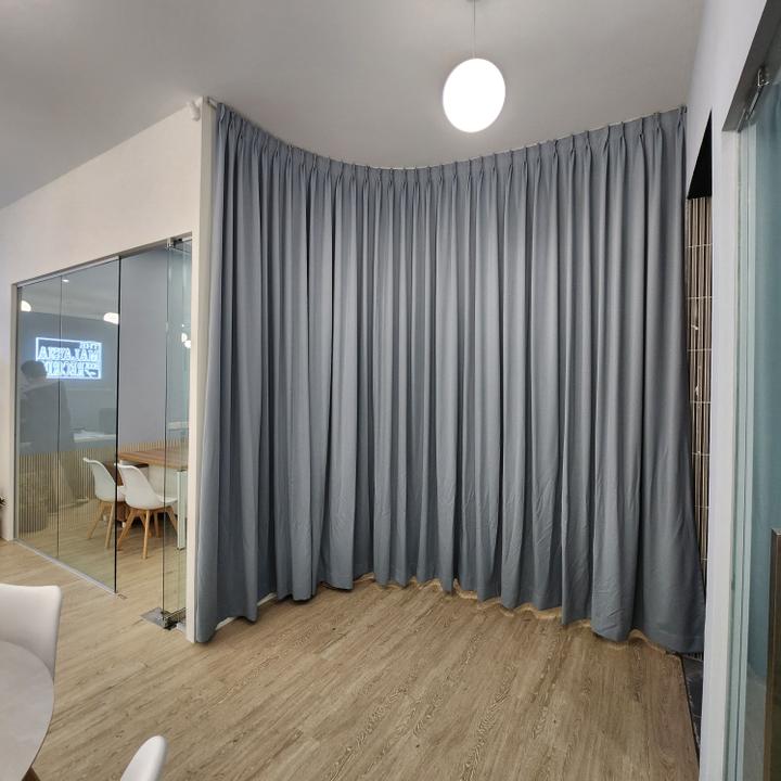
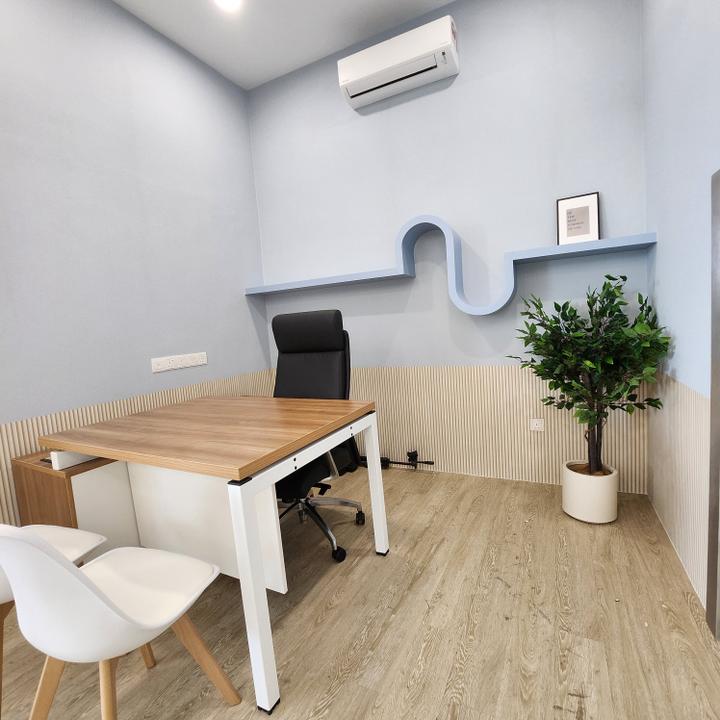
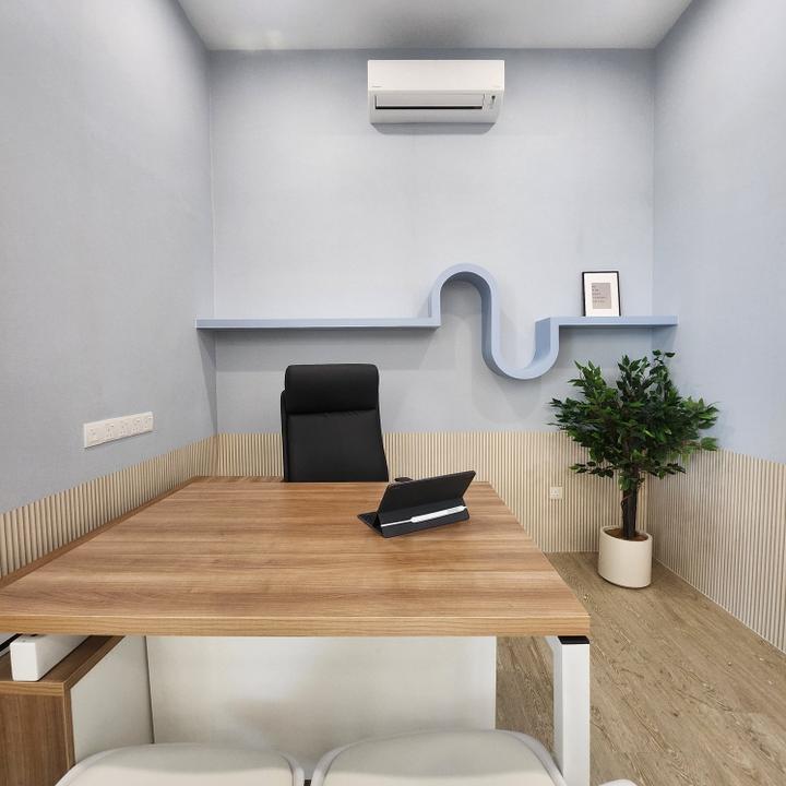
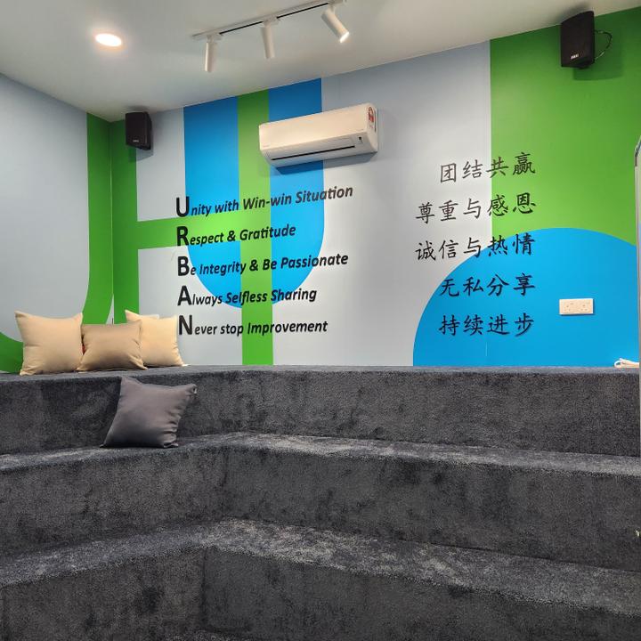
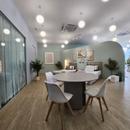
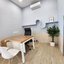
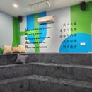
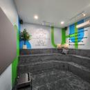
A discussion table at the back of the showroom for client consultations. This layout ensures that potential clients can simultaneously discuss their needs while viewing the product displays. A special meeting room within the showroom adds an element of innovation, featuring the brand's mission, vision, and positioning on the wall. This space serves as a refreshing and inspiring hub for the sales team to meet with clients and discuss solutions.
INNOVATION & ORIGINALITY
Mattress & Co. showroom isn't just a place to display products; it's a meticulously crafted embodiment of the brand's identity and culture. Every facet of the design is a reflection of Mattress & Co.'s unwavering commitment to offering comfort, warmth, and, above all, a pristine level of cleanliness to its customers. As you step into this space, you can't help but be immersed in an atmosphere that radiates these values. It's not merely the products on display that convey this message, but the very architecture and design of the showroom.
The ingenious design elements combine to create a distinct aura of comfort, warmth, and, of course, spotless hygiene. The choice of materials, from the gentle Morandi color palette to the wooden accents throughout, embodies the essence of the brand. The spatial planning itself, focusing on maximising comfort and functionality, reveals a fresh approach to showroom design. Visitors are welcomed into a space that feels like an extension of their own home, mirroring the warmth and comfort one seeks from a mattress. The careful curation of the showroom assures that every feature, every piece of furniture, and every display contributes to an original and exceptional experience, presenting the mattresses in a light that's unlike any other.
ENVIRONMENTAL SUSTAINABILITY
This showroom demonstrates eco-conscious design practices in a commendable manner. One of the notable achievements is the intelligent use of a relatively small space. By thoughtfully transforming it into an open, spacious-looking area, the design minimises the environmental footprint. The brand's commitment to sustainability doesn't compromise the welcoming atmosphere created for its visitors.
This harmonious synthesis of aesthetics, function, and sustainability underscores the core principles of Mattress & Co. The well-placed indoor plants not only contribute to a serene atmosphere but also promote the brand's image as a company that's deeply involved in the world of cleanliness and hygiene. The innovative use of glass walls invites an abundance of natural light into the space, reducing the need for artificial lighting and saving on energy. The choice of wooden flooring, besides adding warmth to the space, promotes the use of sustainable materials. In these and countless other ways, the design of Mattress & Co. doesn't just focus on showcasing the products; it also showcases the brand's dedication to a cleaner, more sustainable future. It's a showroom that does more than it seems, leaving a lasting impact not only in the realm of modern design but also in the hearts of its visitors.DESIGN VISION & CONCEPT
At the heart of Mattress & Co. lies a vision to create a modern haven that offers more than just a display of mattresses; it's a holistic experience designed to emphasise the importance of a clean and refreshing sleep environment. This isn't just a showroom; it's a place where visitors can immerse themselves in an atmosphere that resonates with the brand's focus on mattress cleaning products. The overarching design concept blends modern aesthetics with comfort, creating an inviting ambiance and promoting the brand's core message of cleanliness and rejuvenation.
The core concept revolves around an ambiance that's both modern and profoundly welcoming. The idea was to encapsulate the cozy feeling of home and translate it into an enticing showroom. Mattress & Co. achieves this by showcasing different bed sizes, each with its unique atmosphere and vibe, ensuring that visitors can instantly connect with the distinct experiences offered by each mattress. The bed sizes on display range from the sprawling queen-sized bed, reminiscent of a spacious master bedroom, to the playful, child-friendly vibes of two single beds. At the heart of the design, this showroom captures the essence of modern design while delivering an atmosphere of freshness. This refreshing aspect was paramount because it beautifully aligns with the brand's focus on mattress cleaning products. Thus, every aspect of this showroom is carefully curated to reflect a perfect synergy between design and purpose.
AESTHETIC QUALITIES
The colour scheme is a harmonious blend of wood tones and Morandi colours, including pastel blues, greens, and beiges. These shades were selected to align seamlessly with the company's corporate colors and branding. In this showroom, striking and overbearing colors have been intentionally avoided to ensure that the space exudes tranquility and comfort, echoing the very emotions one seeks in a mattress — rest and rejuvenation. Every detail within the showroom has been thoughtfully curated to provide a visual harmony that invites visitors to explore and experience the mattresses without feeling overwhelmed. From the gentle color palette to the minimalist yet highly functional furnishings, it's a space where aesthetics and functionality effortlessly converge, ensuring that the allure of the products remains the focal point. The design ensures that from the moment clients walk in, they feel at home, at ease, and stress-free, perfectly aligning with the essence of a clean, good night's sleep that Mattress & Co. represents.
FUNCTIONALITY & PRACTICALITY
The glass walls lining the showroom's perimeter not only allow passersby to peek inside but also enable an influx of natural light. The glass acts as a window into an idealised home, guiding sunlight into the showroom and enhancing the atmosphere. Low-height dividers create a spacious and open feel, ensuring the view of each bed isn't obstructed. As you enter, the queen-sized bed is prominently displayed, with a glass wall acting as a window, seamlessly blending the indoor and outdoor spaces.
Furthermore, the entrance wall serves as a canvas to illustrate the brand's journey and values, cleverly intertwined with fixtures that incorporate the company's distinctive brand colors. Moving deeper into the showroom, the design shifts to accommodate different bed sizes, each evoking a unique atmosphere. The king-sized bed captures the essence of a master bedroom, with a simple yet inviting color scheme that mirrors the aesthetics of a modern bedroom. In contrast, the two single beds offer a whimsical ambiance
suitable for a children's room, complete with wall paintings. Plant elements are strategically placed throughout the space, emphasizing the brand's focus on mattress cleaning, while also enhancing the overall atmosphere.
A discussion table at the back of the showroom for client consultations. This layout ensures that potential clients can simultaneously discuss their needs while viewing the product displays. A special meeting room within the showroom adds an element of innovation, featuring the brand's mission, vision, and positioning on the wall. This space serves as a refreshing and inspiring hub for the sales team to meet with clients and discuss solutions.
INNOVATION & ORIGINALITY
Mattress & Co. showroom isn't just a place to display products; it's a meticulously crafted embodiment of the brand's identity and culture. Every facet of the design is a reflection of Mattress & Co.'s unwavering commitment to offering comfort, warmth, and, above all, a pristine level of cleanliness to its customers. As you step into this space, you can't help but be immersed in an atmosphere that radiates these values. It's not merely the products on display that convey this message, but the very architecture and design of the showroom.
The ingenious design elements combine to create a distinct aura of comfort, warmth, and, of course, spotless hygiene. The choice of materials, from the gentle Morandi color palette to the wooden accents throughout, embodies the essence of the brand. The spatial planning itself, focusing on maximising comfort and functionality, reveals a fresh approach to showroom design. Visitors are welcomed into a space that feels like an extension of their own home, mirroring the warmth and comfort one seeks from a mattress. The careful curation of the showroom assures that every feature, every piece of furniture, and every display contributes to an original and exceptional experience, presenting the mattresses in a light that's unlike any other.
ENVIRONMENTAL SUSTAINABILITY
This showroom demonstrates eco-conscious design practices in a commendable manner. One of the notable achievements is the intelligent use of a relatively small space. By thoughtfully transforming it into an open, spacious-looking area, the design minimises the environmental footprint. The brand's commitment to sustainability doesn't compromise the welcoming atmosphere created for its visitors.
This harmonious synthesis of aesthetics, function, and sustainability underscores the core principles of Mattress & Co. The well-placed indoor plants not only contribute to a serene atmosphere but also promote the brand's image as a company that's deeply involved in the world of cleanliness and hygiene. The innovative use of glass walls invites an abundance of natural light into the space, reducing the need for artificial lighting and saving on energy. The choice of wooden flooring, besides adding warmth to the space, promotes the use of sustainable materials. In these and countless other ways, the design of Mattress & Co. doesn't just focus on showcasing the products; it also showcases the brand's dedication to a cleaner, more sustainable future. It's a showroom that does more than it seems, leaving a lasting impact not only in the realm of modern design but also in the hearts of its visitors.Read MoreHide
Renovation Cost
RM500,000
Area Size
3000 sq. ft.
Year of Completion
2022
Interior Style
Modern
Works included
Carpentry
Furniture
Flooring
Painting
Feature Wall
Electrical Rewiring
Aircon
Tiling
Lighting

