Peek into a couple’s retro-inspired HDB home that reflects their personal style.
When couple Marvin and Lingyi started renovating their Telok Blangah flat last year, they set out to create a home that’s inspired by vintage interiors from the 60s; think rooms kitted out in geometric shapes, natural materials and strong colours that convey a distinct old-school vibe. But more than that, the entire space was designed to be a personification of themselves.
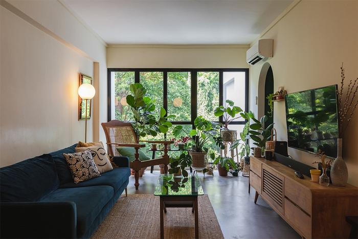
“It represents who we are as people, from our personal history down to the way we live,” shares Marvin.
Read on to discover the different parts that make this timeless HDB home a whole – from its beautiful, greenery-filled view and retro-inspired furniture to the instinctive, personal approach that was taken to create its effortlessly classic look.
About themselves and their inspiration
Lingyi (LY): Since Marvin and I are both in the creative industry, we pay a lot of attention to design and this helped us developed our vision for our home, which we created with Monocot Studio’s help.
Marvin (M): Yup, I feel that being in the creative industry really broadens your horizons. The world, everything you see about it, whether it’s in real life or online, all of it becomes your inspiration.
About their home’s look
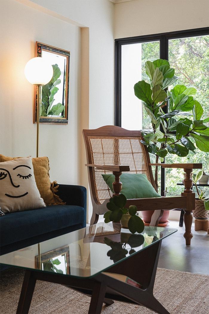
LY: I have always been inspired by old movies such as Jean Luc Godard films from the 60s and Woody Allen films from the 70s. This has not only influenced the way I dress, but also our taste for furnishings and home design.
We enjoy the look of contrast between old and new, since that combination creates something fresh and eclectic. For example, our sofa and cushions are quite contemporary, but the planter chair and table look like they come from another era. This is how we have created something that is uniquely ours.
About their home, pre-renovation
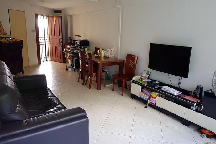
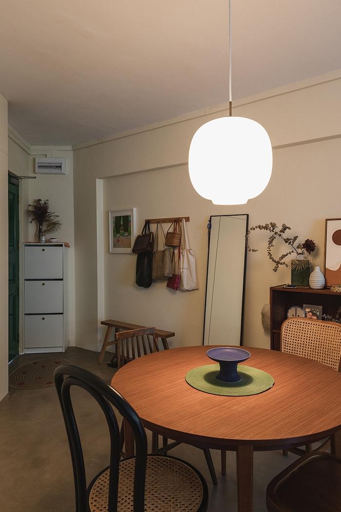
Before-and-after: Furnished with vintage Scandinavian pieces from Möbler, the dining area is now a space for private time and friendly gatherings alike.
M: When we got this house, we knew right away that it was going to be dark, and that we could either embrace this ‘feature’ or fight against it.
In the end, we decided to work with what we had and settled for a cosy colour scheme of dark greens, blues and cream, even though it would make the house look even darker.
On changes made to their home
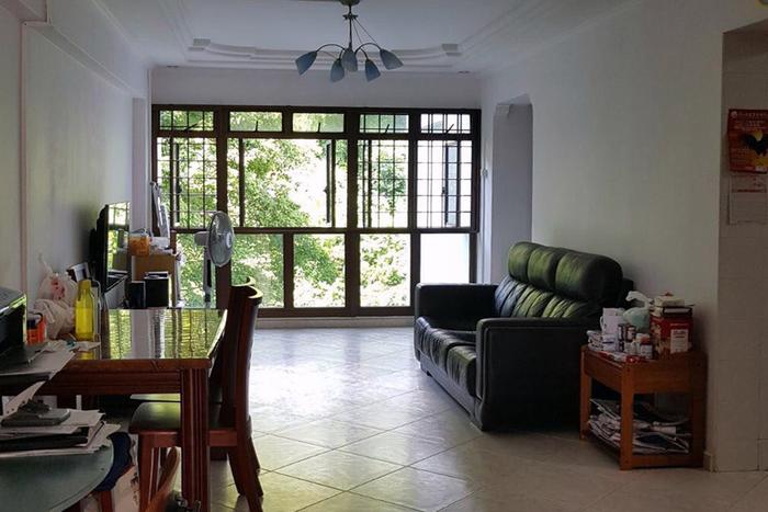

Before-and-after: Other than a mini garden zoned by a strip of terrazzo, new additions to the living area include concrete flooring as well as a pair of matching archways.
LY: If you have ever watched an episode of Mad Men, the sets all have this rich and warm vintage quality to them, and it was that timeless feel which we wanted to capture in our home.
In general, we tried to re-create the look by incorporating furniture and décor from that era or even older. That’s why we bought some furniture from Noden and Möbler which carry vintage Scandinavian furniture from the 60’s.
M: I think what helped (us source for furniture) is that we didn’t just limit ourselves to just buying things from Singapore.
There were specific items that we were fixated on for the house, and we wouldn’t have been able to purchase them without the help of the Internet – our Louis Poulsen dining lamp and living room standing lights were ordered online from the UK and Amazon respectively; the TV console was from Carousell.
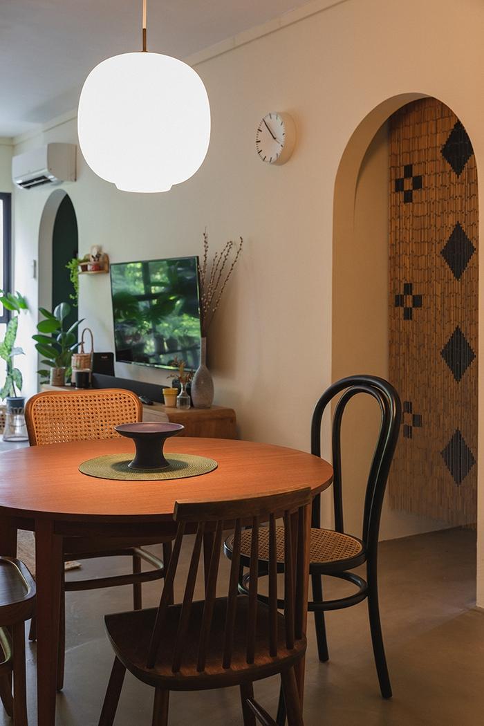
M: The flooring was a decision that we deliberated over for quite some time. From the start, we knew that we didn’t want to use vinyl or any artificial materials, but it was only until we stayed at a hotel with concrete screed flooring that we thought “Oh, maybe this is the solution”.
In the end, I feel that it’s the right choice. Just like a blank canvas, it complements our furniture very well – and even though we’re starting to see some cracks, we’ve embraced these flaws as part of our home’s character.
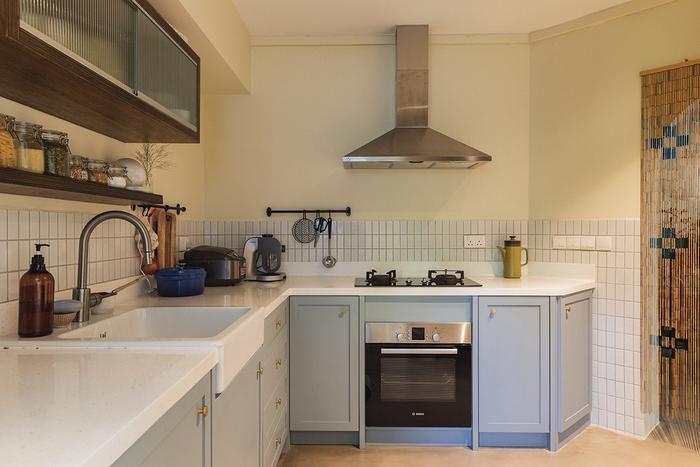
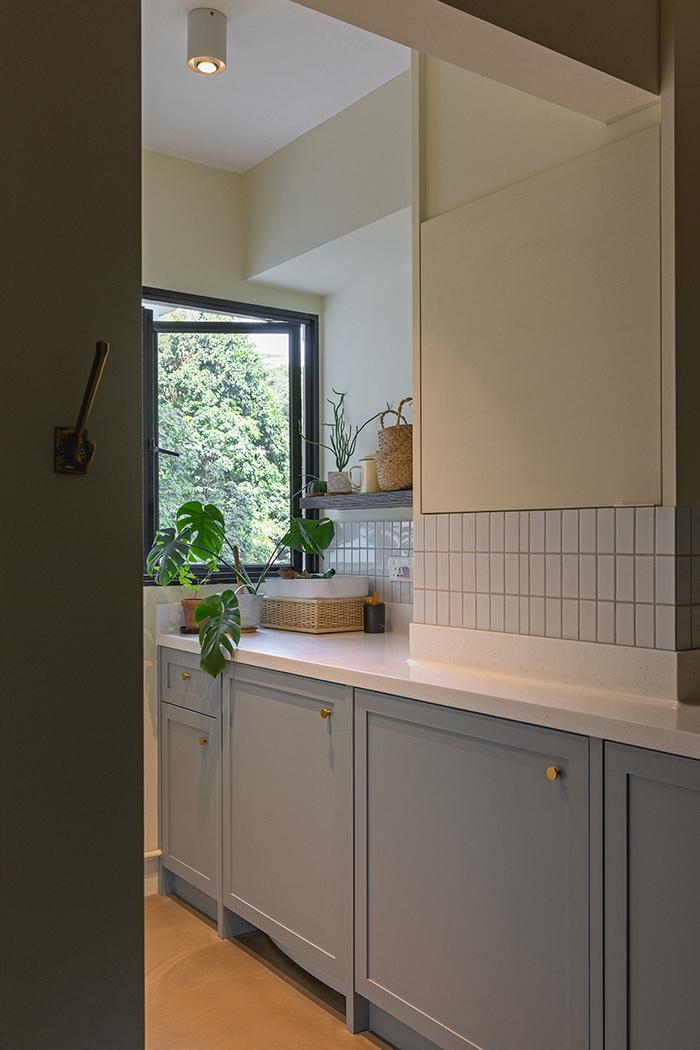
LY: There are two doorways in the living area – one leads to the bedrooms and the other to the kitchen. Because they lead into two very separate ‘worlds’, we thought about doing something special by creating symmetrical archways.
As for the kitchen itself, we decided to do away with upper cabinetry because we didn’t want the space to feel too cramped, and honestly, it’s comfortably sized so we knew we didn’t need any more storage. Still, we installed some shelves so we could store our bottles and jars in the open.
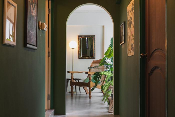
M: Initially, our plan for this passageway was to cover everything in wallpaper, but we ended up painting it in a shade of dark green, which feels quite nice and cosy.
LY: We call this our ‘floral corridor’ and decorate it with art inspired by flora and fauna. There are some orchid paintings by my grand aunt, Lim Chu Suan, who was an established artist in the 40s to the 60s. The orchids that she painted were inspired by those in my mother’s old home, which hold a lot of sentimental value for my family
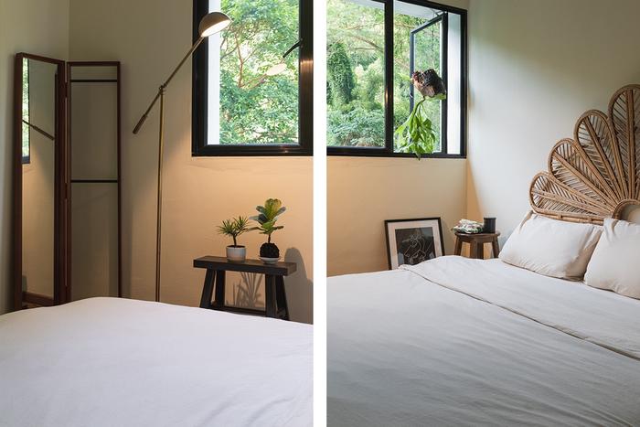
LY: The guest bedroom is still a work in progress for us. My sister who lives in the U.S. uses this space when she comes over and she brings stuff for it every once in a while.
Other than that, it’s just a simple set-up with some storage solutions, a bed, and a view of Telok Blangah Hill, which is right behind our home.
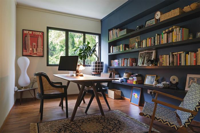
M: Between Lingyi and I, we’ve quite a lot of books, so a bookshelf in the study was naturally something we would need. We did consider installing built-ins, but that would be quite expensive. So, we ended up just getting open shelves from IKEA instead, and we paid a lot less – about one-tenth of what it would have cost.
LY: Keeping the original parquet flooring and hardwood doors here and in the bedrooms also helped us save on the renovation too. The floors were quite well-maintained, and they now have this nice matte finish after they were restored.
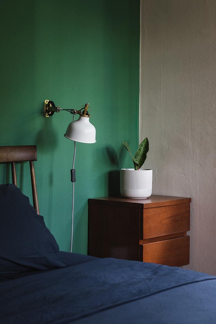
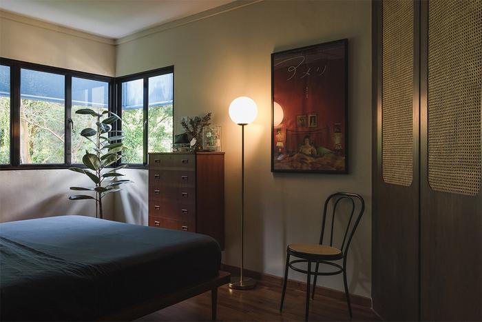
LY: We knew we wanted to wake up to a view of the outdoors, which is why we had our bed placed right beside the windows in our room.
The chest of drawers are from Möbler as well, the bedframe is from JB and the built-in wardrobe is something that our designers proposed to cover up an awkward corner; it’s made out from rattan and that really completes the old-school look.
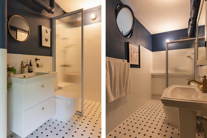
The common bathroom (left) and the master en suite (right) were done up similarly with both spaces featuring brass fittings, dark blue accents and patterned subway tiles.
To sum up
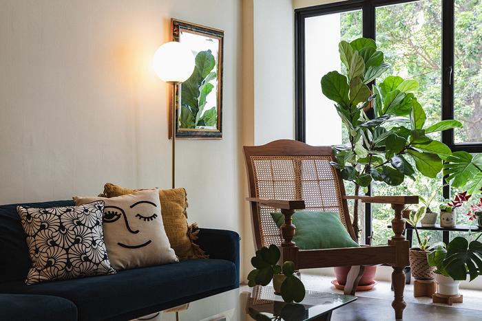
M: What we like best about the house? Hmm, of course, there’s the view but that’s just a bonus really. I think I speak for both of us, when I say that the entire space is a sum of our experiences.
Every time we travel, we always make an effort to bring something back with us and make it part of our lives, and because of that, home isn’t just a place we always return to – it’s also everywhere we’ve been.
Like to see more of Marvin and Lingyi’s home? Check out their Instagram at @ourseaofgreen!
Looking for a professional to renovate your home?
Let us know and get quick, personalised renovation quotes from five local interior design firms for free!

 Get a budget estimate before meeting IDs