Because age is just a number.
It looks terribly outdated. It's cluttered and dingy - a result of years of wear and tear. And you can't (for the life of you) see any potential in making it work.
But it's there, in every rundown resale flat you see. And if you do manage to look past its shabby surface, what you might find is a gorgeous hidden gem (and epic transformation) waiting to be discovered, just like these 5 jaw-dropping resale makeovers! From drab old flat to spiffy new home, these before-and-after overhauls make us wish we had our own resale fixer-uppers to work our renovation chops on. Sigh...
Renovation Cost: $100,000

Honest to God, we did a double take - is this a showroom for a condo unit or somebody's HDB home? Fitted with sleek accents, this dark, dramatic (and spacious) resale has come a long way from its well-maintained (but seriously outdated) beginnings.
Before:
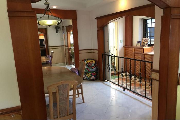
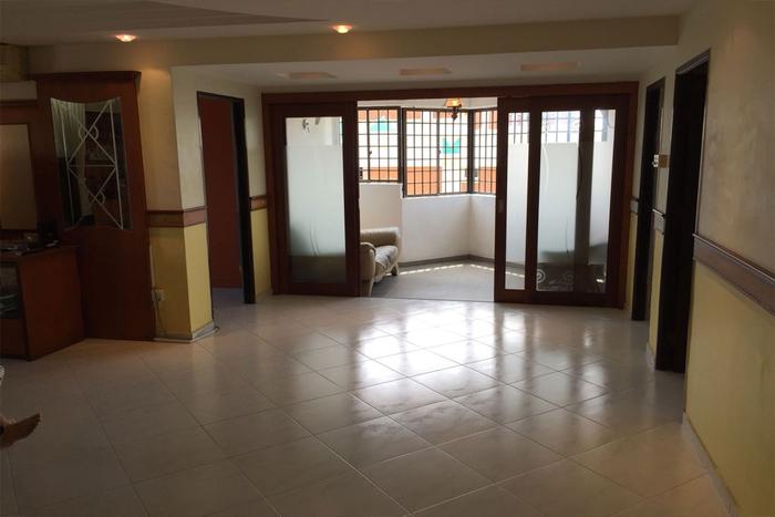
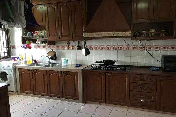
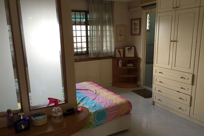
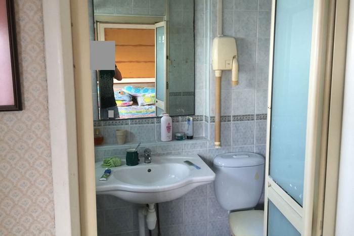
We'll admit - it all looks like its kept in pretty good condition. But style-wise? Talk about a throwback to 1998. From flourished wooden arches, wooden cabinet fronts, wooden furniture, even wooden wall borders, dark, wooden accents are used in almost every corner, casting a heavy, orangey glow. Likewise, the bathrooms' rusted mirrors, grimy exposed pipes and old-school tiles cast a sickly air that's sorely in need of an update.
After:

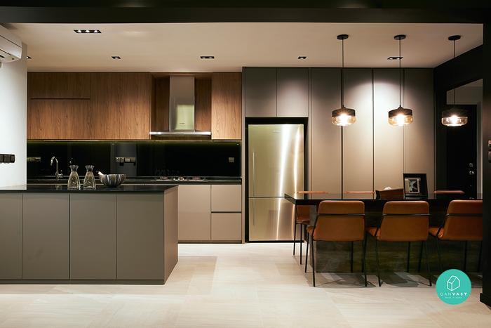
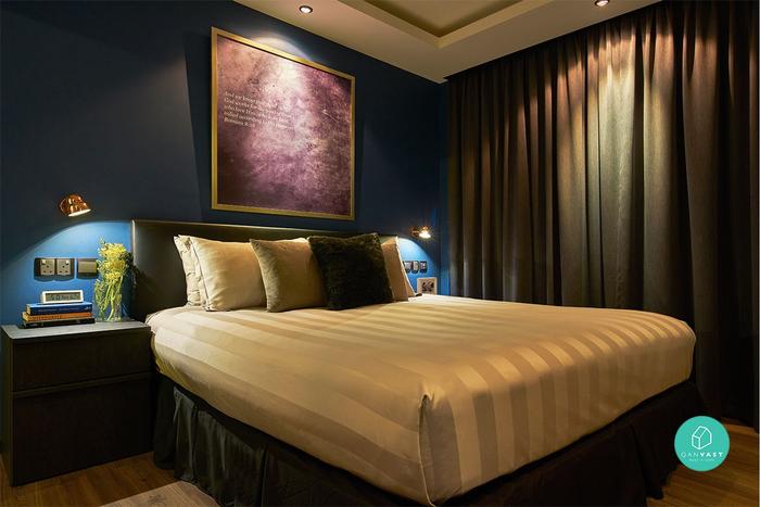
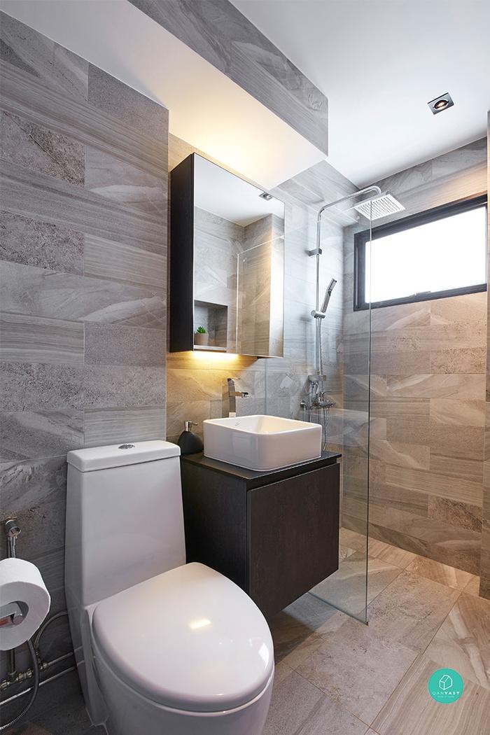
Now, here’s a modern abode that's more aligned with the times. Combining the kitchen and living areas to form an extended cooking, dining and entertainment space, black beams provide a statement-making contrast to the space. Moving into the bedroom, a rich shade of navy blue is applied to create a relaxing atmosphere perfect for snoozing in, while the bathroom retains an elegant air with neutral-hued tiles and clean-cut built ins.
Renovation Cost: $140,000
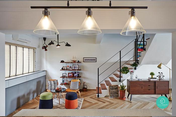
Bright and colourful, this maisonette is populated with all sorts of playful elements that give it a quirky (yet contemporary) twist. From herringbone floors to furniture/decor in shades of electric blue, it's certainly no minimalist home! But wait till you see the absolute clutter-fest it used to be…
Before:
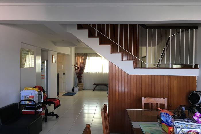
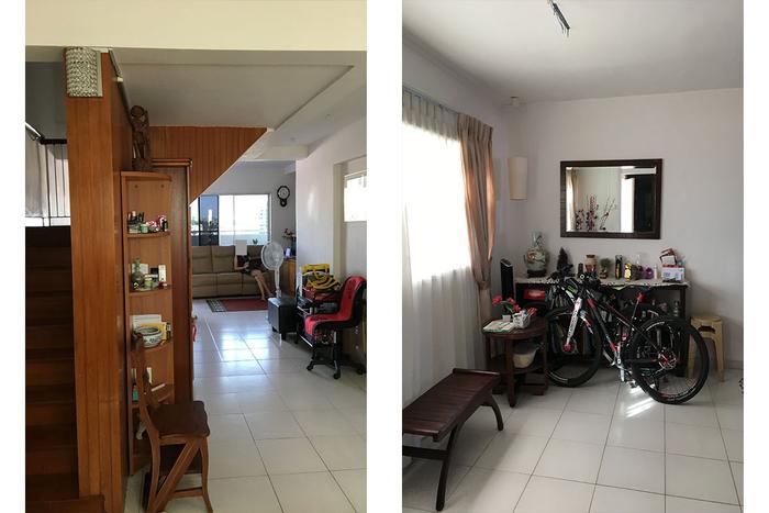
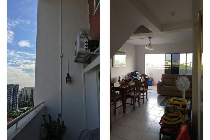
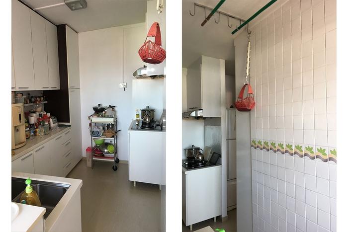
There are many words to describe this space, but 'neat' is not one of them. While there are hints of the home's basic design, most of it is unfortunately overshadowed by stuff. We mean lots of stuff. Random office-chairs, cardboard boxes and all sorts of knick-knacks; it feels almost claustrophobic. The apartment was also beginning to show signs of age, especially in the kitchen area (1970-era tile decals, we’re looking at you).
After:
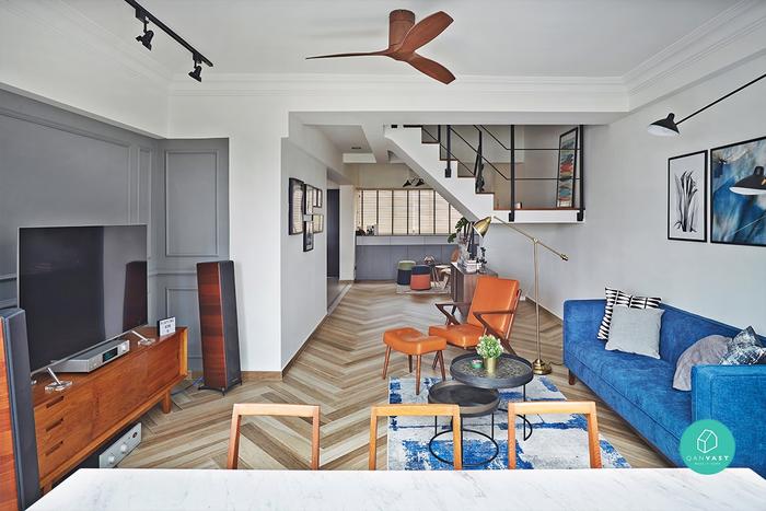
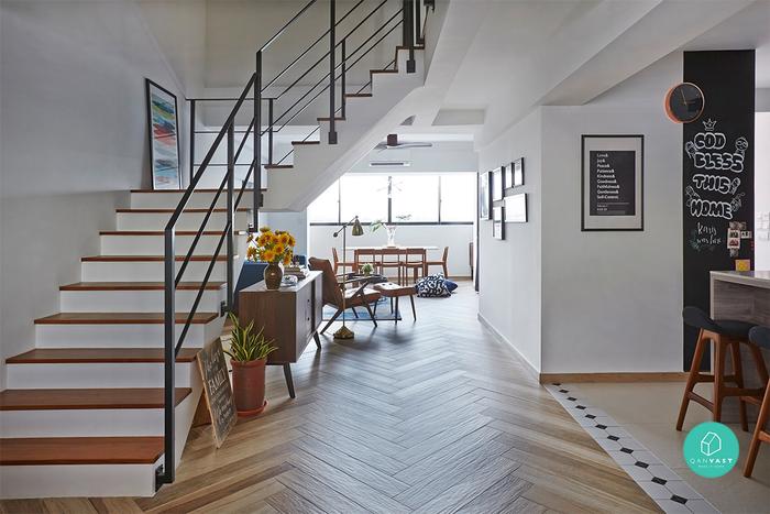
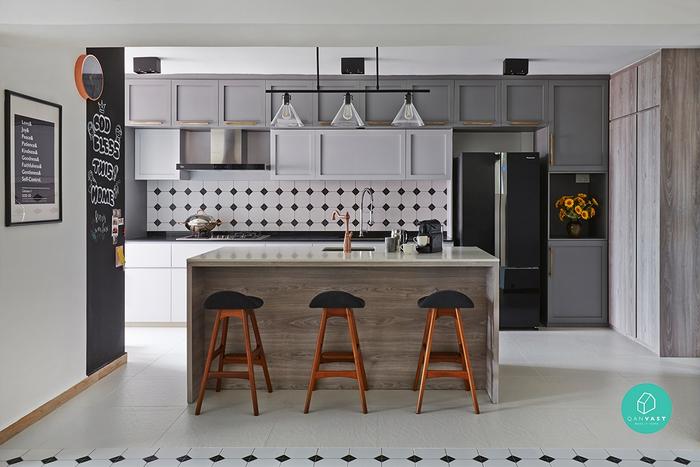
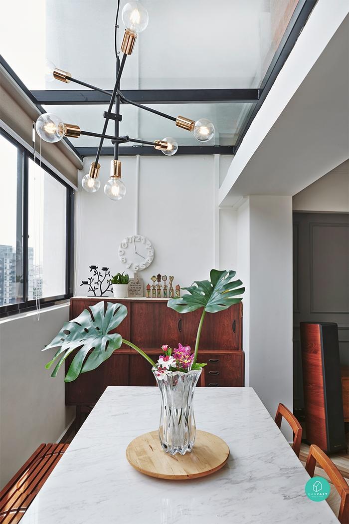
Sticking to white walls that accentuate the unit's expansiveness, design details are thrown into the mix to keep things from looking too clinical. Grey works as an accent hue, colouring the feature walls, cabinets and doors, while black lines - from the modern stair railings, wall lamps to the picture frames - help to add structure. The once-outdoor balcony area is also converted into an enclosed dining room with skylights - perfect for fun dinners under the stars! And the chaotic kitchen space? Transformed into a larger open concept kitchen with tons of storage cabinets.
Renovation Cost: $150,000
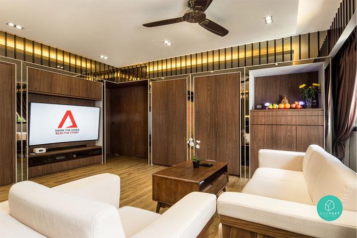
Wrapped head to toe in gold and woods, this glitzy HDB resale reminds us of a certain 'luxury yacht cabin' that we featured recently. However, what's amazing is that almost everything was torn out and redone – a far cry from its retro-looking aesthetic at the start.
Before:
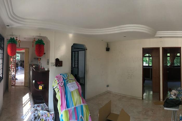
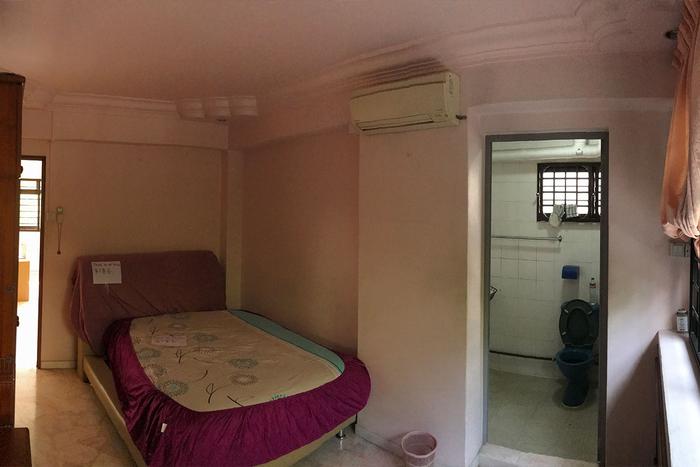
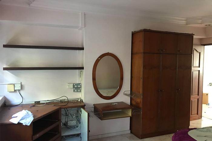
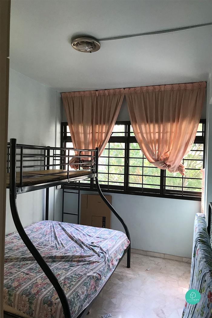
We call it the perfect, 1980s home starter pack. Curved, ridged cornices, those pink, glossy stone floor tiles... along with fancy archways with little tufts on the sides. We can almost imagine flipping through family photos of the past and seeing the exact same look. This retro theme extends throughout the home, whether it's the old-school iron bunk beds or heavy-set wooden built-ins that don't match with the rest of the space's pale colour scheme. Ah, good times.
After:
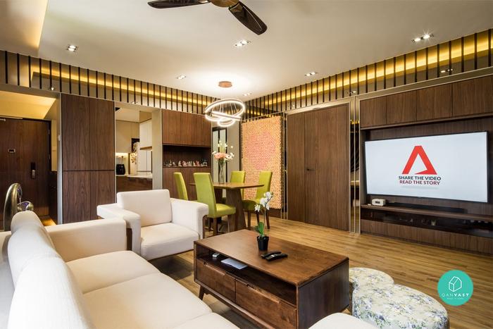
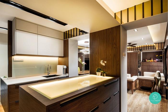
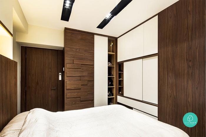
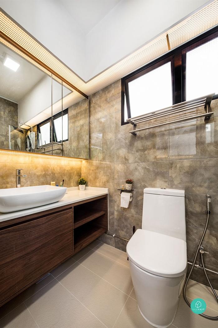
All the stops have been pulled, people - this is how you work a wooden theme without going overboard. Decked top to bottom in dark wood grains, mirrors in golden hues help to brighten and give the apartment a modern, lavish feel. In fact, certain areas were re-configured, as bedrooms were repositioned and concealed behind sleek doorways that blend perfectly into the rest of the living room. Meanwhile, the kitchen is given two entryways to form a U-shaped cooking area – a smart idea for easing movement in this otherwise cramped space!
Renovation Cost: $98,000
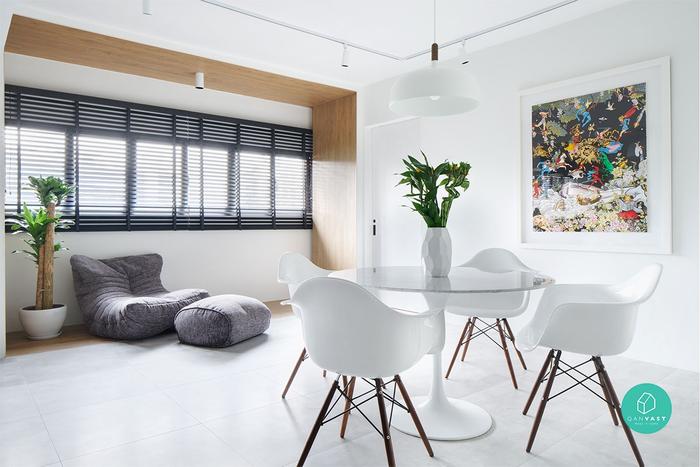
Looking every inch a spanking-new BTO or condo, this pristinely bright HDB flat is (you won’t believe it) more than 30 years old! That being said, it did look somewhat its age in the beginning – and unfortunately, for all the wrong reasons.
Before:
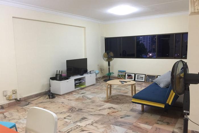
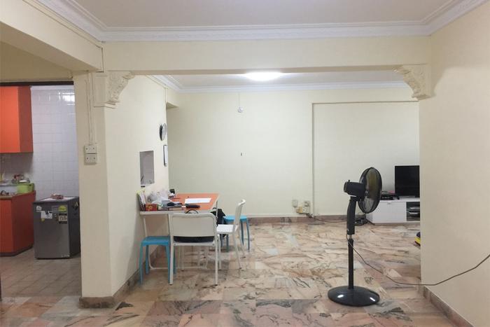

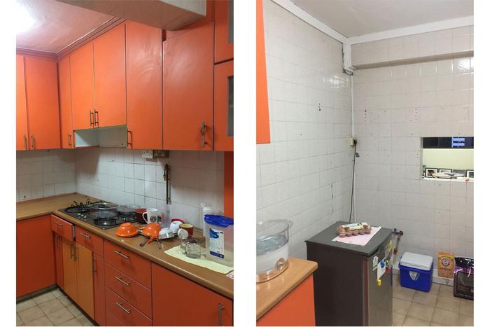
On the surface, the home looks just like any other bare, dull apartment. But peer closer, and many questions start to arise. Why a blinding shade of orange for the kitchen cabinets? Why that psychedelic shade of purple for the wardrobe? Is that a square hole in the wall between the kitchen and living room? And most importantly, does that ceiling cornice (which looks like it's better suited in a shophouse) actually fit with the rest of the home's look? It's all a mystery.
After:
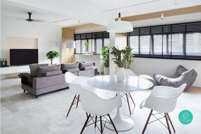
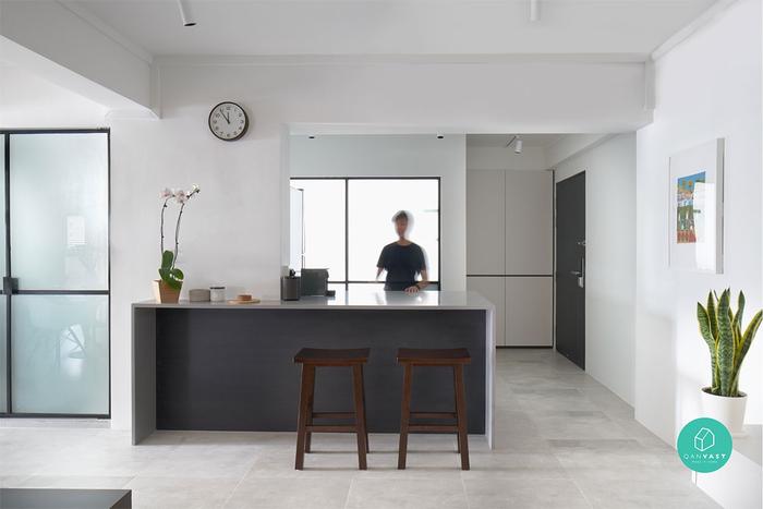
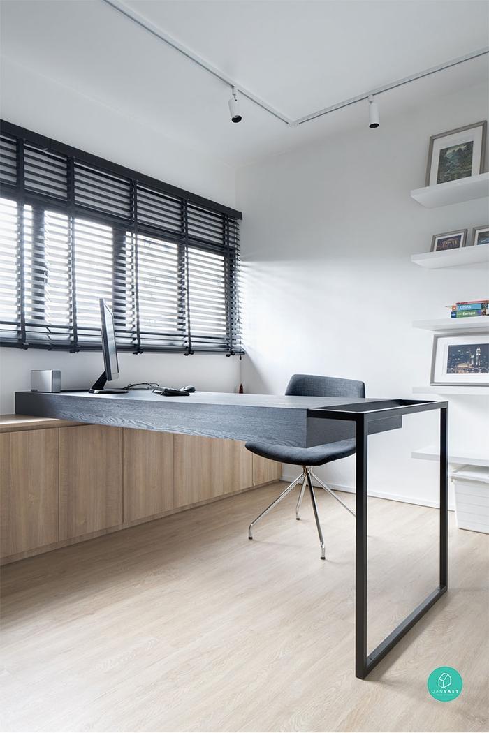

Redesigned for a single homeowner who wanted something light, airy and low-maintenance, one bedroom was hacked away to extend the living room - allowing more light to filter into the larger, open space. Similarly, the kitchen was converted into an open-plan cooking area, where the homeowner could easily whip up a meal whilst entertaining guests. Set in a primary palette of whites and pale woods, here - unlike its initial state - colour is subtly used in artwork, greenery and a pale pink feature wall to add a hint of freshness.
Renovation Cost: $500,000
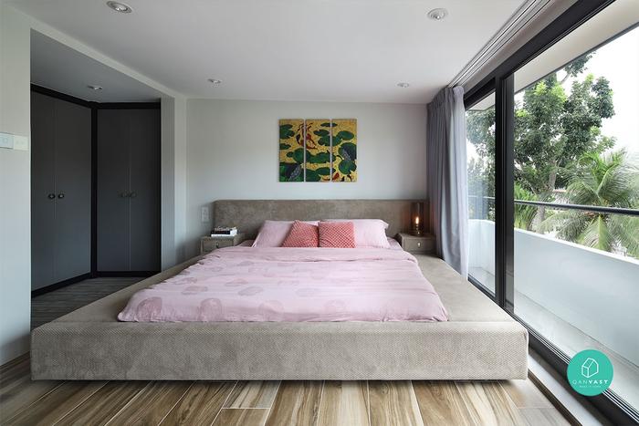
At 2,700 sqft, this posh but welcoming townhouse takes the cake for being the ultimate family abode. However, we're more blown away by how the designers were able to turn what used to be an absolutely decrepit, worn-out house into that. Major props.
Before:
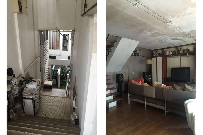
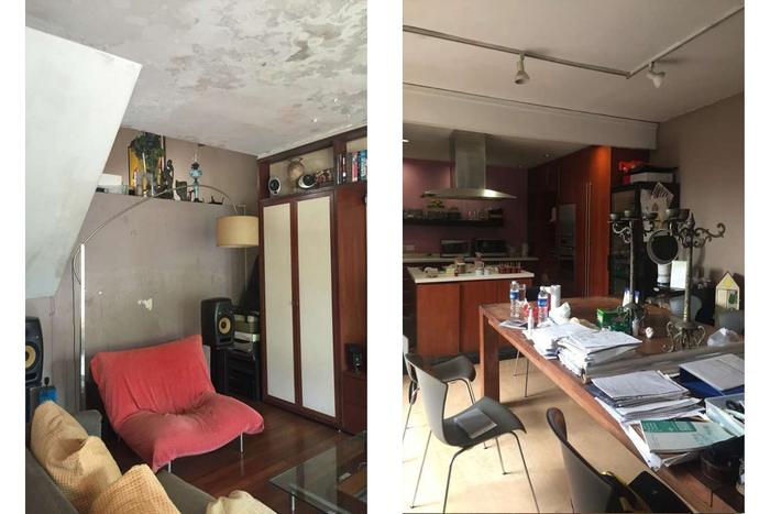
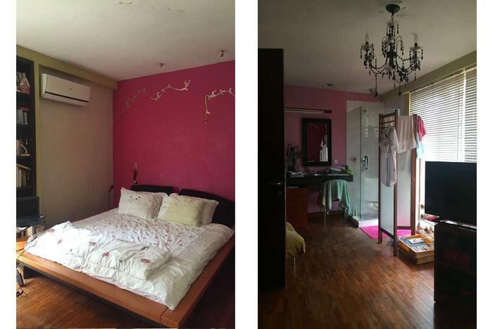
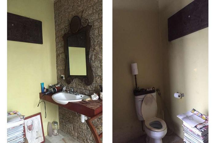
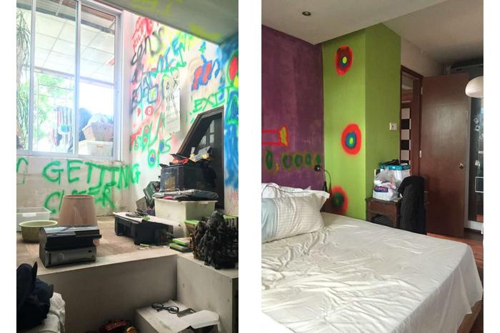
We weren't exaggerating when we said 'decrepit'. The outdoor facade looked as if it belonged to an abandoned 1960s factory lot, with grimy, blackened tiles, moss-stained walls and tons of clutter. Things don't get any better indoors either - step in, and you're greeted with a mouldy ceiling that stretches throughout the entire house. While the space's furnishings and built-ins seem pretty modern, they are absolutely ruined by the dirty walls and cracked parquet floors that give the entire home a crummy, disheveled look.
After:
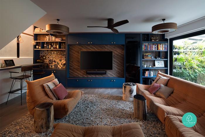
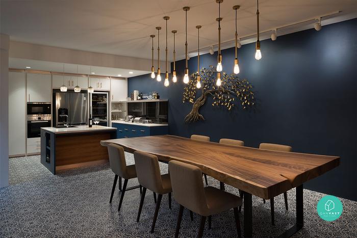
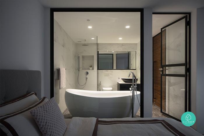
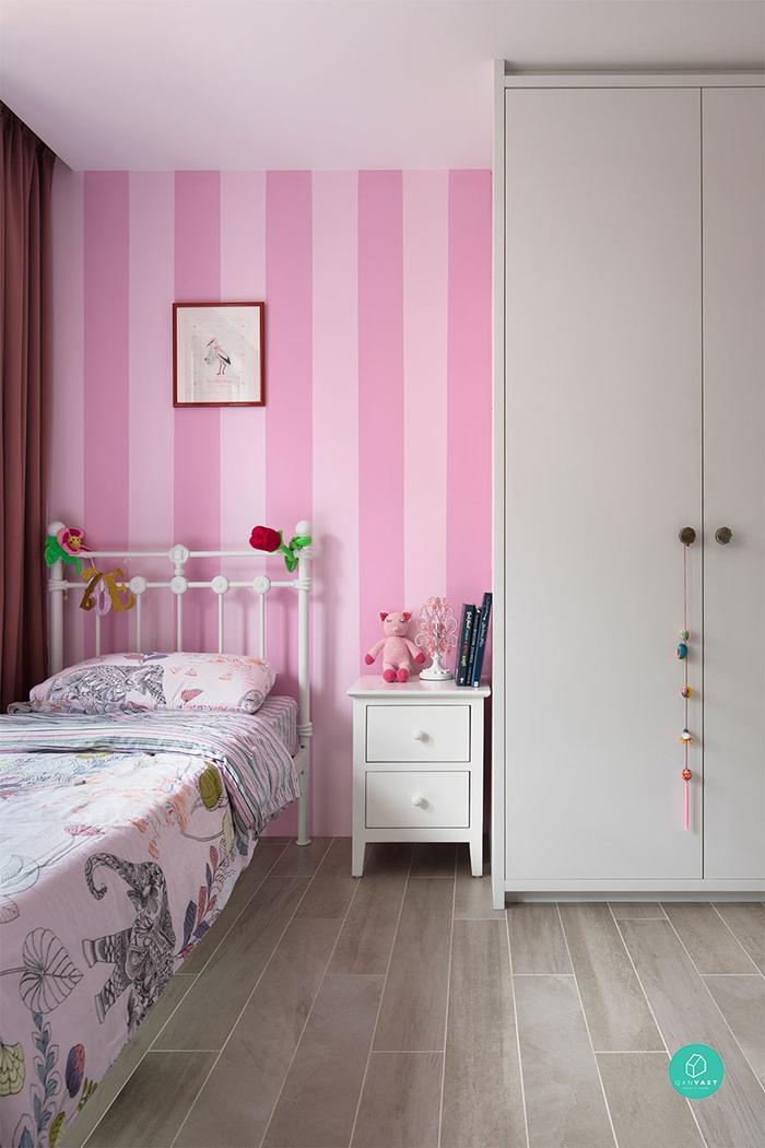
A 180-degree change-up! Gone were the clutter, the mouldy ceilings and walls, replaced with clean, contemporary fittings. Rich, navy hues, matching brass accents and a splash of graphic, patterned tiles throughout lend a quirky, eclectic twist in the communal areas, while the bedrooms take on a more sophisticated air with neutrals.
And in spite of the obvious change in style, certain elements were kept and given a fresh update! Take the TV console, which retains a similar structure as before, albeit spruced up with tiles and a wooden backing to match the surrounding decor.

 Get a budget estimate before meeting IDs