More than a feast for the eyes.
Not everyone can boast the skills of a bona fide chef, but Darryl – the owner of this 5-room resale flat in Pasir Ris – sure can! When he and his wife (who happens to work at Qanvast) started their search for a home of their own, they had a clear vision of what they wanted.
“We host often, so we wanted our home to be an experience for our friends and family – almost like a casual home dining experience,” shares Darryl.

The couple engaged Happe Design Atelier to give the 30-year-old flat a dramatic transformation with some fun details – including a ‘retail store window display’.
Keep scrolling to find out exactly how Darryl’s home revamp turned out!
About the homeowners and their home
Darryl (D): My wife and I viewed over 70 homes in a year before choosing this flat. It didn’t help that this was back in 2021 during the pandemic, when property prices were very high.
We were also looking for a place that resembled our childhood homes: something spacious, with a square layout and a balcony/entryway. Ultimately, we wanted to create a cosy and inviting space for ourselves and our guests.

View this project by Happe Design Atelier
D: We spoke to different IDs and finally went with David and Vanessa, our ID and project manager from Happe Design Atelier. They had a consistent portfolio and they were very receptive to new ideas, which stood out to us.
WATCH: Homeowner Darryl gives viewers a tour of his revamped home
On opening up the entryway

The entryway, pre-renovation
D: Our entryway was inspired by the Japanese concept of a genkan, which is a holding area to take off shoes before stepping up into the ‘main’ area of the house.
Previously, it was bounded by the kitchen wall to the left and the living room entrance ahead, but we knocked the wall down so guests can step up directly to the kitchen.
We also changed the flooring to a pebble wash finish that I liked. Admittedly, it can be a little troublesome to maintain.

The entryway, post-renovation (left) and a close-up of the pebble wash finish (right)
D: We closed off the original entrance to the living room with this full-height glass panel, which helps to widen the perspective and make the space look bigger.
My wife likes to call it a ‘retail store window display’ (laughs). We put up our decorations behind it during festive occasions like Christmas, which is the first thing you see when you enter the house.
About the kitchen’s makeover

The kitchen, pre-renovation
D: I’m a chef, so obviously, having a kitchen that is uniquely mine is very important to me. It took us the longest to plan because we wanted to maintain the space we had while balancing it with functionality for cooking.

Pre-renovation floorplan
D: Originally, the kitchen was completely closed off, so it was pretty small and dark. That’s why we knocked down the walls to open it up to the living room. This helped to brighten up the kitchen and improve ventilation for cooking.
We also hacked the service yard wall to make the overall space bigger.

Post-renovation floorpan | View this project by Happe Design Atelier
D: Since we didn’t want the kitchen to look cramped, we chose to only have floor cabinets and omit overhead cabinets. The upper section has open shelves instead, which are convenient to reach for.
We used quartz for all the countertops and the backsplash since it’s durable and easy to maintain.

The kitchen as seen from the living/dining area, post-renovation
D: One of my must-haves was an island. The IDs we initially spoke to recommended getting a rectangular one, or flushing it to the wall, but we thought it would look awkward or block the walking space.
We took some time to play around with the shape and settled on this organic one with a lot of curves that flows naturally to the living room. It softens the space too.

The kitchen island was installed at a slightly diagonal angle to the rest of the kitchen for a better flow | View this project by Happe Design Atelier
When our friends come over, they like to hang around the island and chat while I cook, or listen to my explanations about how I plate the dishes.
About the dining and living rooms

The living room, pre-renovation
D: This flat hasn’t been updated since its first renovation in the ‘90s, but luckily we didn’t encounter major issues during hacking. The foundational structure was in pretty good condition, although we understandably had to rewire the entire house since it’s old.
It worked out anyway since we wanted to change up the electrical points.
One thing we appreciated about David and Vanessa during this process is that before any work was done, they’d confirm with us: “Is this the way it’s done?”
They also gave us tips that helped us save on the renovation.

The living room, post-renovation
D: Pre-renovation, the house had a traditional look with dark red marble flooring and shades of maroon, which was honestly quite ugly.
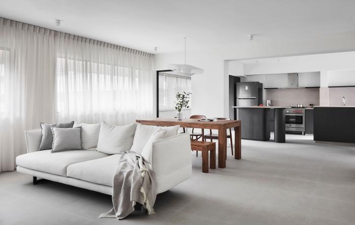
My wife used to work in the fashion industry so she was quite particular about colours. We decided to redo the flat with a muted and timeless colour scheme; you’ll see white, deep browns and shades of grey that create a cosy and welcoming feel.
At the same time, we didn’t want our home to look flat, so we incorporated a lot of different textures that have a natural or ‘raw’ feeling. Our flooring, for example, is made up of large-format Italian ceramic tiles while our dining table is made of reclaimed teak.

The living room, pre-renovation
D: We kept things simple for the living area; there’s a concrete TV console with curved edges and a wide sofa – both of which our friends can sit at when they come over. When it’s just me and my wife, we wind down here together.

The living room, post-renovation
D: There was a low false ceiling here before – so low the chandelier was actually at my chest! During the rewiring, we removed the false ceiling, which gave us enough clearance for the designer pendant lights I really wanted to have.
On renovating the master bedroom and ensuite

The master bedroom, pre-renovation
D: The master bedroom door was initially too close to the kitchen and common bathroom doors. There was barely any swing space, so David recommended shifting the master bedroom door further down.
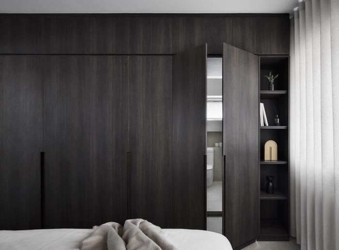
In terms of furnishings, our bedroom is one of the few spots in our house where you’ll see built-ins. We chose a deeper colour for the wardrobe since we wanted our bedroom to be extra relaxing.

The master bedroom, post-renovation

The entrance to the ensuite |
View this project by Happe Design Atelier
D: The stand-out feature is the entrance to the ensuite bathroom, which David suggested. The door connects seamlessly to the wardrobe, so you won’t realise it leads to the ensuite. My wife and I both loved the idea.

The master bathroom, pre-renovation (left) and post-renovation (right)
D: We don’t get a lot of natural light in the ensuite because the neighbouring block is very close, so it can get quite gloomy. That’s why we chose light-coloured tiles to maintain a bright and airy look.
One detail my wife had fun with is the mirror, which we hung up at a slight tilt to break up the clean lines.
On revamping the common bathroom

The common bathroom, pre-renovation
D: We wanted a reeded glass pane for visual interest for the common bathroom door, but we had to be careful since the shower area is right next to the entrance.

The common bathroom, post-renovation
D: There were a few rounds of trial and error before the pane was opaque enough to ‘hide’ any figure in the bathroom.
About the study rooms
D: My wife and I wanted separate study rooms, which we decorated with loose furniture and decor that reflect our personalities. Mine has all my cookbooks and some collectibles.
It’s also easy to change up in the future if we need to.

Darryl’s wife’s study pre-renovation (left) and post-renovation (right)
D: The only custom carpentry we have for the study rooms is the vanity in my wife’s study. There’s actually a story behind it (laughs). Basically, we misjudged the height we wanted for the kitchen island, so the first one ended up being too high to cook on (at 1.2m).

Darryl’s cookbooks and collectibles display (left) and his wife’s vanity (right)
Instead of discarding it, we decided to repurpose it as her vanity since it’s just the right height for her.
To sum up

D: Naturally, there were a few hiccups and delays; there were also some days when there was no work done because of pandemic restrictions. Still, we didn’t want to rush with our long-awaited home, so we took the time we needed at each stage.
My wife and I are happy with the end result. We truly appreciate that Vanessa and David were very prompt in communicating with us and resolving issues.
We’ve been living here for about eight months now and regularly host gatherings. During a recent party we had, seeing our friends enjoying their meals and mingling made us feel like our vision has truly come to life.

 Get a budget estimate before meeting IDs