A dated interior and irregular-shaped rooms didn’t stop this flat’s new owners from turning it into their dream home.
“The flat definitely required a lot of work,” says homeowner Jacqueline about the 36-year-old Potong Pasir HDB flat, where she currently resides with her husband Joey. “But we knew what we were getting into. Compared to today’s BTO flats, the layout is pretty irregular – especially before renovation.”
Yet, that didn’t stop the couple from purchasing and turning this Potong Pasir resale flat into their ideal home. “I wouldn’t call it a selling point [laughs], but the layout grew on us, especially after we started working with Adroit on customising it to our needs,” says Joey.
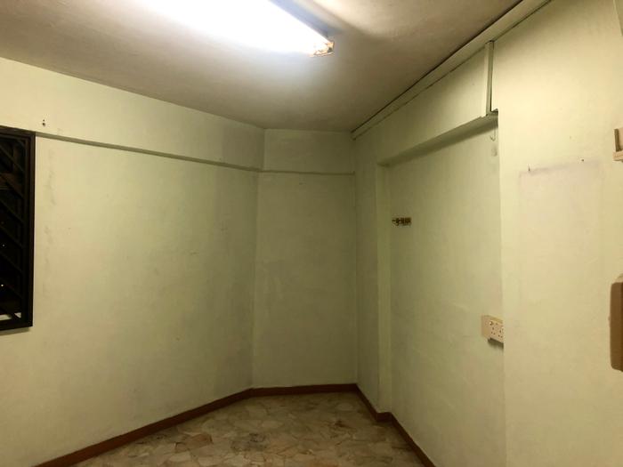
The inside of the study room, prior to the renovation.
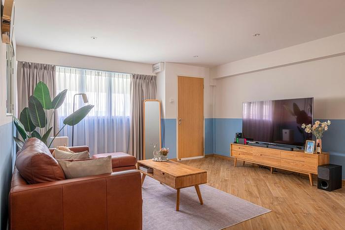
Looking at it now, Jacqueline and Joey’s abode looks completely different from before. Transformed into a cosy couple’s nest, their flat possesses a lively energy along with an optimised layout that sees irregularly shaped rooms transformed into useful spaces. Read on to find out what took place behind the scenes of this makeover!
About themselves and their home
Joey (Jo): I'm more of an introvert, so having personal space is very important to me – my “man cave”, as my wife puts it. That was one of the major requirements for the house; I need to have my own room where I can do my own things. Jacqueline is more of an extrovert, and that’s reflected in our home too.
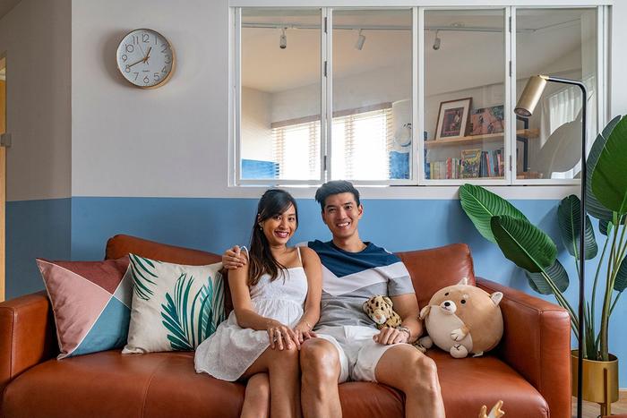
Jacqueline (Jac): I'm more of a sociable person, so my hobbies, like exercising, are all done outside. During my downtime at home, I tend to take things easy by watching TV or playing with my phone.
We had actually purchased this flat in January last year, but took our time with the renovation, because our wedding was set to take place in November, and we didn’t have plans to move in right away then.
Jo: Finding a flat in the right place and at the right price was challenging for us because of our budget. For example, while house hunting, we realised that we were uncomfortable with taking up such a big loan for our first home. We didn’t want to be too tied down financially, so to speak.
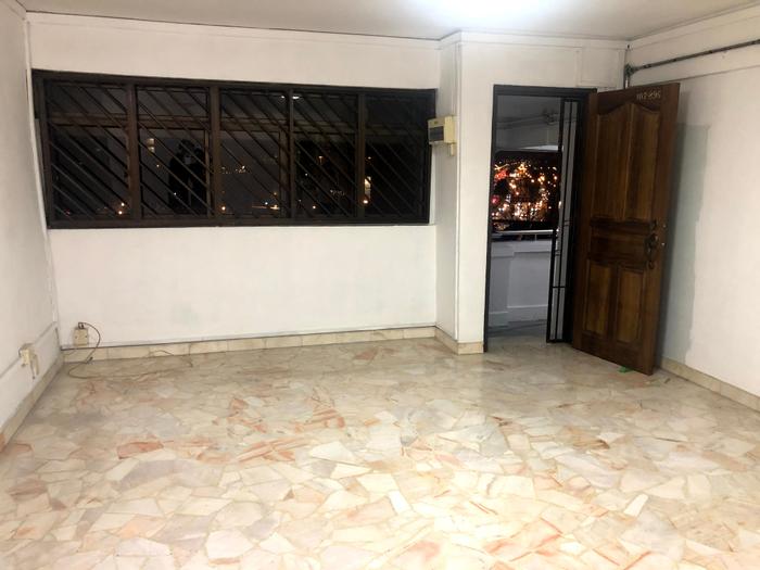
The living room, before the renovation.
We had also viewed a few homes in Mountbatten since it’s nearer to my parents’ home, but those were on the pricey side. We were concerned about finding a resale flat that would fit our requirements – then we came across this unit.
When we first arrived for the viewing, we had visited another unit with a totally different vibe even though it was in the same block; it was renovated, but not to our tastes and the price was higher as well. After that, we came a few floors down and found our current home. I took a liking to it because it’s a corner unit.
About getting a home in Potong Pasir
Jac (to Jo): Why don't you do your pitch on Potong Pasir being the nexus of Singapore? He's a very big advocate for Potong Pasir – it was even in our wedding speech!
Jo: (Laughs) It was mainly to irritate her, but there's some fact in that, because our estate is located close to the cross junction of various highways, which is ideal for us. Before expecting our first child, we didn't want to have our own car so soon. Convenience was a key criterion for our neighbourhood choices, and Potong Pasir really suited our needs.
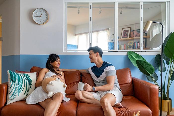
The park nearby has a connector that goes all the way to Bishan. And with Toa Payoh just across the highway, I’d walk there to buy food back every once in a while. In fact, we didn’t realise that we could get there by foot until we moved in!
Jac: Yeah, I agree that Potong Pasir is a nice location. Not many people think of it when you mention central Singapore, but it’s like a hidden gem compared to other mature estates like Bishan and Toa Payoh. It’s only people who have stayed or are staying here who know how great it is.
On planning the finances for a flat purchase and their renovation
Jac: With the CPF grants that we received, such as the Proximity Housing Grant, we were able to put a little more money into making our home look the way we wanted it to. The extra liquidity not only helped to offset the cost of our renovation, but also our furniture; we aren’t fans of built-ins, so we definitely wanted good-quality furniture for storage.
Jo: The total cost of our renovation was about $55,000. With the furnishings, it came close to $70,000. The amount of grants we received helped us to stick to our budget.
There's also the factor of time and planning – we didn't want to take care of our wedding and our new house at the same time, so we settled the purchase ahead of the wedding. Some of our friends tackled both concurrently and it was quite stressful for them. In this way, the grants gave us more breathing room for other expenses down the road as well.
About the living room and dining area’s makeover
Jac: The whole aesthetic of our flat is essentially Joey’s Pinterest board come to life. When we first started our research, I was going to go for the usual Scandinavian, all-white look.
After that, he showed me more contemporary designs, and we realised that this ‘boutique feel’ is more ‘us’. We wanted something that's a bit more classic and not so minimalist because that doesn't really feel as warm. We ended up choosing oak wood as the main material because of how cosy it looks.
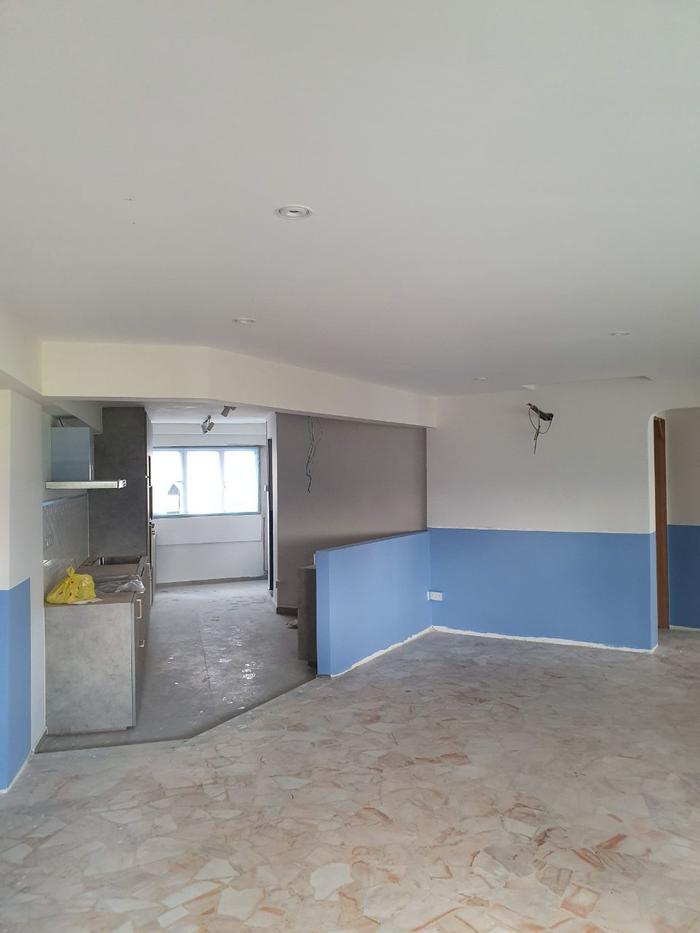
The communal areas of Joey and Jacqueline’s home, mid-renovation.
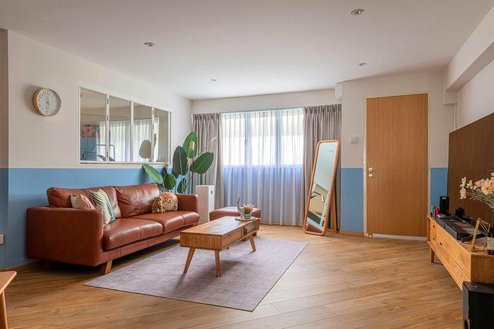
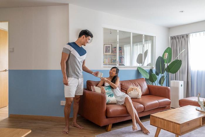
Jo: The half-wall look is something I've always envisaged for our first home because I like the idea of colour blocking. Blue is our favourite colour and it holds a special meaning to us.
It's somewhat cliched, but I proposed to her in Santorini while we were on vacation. We wanted to reference the Greek aesthetic in our home’s design to remind us of that special moment. We also wanted greenery at home for a more nature-inspired look, so we have some fake plants around.
Previously, there were these old-school terrazzo tiles around the entire flat. We wanted to retain them initially but ended up installing clip-on vinyl flooring on top because the reddish-purple shade of the floor didn’t match the blue walls we wanted.
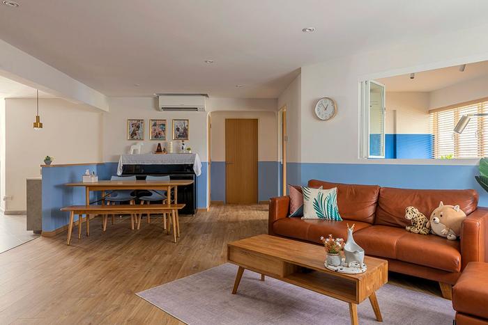
Jac: There’s a long wall in front of the living room, which the previous owners had left empty, so we placed our TV there. I am glad that we purchased a bigger screen because it fills up most of the space and it’s enjoyable to watch shows with it [laughs]. Most of the furniture, such as the TV console and coffee table, are from born in colour; the sofa set is from Commune, whereas the rug is from Taobao.
On changes made to the kitchen
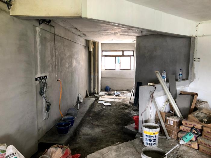
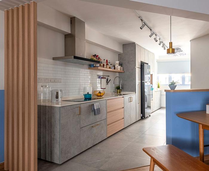
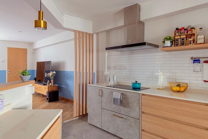
The kitchen during (top) and after (bottom) the renovation
Jac: For the kitchen, we were originally considering between an island or a bar table. But I'm old-school and thought that we still needed a proper dining table. So, we ended up with a preparation counter that acts as a pseudo island.
Storage-wise, we requested for tall kitchen cabinets and pull-out units to hide all of our pantry items and homeware; some of the built-ins also hide old pipes, which we did not want to leave exposed.
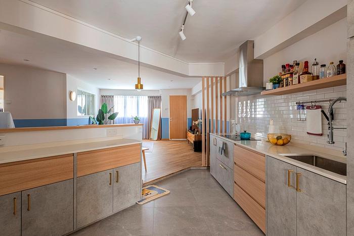
When we were still hunting for our home, we visited the MyNiceHome Gallery located at HDB Hub in Toa Payoh. We really liked the layout of the service yard on display, which was separated from the kitchen. We tried to recreate it in our home, and also got a Xiaomi laundry system with a heating function to maximise the space.
On the study area’s makeover
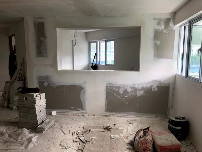
The study room, mid-renovation
Jo: As mentioned, our flat’s layout is quite unique. There’s a fair number of slanted walls throughout the flat, including around the study.
To work around this, Adroit built partitions to create a more even profile on the outside of the study room. It’s another reason why we’re glad to have benefitted from the HDB grants, which enabled us to put more of our savings into our renovation.
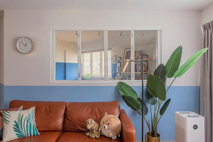
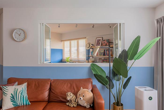
Jac: We also installed an indoor window to bring more light into the room. There was only a ceiling lamp as the single light source in the room before, so there were a couple of dark corners in the room despite its outward-facing windows.
On the master bedroom and en suite’s renovation
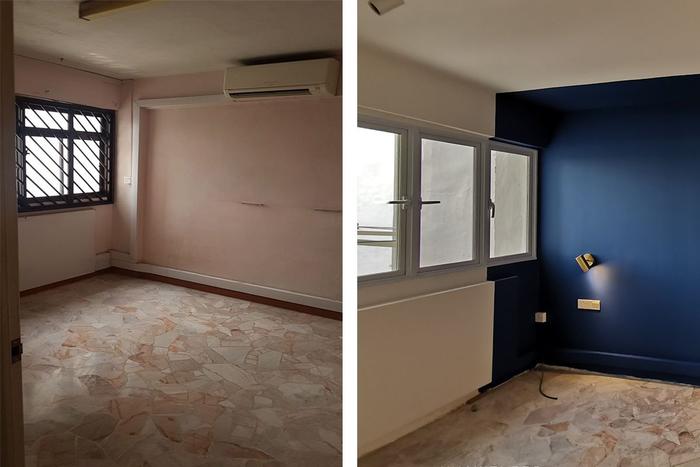
The master bedroom, before (left) and during (right) the renovation
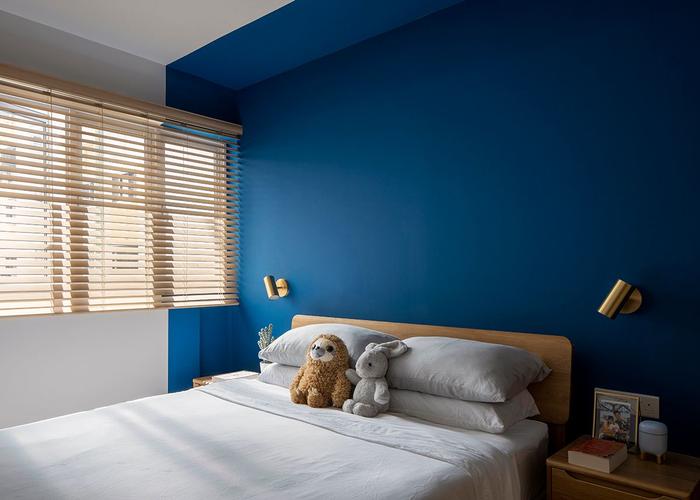
Jac: To match the living room, our bedroom’s colour scheme is also blue-and-white, but we chose a darker shade of blue for a more restful vibe. The bed frame as well as the side tables are from born in colour, while the brass lamps are from Taobao.
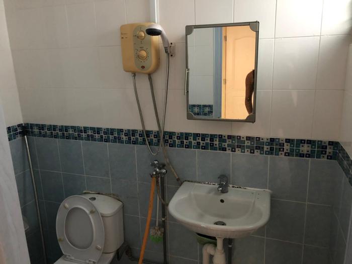
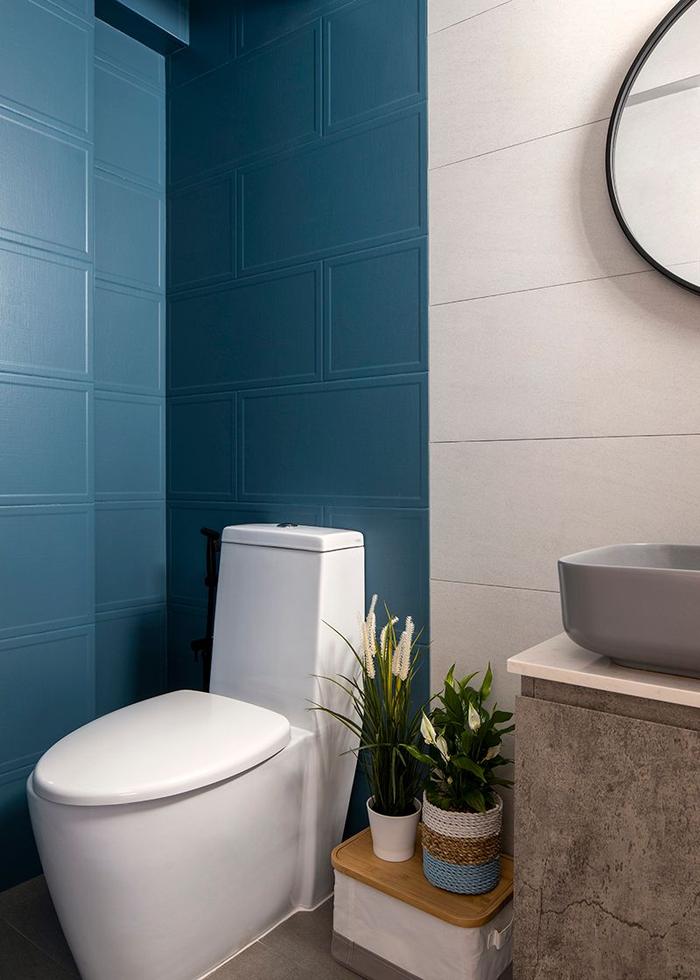
The en suite, before (top) and after (bottom) the renovation
The most unique feature about our en suite is the wall tiles from Hafary. We spent a long time deciding on the right colour and textures for the half-and-half lay, to replicate the blue-and-white theme here as well.
Joey and I made the decision to turn the en suite into a fully dry bathroom, but we kept the water points in case a future owner needs them. We made this choice as there isn’t sufficient space to install a shower screen, and we didn’t want to get our toiletries and belongings wet during bath time.
About the common bathroom’s renovation
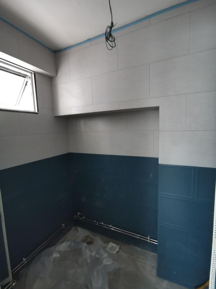
The common bathroom, mid-renovation
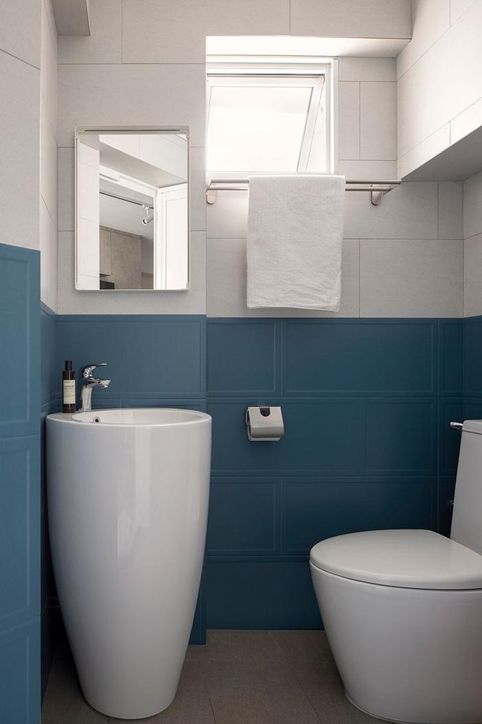
Jo: We were lucky that our estate had undergone HDB’s Home Improvement Program before we moved in, so our bathroom pipes had already been replaced by the time we got the keys. This saved us some money as we didn’t have to worry about getting new plumbing.
However, we still chose to swap out the bathroom fixtures, like the WC and the sink, with new ones that matched our taste; the only challenge was finding a suitable standalone sink that could fit, which we finally did at Modeste.
To sum up
Jac: In a way, I think one of the biggest challenges was finding a balance between my layout preferences and having a home in an ideal location. For instance, I didn’t want a house with a common bathroom at the back of the flat, because I did not want my guests to have to walk through the kitchen to use the toilet.
Both Joey and I have grown quite fond of our home, especially since we’re now spending more time at home while expecting our first child. It’s also a very unique space to us, thanks to so many people seeing it online through Qanvast. In that sense, our home definitely ended up having a lot more character than I thought it would!
This renovation journey home feature was brought to you in collaboration with MyNiceHome, HDB’s official website for all things related to home buying and renovation in Singapore!

 Get a budget estimate before meeting IDs