Smart tweaks that you can learn from to make your own small (and time-worn) space shine.
When it comes to renovations, you may find that resale flats are a tough nut to crack because of their age and deteriorating condition, and if it’s a 3-room home that you’re working on, things can get even harder due to limited space.
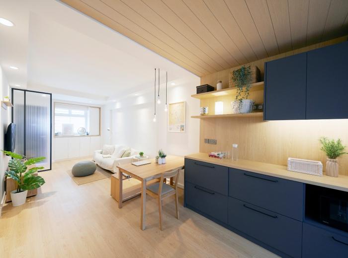
View this project by Carpenters 匠
But trust us, when we say that all you need is some keen design sensibility coupled with strategic space planning to elevate your dated 3-room flat into a livable space. Look no further than these real-life examples for proof (and also inspiration)!
1. If you’ve been hunting for a new home or have seen the latest BTO flats, you’ll definitely find that one of the biggest differences is them and 3-room resale flats is their layout. BTOs tend to have a ‘blockier’ look, whereas 3-room resales possess a longer, narrower floor plan.
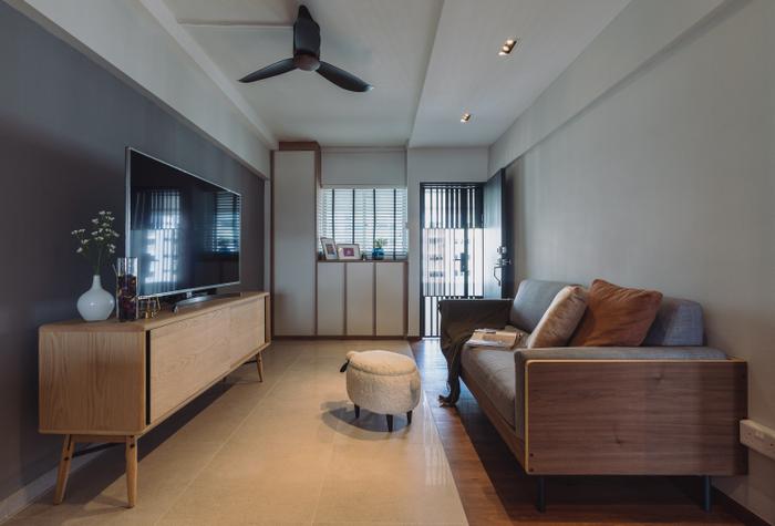
View this project by Artmuse Interior
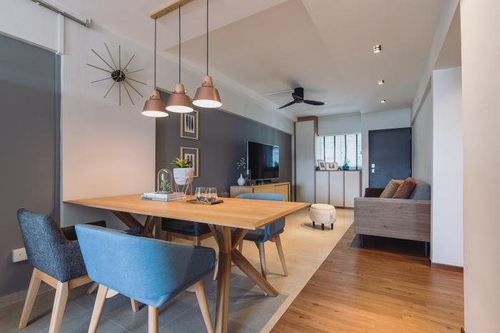
Play on this feature by going open-concept, just like this Gloucester Road apartment – both the kitchen and master bathroom walls were removed to make it feel less enclosed.
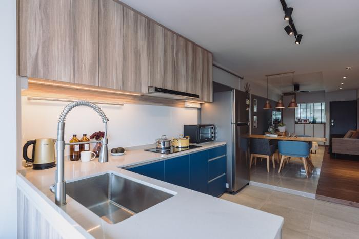
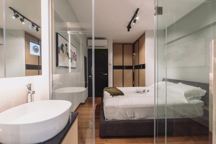
2. You might have heard that dark colours can be a challenge to work with (and they are!) but you can’t deny their appeal. One layout tip that works just as well for dark homes and also narrow ones is to have your cabinetry flushed to the walls.
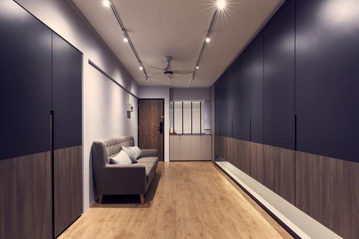
View this project by Happe Design Atelier
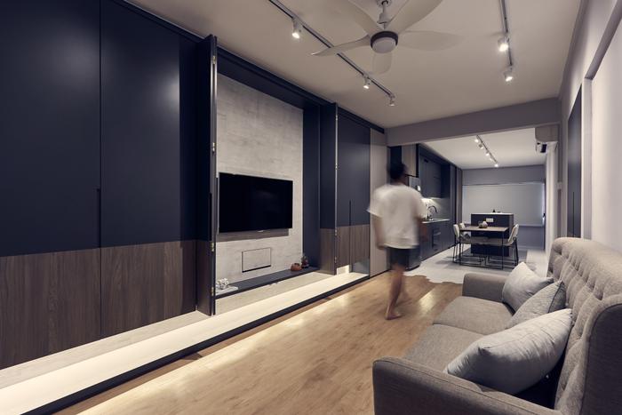
This Ang Mo Kio flat has a ‘larger’ look by despite sandwiched by navy blue built-ins on both sides. Taking this streamlined approach with less decorative features creates a long and open space that flows.
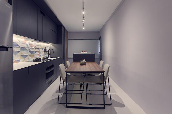
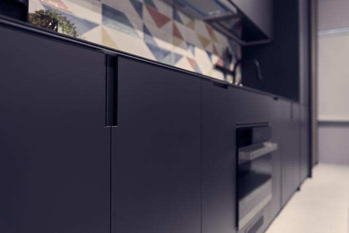
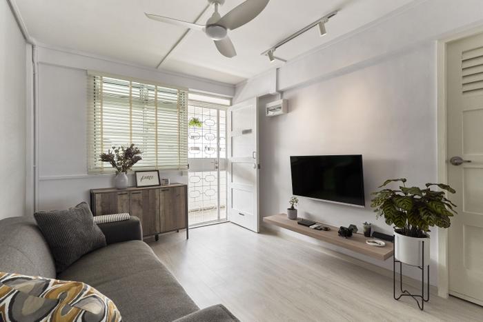
3. Styling is key! If you plan to renovate your 3-room resale flat with a white-and-wood look in mind, consider getting wood-look/natural furniture, storage solutions and décor. This tip works because you’ll get the freedom to move your furniture anywhere you please (important for a flexible layout), without compromising on style.
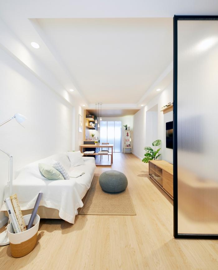
View this project by Carpenters 匠
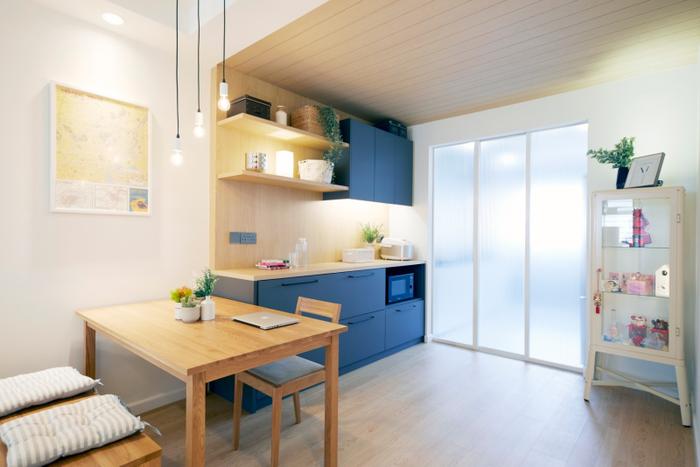
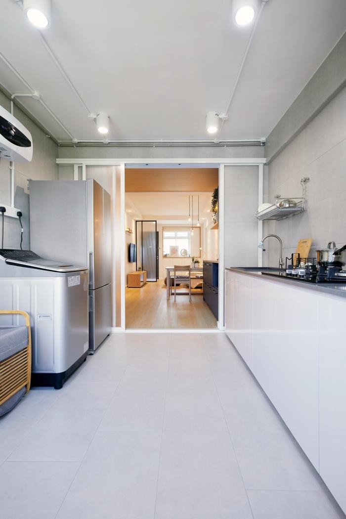
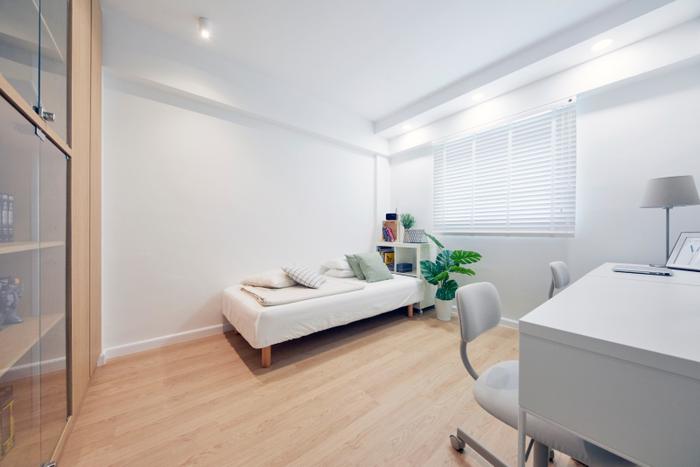
4. Without hacking away at the walls, it can be hard to create a more spacious layout in your 3-room resale home. But before you grab the sledgehammer, check out this apartment at Whampoa Drive. By using mirrors, its owners managed to ‘enlarge’ the surroundings of the living room. Having integrated shelving helps too!
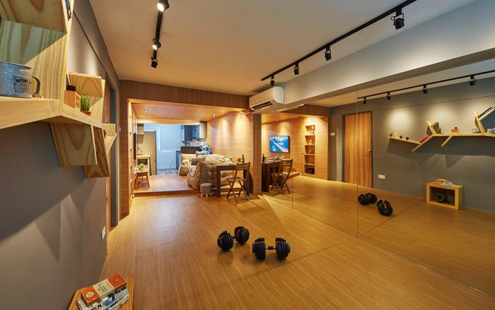
View this project by i Chapter
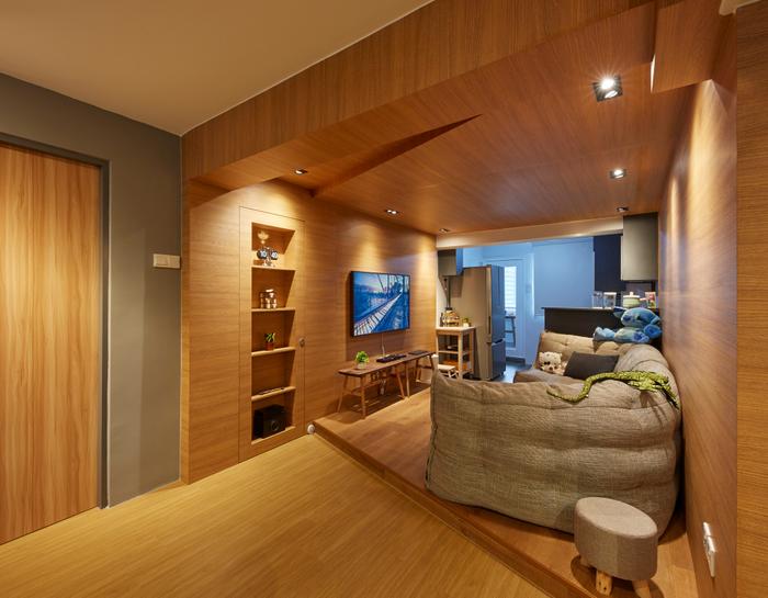
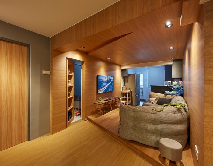
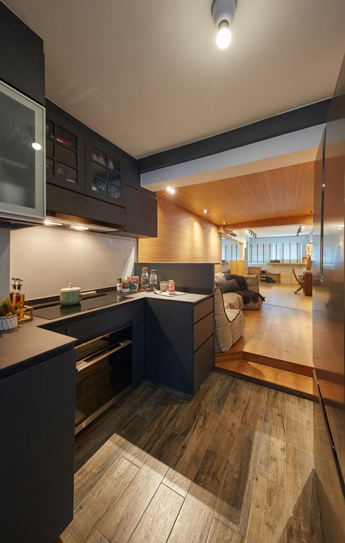
5. A cramped look doesn’t necessarily translate into tight walkways. Sometimes having a top-heavy configuration for your storage solutions can also result in the same effect. So, for this reason, skip out on mounted cabinetry, even if it means less storage space as it can make your ceiling look taller.
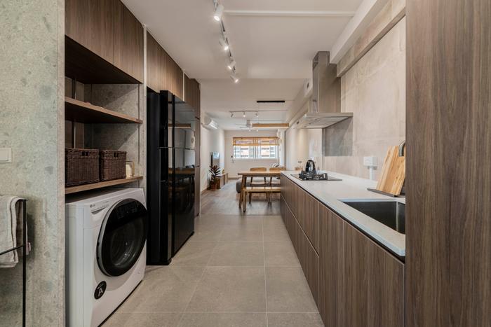
View this project by Omni Design
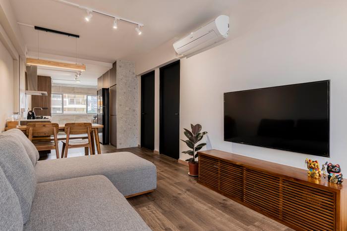
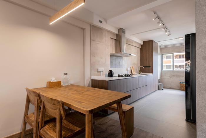
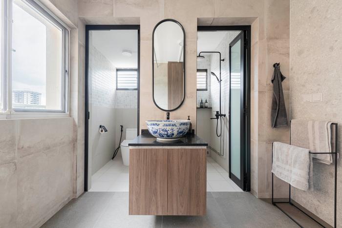
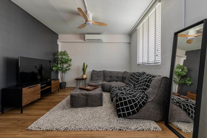
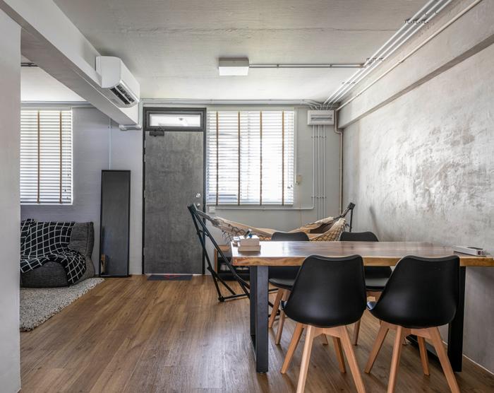
6. If space is an issue, one tweak you can make to your 3-room resale flat would be to convert an adjoining bedroom into a living area. Thanks to this hack, the walkways of this open-plan home in Jalan Bukit Ho Swee hardly feel cramped, plus there’s now a cosy corner for entertaining guests!
View this project by Butler Interior
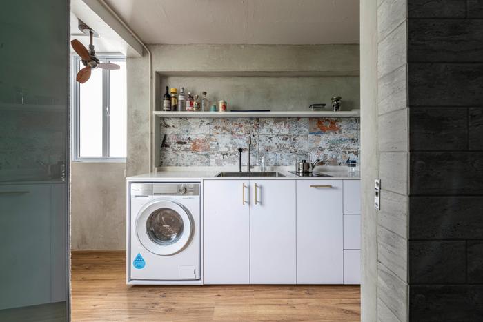
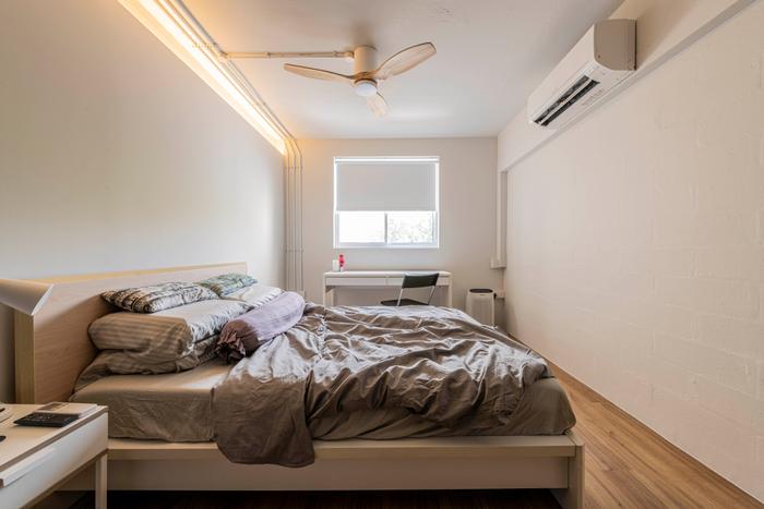
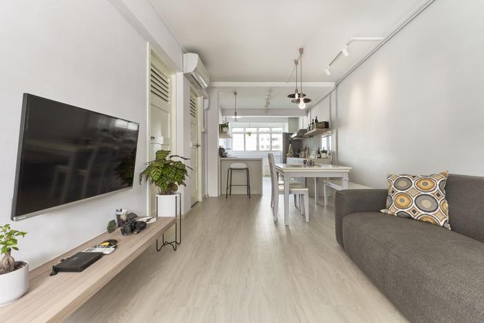
7. As evidenced by number 6, leaving a wall unhacked can make the difference between a narrow flat and a more spacious home. In the case of this Stirling Road apartment, its rear kitchen wall was removed, which not only creates enough space for a breakfast counter, but also allows natural light to enter unimpeded.
View this project by ELPIS Interior Design
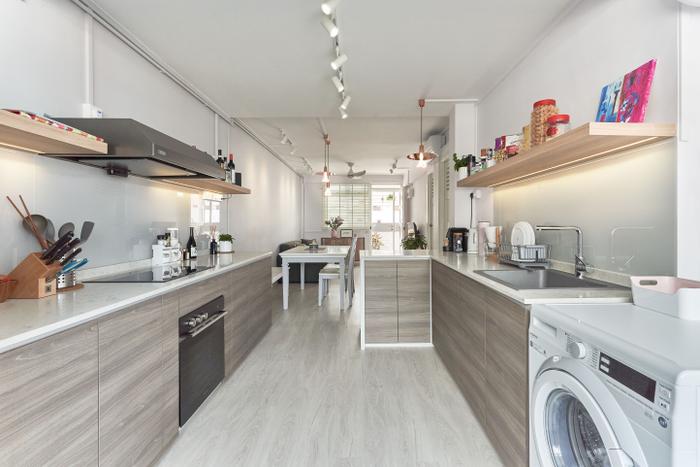
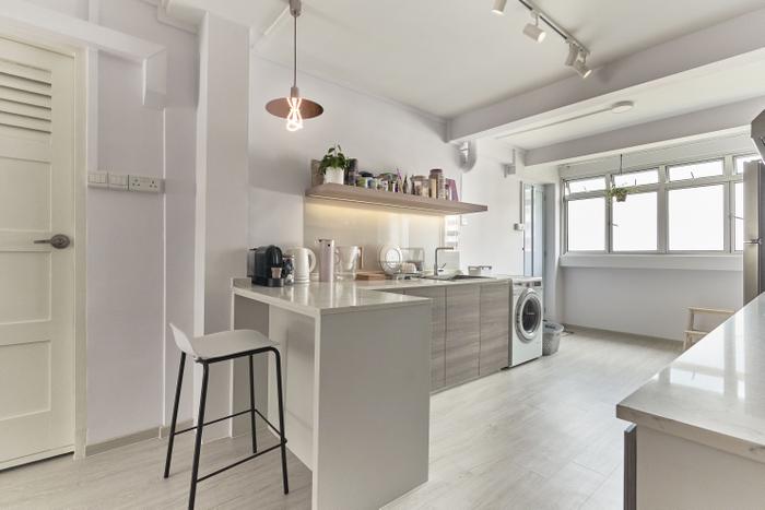
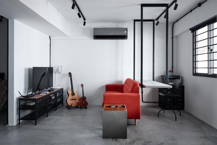
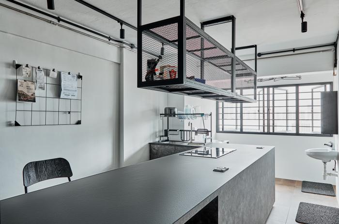
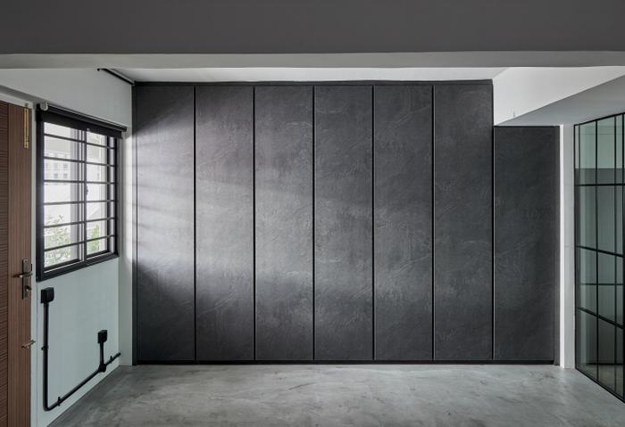
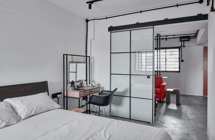
8. While it’s also a 3-room resale HDB apartment, this home in Queen Street looks a bit different, not because of its industrial-style look, but due to how it is laid out. Here, décor is kept to a minimum, and emphasis is placed on storage through cabinetry and suspended shelves/tables.
View this project by Ascend Design
Give your resale unit the refresh it needs!
Let us know and get quick, personalised renovation quotes from five interior design firms for free!
Also, when you engage an interior firm through our free recommendation service, you’ll enjoy perks, such as the Qanvast Guarantee - a free scheme that safeguards up to $50,000 of your renovation deposits.

 Get a budget estimate before meeting IDs