Eschewing the popular MUJI look, the owners of this flat opted for a more rustic Japanese vibe for their home.
When Dale and his wife first got the keys to their new Tampines home, it was pretty standard as far as BTO flats went. “There was almost nothing inside,” says Dale, who is in his thirties, and like his partner, works in the creative industry.
Be that as it may, having what was essentially a “blank slate” proved handy for the couple as they could more easily project their idea of a dream home onto it.
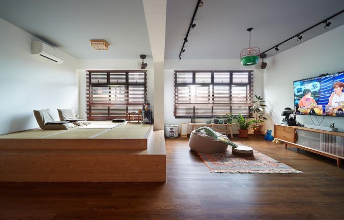
View this project by D5 Studio Image
Having a unique vision helped too. “We’re huge fans of Japan, so we definitely wanted to incorporate some (Japanese) elements into our home,” says Dale.
However, instead of adopting the ever-popular MUJI-inspired look, Dale and his wife were inspired to put their own modern-day spin on the traditional interiors of rural homes in Shirakawa-go – a historical enclave in the Gifu Prefecture.
To find out more about the couple’s creative process as well as their renovation experience with D5 Studio Image, we sat down for a chat with Dale!
About themselves and their home
Dale (D): My wife and I are both avid travellers, so although the main theme of our home is Japanese, there are also elements from the other countries that we’ve visited.
For example, we’ve been to the Middle East and Greece as well, so some of the decor items like our living room carpet, are actually souvenirs that we’ve managed to incorporate into the overall look.
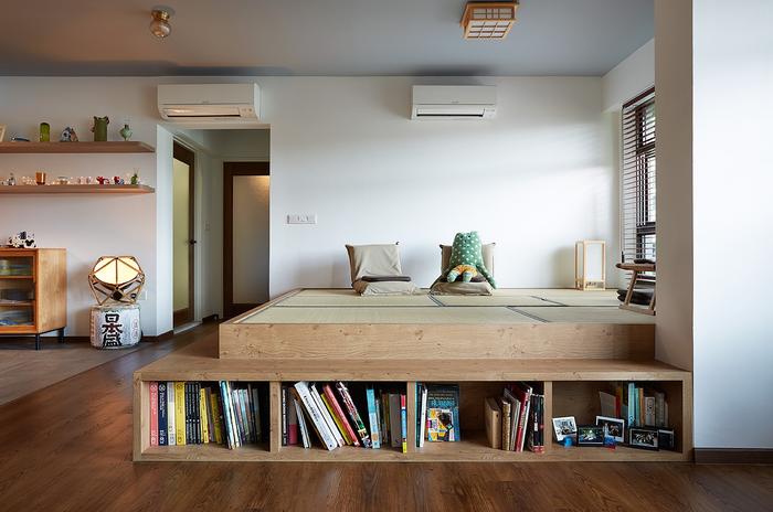
The space beside the living room was originally intended to be a dining area, but it now displays a variety of knick-knacks that were collected from around the world.
We also wanted our home to be cosier and less clinical, so for the floor and fixtures, we deliberately chose darker wood tones, similar to the ones that we saw in village houses in Shirakawa-go.
To add on to the Japan-inspired vibe, we had the room doors customised as well; they have a panel of textured glass that’s fixed into a wooden frame, which makes them kind of like a modern-day version of shoji screen doors.
About the living room
D: We wanted to maximise the living area from the get-go, so we envisioned it to be an open-concept space.
It’s actually two rooms merged together, and the walls of the bedroom nearest to the living area were actually hacked away – that was definitely the correct decision to make because both of us felt the original space was too cramped right from the moment that we saw the house.
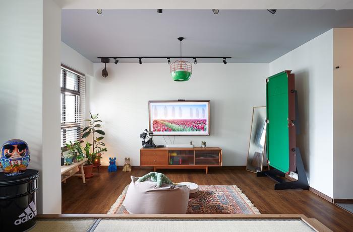
The living room is our main entertainment/hosting area, which is also why we kept the layout flexible so that it’s easy for us to use the space for almost any activity. There’s a foldable pool table that we store at the side (of the room) as well as beanbags and a mini garden near the windows.
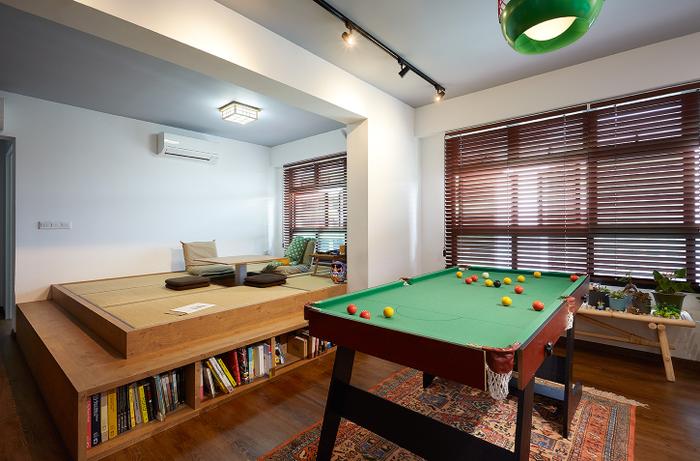
The main highlight is still, of course, the tatami platform. It’s where we chill out at home and having it here in the living area made the most sense because that’s where most of the natural light enters.
If you take a closer look at the platform, you’ll notice that there’s a built-in table in the centre. There’s a button that activates a hydraulic system which raises the table; it’s useful for our hangout sessions because all we’ve to do is to place our foldable mahjong board on top of it for a good time with our friends.
About the kitchen
D: Unlike the living area, we chose stone tiles for the kitchen both as a way to demarcate the space and to add a cool contrast to the warmth of the surrounding cabinets. The knobs on the drawers are from Santorini. Initially, we didn’t have a plan for them until we thought about using them in the kitchen [laughs].
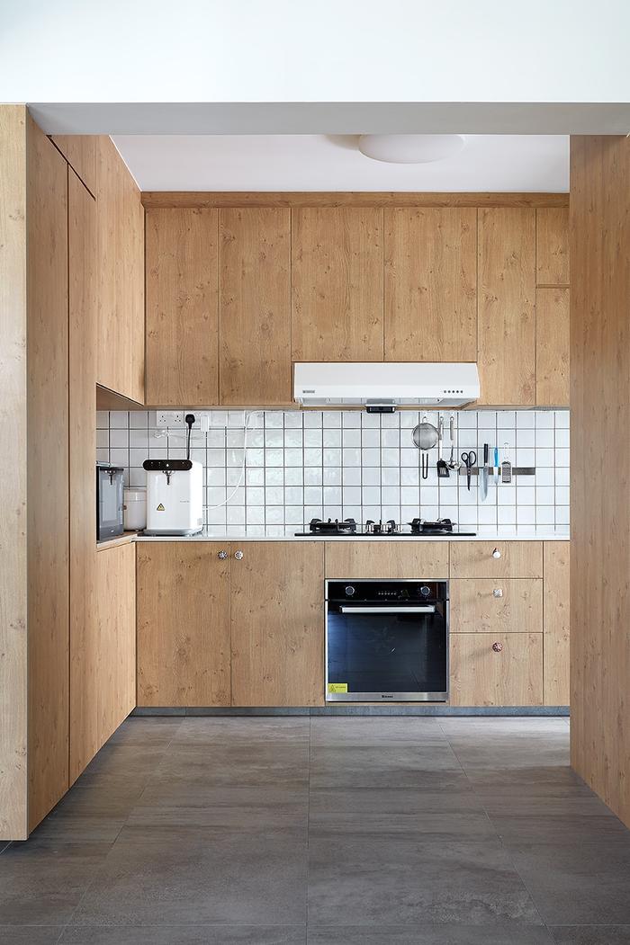
On the practical side of things, we actually requested for the cabinets to be mounted a bit higher, because both my wife and I are fairly tall; the same goes for most of the other fixtures in the house.
In terms of space-planning, the kitchen is quite efficient as well, because D5 Studio Image was able to help us optimise the placement of our appliances and fixtures. I really like how they were able to hide the fridge behind the wall to the right of the entrance – it’s a nice touch because it gives the kitchen a sleeker look from the outside.
About the study
D: This room is mainly for our creative pursuits. I do paint a little in my free time, so it’s a conducive space for me to focus. And recently, due to the COVID-19 situation, it has also become a photo studio where I shoot stuff for work.
For the flooring, we deliberately chose cement screed, because it would still look fine to us, even if it’s slightly dirty after we’re done with our arts and crafts sessions.
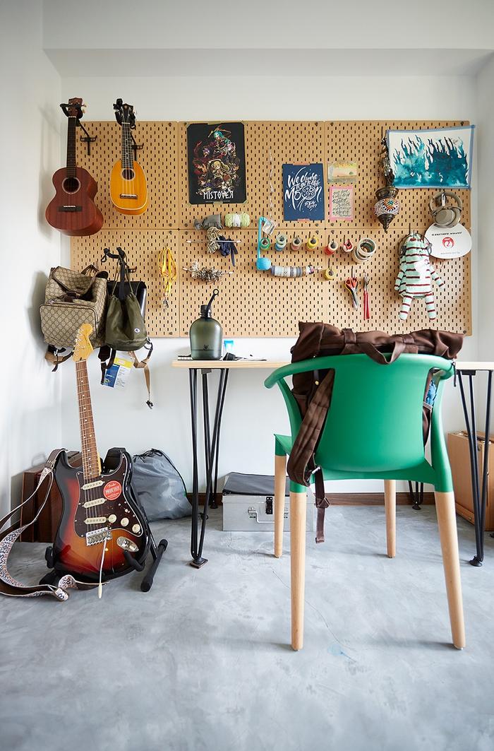
The pegboard that’s in front of the desk was bought from IKEA, and it’s really useful because it lets us maximise empty wall space and keeps all of our art supplies within easy reach. Plus, I guess, it makes for a cool backdrop too.
About the master bedroom
D: Having a platform bed here was pretty much a natural decision for us, since if it works for our living room, it would work in the bedroom as well.
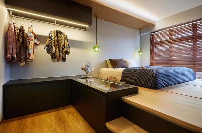
As for the open-concept wardrobe, we wanted it mainly for visual reasons as it would allow us to see more of the bedroom space compared to a standard wardrobe; there’s also a glass display cabinet on the side to store our fashion accessories like pins, watches, and also perfume bottles.
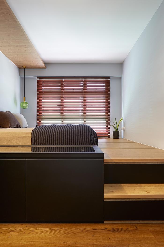
The original design for the cabinet’s cover was actually quite heavy, but D5 was able to install stronger hydraulics so that it’s easier to open. They were also the ones who ensured that there was enough clearance between the clothing rack and the cabinets below, so we could retrieve our clothes easily and also have a vanity surface of sorts.
About the bathrooms
D: If you notice, the bathroom tiles are identical to the ones used in the kitchen, and that’s because the leftovers were used to construct the backsplash. I guess it also helps that my wife really likes the tidy look of mosaic tiles, which we chose to pair with matte black fittings for a high contrast look in both the en suite and common bathrooms.
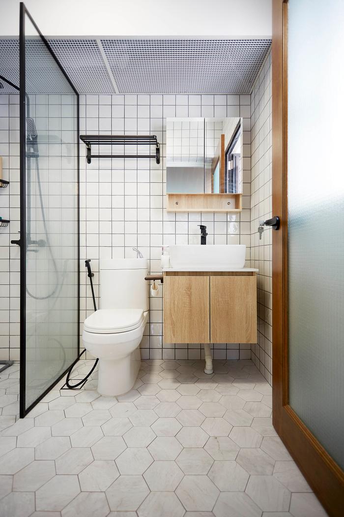
The master bedroom en suite.
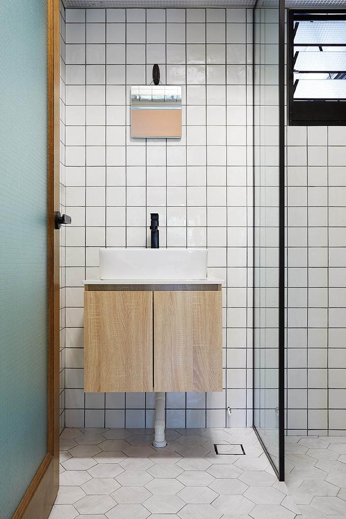
The common bathroom.
In case you’re wondering, the common bathroom’s mirror is much smaller because there was a happy accident of sorts; the original mirror that we purchased broke and we ended up using the one that we had bought for the bedroom changing area here.
Currently, we’ve no plans to change this mirror because it adds a cutesy vibe to the space. One of my friends also commented that it reminded them of the ones they’ve seen in Hong Kong apartments, so that’s extra style points, I guess?
To sum up
D: In a way, I think the lockdown is a test of how comfortable and functional our homes are because we’re all spending so much time indoors – and I can say that ours definitely passed as there’s enough space for all our needs.
As for advice for new homeowners, I’d definitely encourage them to share any visions they have with their interior designers because they can know how best to bring these ideas to life.
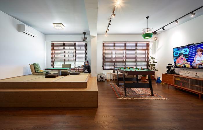
For example, prior to our renovation, my wife had actually did some 3D sketches of the living room, but it was Dave, our designer from D5 Studio, who helped us figure out the practical details, like how high the platform had to be for it to be used for storage.
So yes, if you’ve got a strong concept in mind, look for a designer who is patient, flexible, and is able to make it work.
Now's a good time as any to get started on your renovation plans!
Many Singapore homeowners have had to put their renovations on hold due to COVID-19 BUT that doesn't mean you can't start planning for yours now.
Ironing out the kinks in your home makeover plan will enable it to proceed smoothly once circumstances improve, so if you’d like some professional help let us know and we'll link you up with local interior firms that offer virtual consultations!

 Get a budget estimate before meeting IDs