Updating a decades-old home is never easy, but if this walk-up apartment at Zion Road is any indication, the results are well worth the effort.
Renovating an old home is never easy because it often calls for a top-to-toe revamp. But if there’s a local design firm that’s capable of handling the job, it’s Third Avenue Studio, which recently worked on couple Vince and Mina’s walk-up apartment at Zion Road.
View this project by Third Avenue Studio
“To be frank, nobody really knows how old this building is,” tells interior designer Lawrence, who helmed the apartment’s 16-week transformation. “Some websites say that it dates back to the 1960s, others say 70s. The homeowners also checked with URA and BCA, but they couldn’t find any records.”
One thing is for sure, though. Vince and Mina’s 92 sqm home now has an updated look and brand-new interior features, including a walk-in wardrobe, an additional bathroom, and an updated layout. To find out how all this was achieved, we spoke to the owners about their renovation journey.
About themselves
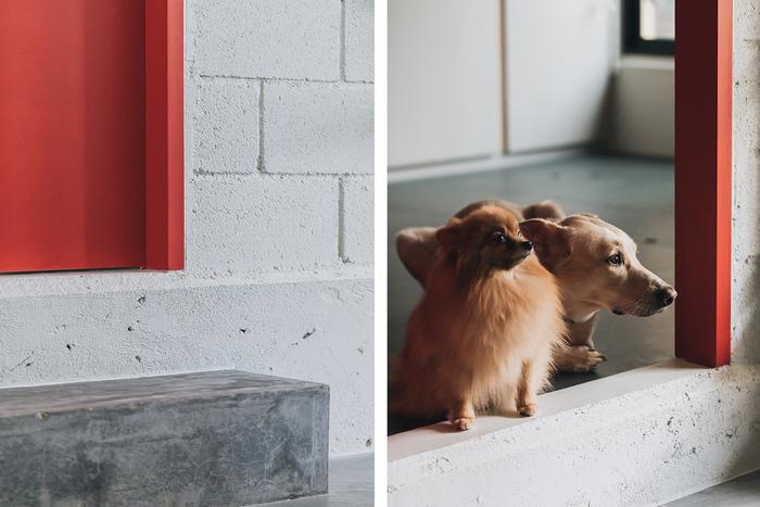
Vince (V): We’re a couple in our thirties. We live here together with our 6-month-old son and domestic helper. We also have pet dogs and rabbits sharing the space.
About their home’s look
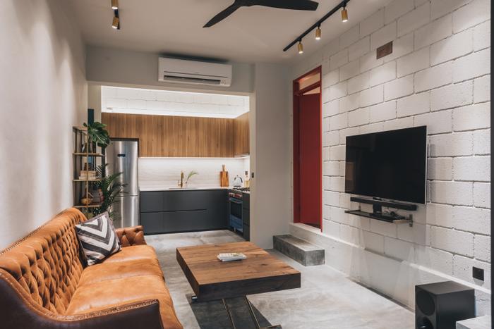
Mina (M): I would say modern-contemporary with a dash of quirkiness? I like to think there’s a lot of character to our home and it’s not quite like any other house that I’ve ever been to. It’s really practical and tailored to our needs.
Although we aren’t exactly minimalists, we don’t like having a lot of clutter around. We don’t have much furniture or home decor either, and instead of having art on the walls, we kept them bare.
Also, because the accessories are kept to a minimum, the design of the surroundings has to convey the ‘personality’ aspect of the house and it manages to do a good job without looking forced if you get what I mean.
About finding inspiration
M: We looked at a lot of small spaces, tiny homes and boutique hotels while brainstorming. We also enjoyed poring over pictures of jungalow-style and green-inspired homes.
We get excited by minimalist spaces and clean lines too, but we realised that the house had to accommodate the practicalities of our everyday life, which involves living with a child and pets.
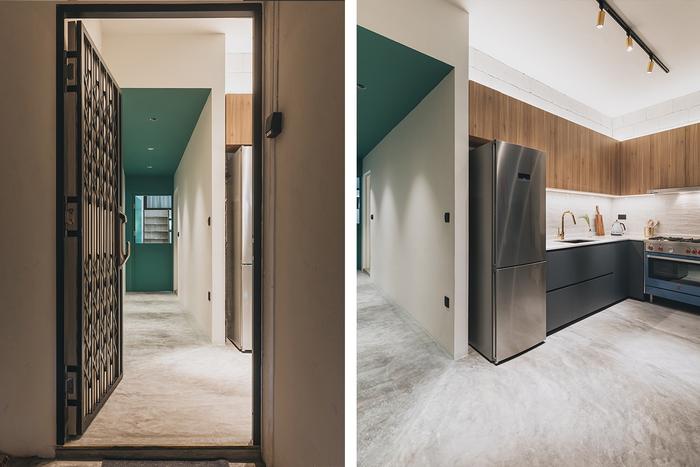
In other words, we really needed a friggin’ lot of storage and durable flooring. We used cement screed for most of the house as it’s easy to clean when pet fur gets everywhere.
About their must-haves
V: Our home is located in a really old building that hasn’t been renovated in decades. It was a mess when we bought it! We saw the potential, but we really needed help re-designing the space.
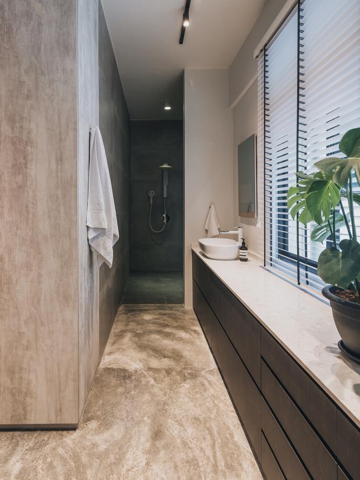
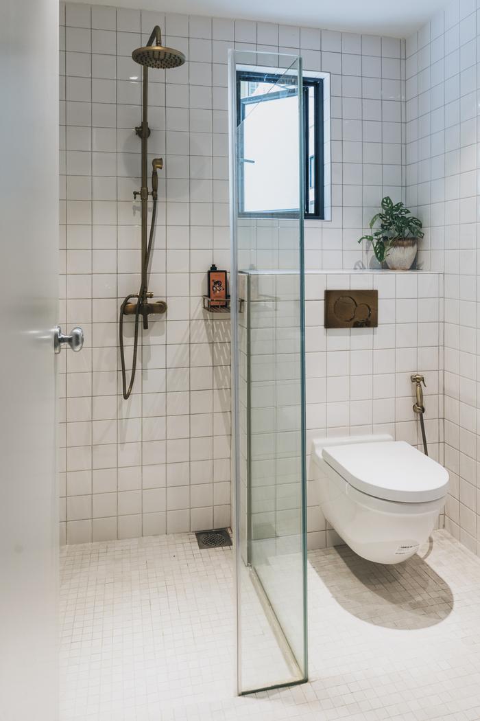
First, we wanted to add another bathroom. The original design only had one toilet, and we wanted our own master en suite. Every space in the house also had to be able to handle multiple functions. For example, we didn’t want a dedicated dining area that’s segregated from the living space.
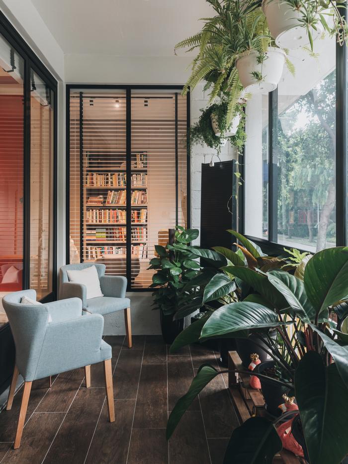
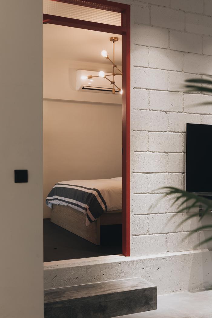
M: Another one of our many special requests was to incorporate indoor windows to brighten up the whole house.
Lawrence accomplished that by installing some above our bedroom doors as well as a larger one in the nursery that looks out from the balcony. It’s especially breath-taking because the windows open up the whole space and make it look larger than it actually is.
On renovation works done
V: Basically, we hacked everything. And when I say everything, I mean EVERYTHING. The whole space was rebuilt ground up.
It also took some clever space planning on Lawrence’s part to fulfil our requests. When we first met him, we brought along this 50-page deck with references and ideas, plus a 20-point list of our must-haves. And as you can see, he was able to accommodate everything we wanted.
M: For the main living area, the key highlights here are the open kitchen and bifold glass doors that open up to the balcony. We’ve also got a coffee table that extends to dining table length –and by opening up the entire space between the living hall and balcony – it basically allows us to eat, lounge and entertain in the same space.
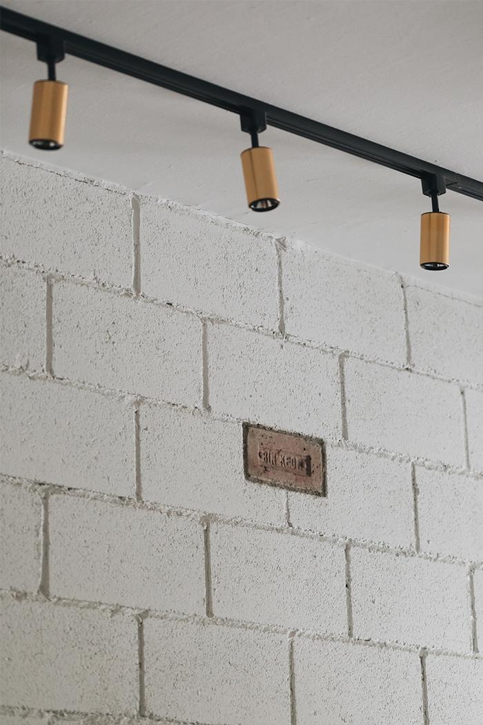
For the living room, Lawrence was also able to salvage a brick from the original structure – it's built into a wall to serve as a little reminder about our home's history.

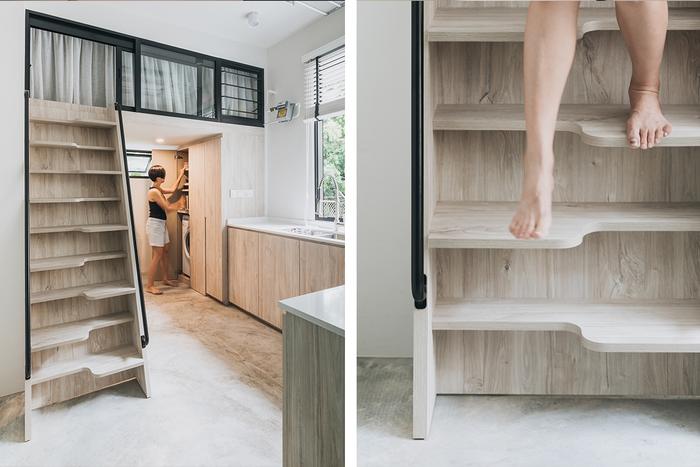
As for the rear kitchen, we wanted it because we cook a lot, and the space is unique because Lawrence was able to incorporate a loft sleeping area above the pantry/laundry area. We looked to capsule hotels for inspiration, and the final result is a really cosy private space that many of our friends are impressed with.
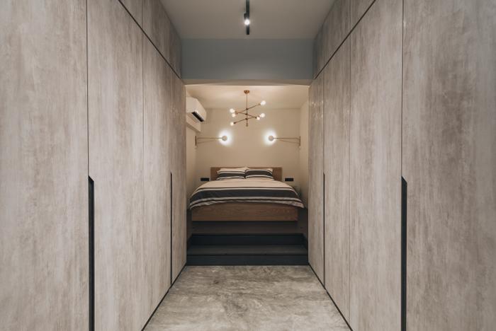
The other space in our home that’s popular among our friends is the master bedroom. It’s our favourite too, because of the walk-in closet and open-concept bathroom. Waking up in it feels like we are staying in a posh designer hotel. In fact, it’s hands down better than any other hotel room that I’ve ever been in! [laughs]
On challenges encountered
V: Because we were working with a very old space, there were quite a lot of unknowns that we had to deal with, especially old building structures.
First, the plumbing proved to quite an issue because of our request to add another bathroom, the same goes for the piping because of the new kitchen as well.
The other big challenge was the discovery of unexpected structural beams. We only found out about them after we hacked all the walls, so our bedrooms ended up being raised, which is why there’s a step up outside them. To make the most of the situation, we ended up building storage into the raised platform/floor.
On working with Third Avenue Studio
M: Everything worked! When we first met with Third Avenue Studio and Lawrence, we weren’t sure if they would be up for such a difficult project. But when he showed his space plans, we knew he was the right person. Like I mentioned, he managed to fit our entire wishlist into his proposal – something that the other designers we consulted weren’t able to do.
V: When it comes to project management, we couldn’t have asked for a better partner than Lawrence.
Yes, there were unexpected delays, but we never felt like things weren’t moving along. He was responsive and proactive, and his team was awesome.
And when we had to alter the house’s design to turn the spare room into a nursery after we found out we were expecting, Lawrence took our request in stride; his attention to detail and meticulousness really made our first renovation a great experience.

To sum up
M: We’re extremely happy with the result. We’ve been living here for almost a year and we still love coming home every single day. We wouldn’t have done anything differently.
It’s now the kind of space that you want to be in all the time. We even find ourselves going out less often nowadays, simply because of just how lovely it is to hang out at home!
Looking for professional renovation help?
Submit your request for an interior designer via this link here and we can connect you with up to 5 design firms for non-obligatory quotes for free, based on your renovation requirements.

 Get a budget estimate before meeting IDs