Despite its awkward layout, this ID/homeowner was able to make full use of it to accommodate his friends and family!
As the saying goes, change is constant – and sometimes, even the most resolved homeowners outgrow their houses and yearn for something new. That was exactly what Earth Interior’s Mr Ong and his family felt in their old home, despite it being perfectly functional.
“Our previous home was a smaller, older HDB flat that had never been renovated before,” says Mr Ong. “Even though it was just the three of us, we felt cramped and restricted, because we didn’t have enough space to enjoy it with other people.”
“So, we decided we needed an upgrade, and told ourselves that we were going to make our new home our dream house, no matter what.”
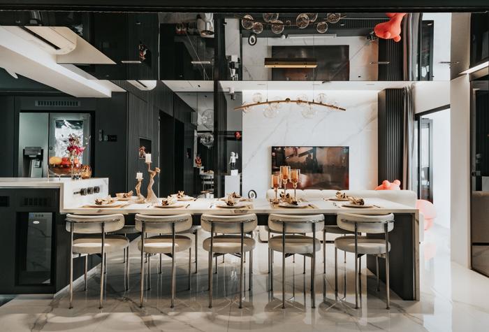
View this project by Earth Interior Design Pte Ltd
Plagued by COVID-19 restrictions, Mr Ong and his family had to wait for almost 1.5 years while their new executive apartment in Bukit Batok was being renovated.
But with its spacious, sleek look, as well as its unique new features – like a 10-seater dining table, adjacent entertainment room, and king-sized bunk beds – it’s clear that the wait was worth it. Keep scrolling to find out more about this whopping $209,000 makeover!
About himself and his home
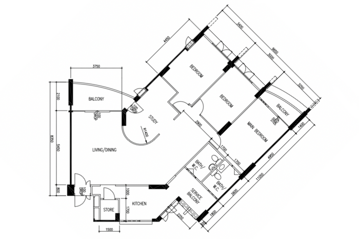
The floorplan of Mr Ong’s home, pre-renovation
Mr Ong (MO): I’m both the homeowner as well as the designer of this house, and I share this home with my wife and 12-year-old daughter.
During the pandemic, we found that we really needed a bigger space, so we began looking at nearby maisonettes, executive apartments, and 5-room flats that were up for sale.
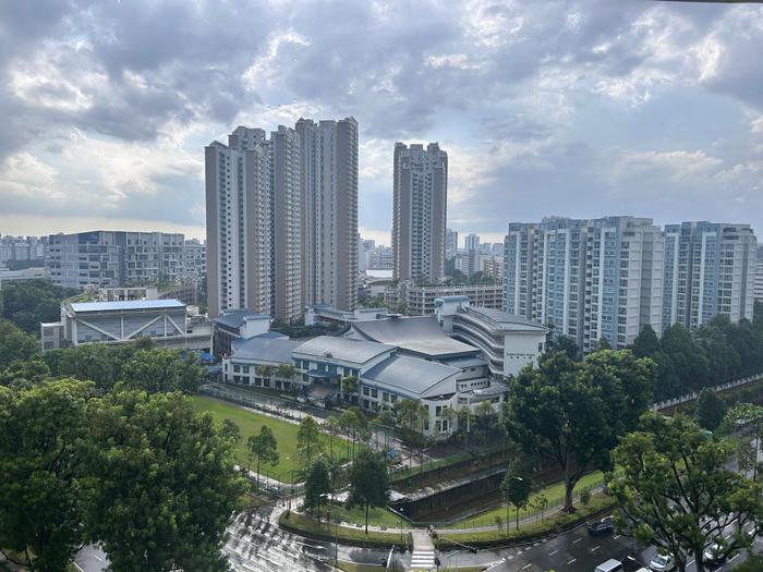
The view from Mr Ong’s balcony
We saw so many houses that at one point, I was ready to give up and just remain in our old house. But then, we found this unique executive apartment in Bukit Batok – which was on the top floor and had gorgeous unblocked views. I think we knew from the start that this was the perfect place for us.
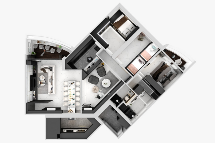
An aerial 3D mockup of Mr Ong’s reconfigured home
For the look, my family and I wanted something sleek and classy. When we go overseas, we love staying in nice hotels — to us, the modern-luxe look has the right balance of cosiness and sophistication. It was only natural for us to replicate the look in our new home.
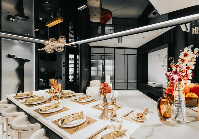
Overall, it took us almost 1.5 years to renovate this space – if I remember correctly, we got the keys in May 2021 but only moved in around September 2022. Aside from COVID-19 restrictions, we really wanted to make sure that the house would be something that we and other people enjoy spending long amounts of time in, so we definitely didn’t want to rush the job.
In fact, our daughter was the only one that wanted to move in ASAP, mainly because she couldn’t wait to invite her friends over (laughs).
About the foyer and living room
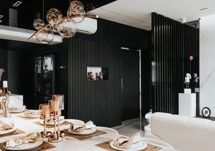
MO: In any hotel, the lobby is what gives you the first impression of the place. So, we wanted to emulate this feeling by creating our own ‘luxury hotel lobby’ — which is this foyer right by the main entrance.
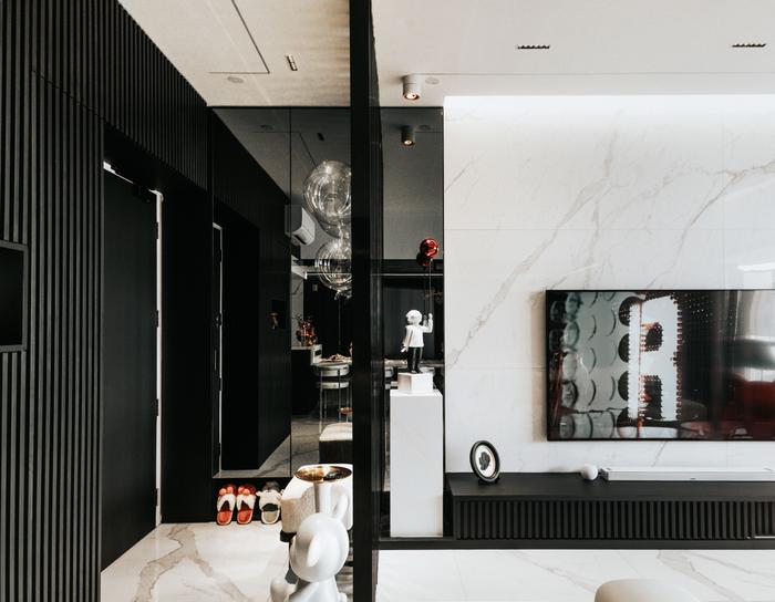
We have seats to put on or take off shoes, a floor-to-ceiling mirror for last-minute outfit checks, and even some storage cabinets with things you may need outside, like umbrellas.
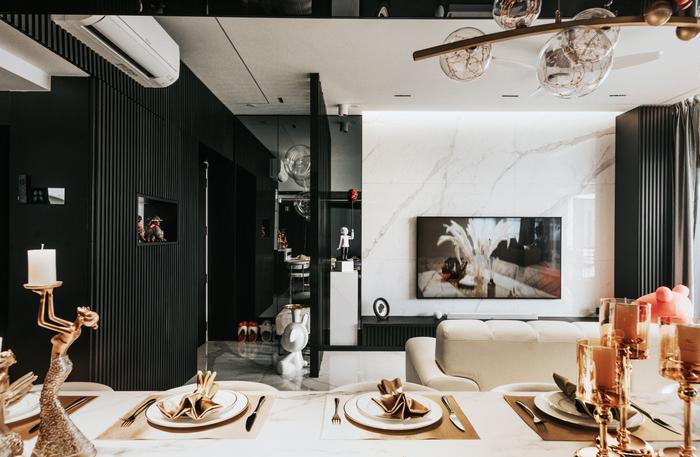
Our living room itself is pretty simple. We chose these large-format 1800 x 900mm tiles for both the floor and the TV feature wall, as we wanted to minimise grout lines and also avoid having too many different tiles cluttering the look.
Also, if you realise, all these tiles have continuous marble veining throughout the communal area. Usually, most tilers use any spare tiles they have to cover the edges, but I said no – I wanted the edges to match as well.
It was definitely more expensive to do so, but I thought it was worth it. To me, if you really want something, you should invest in it, instead of settling for something that may not necessarily be to your liking.
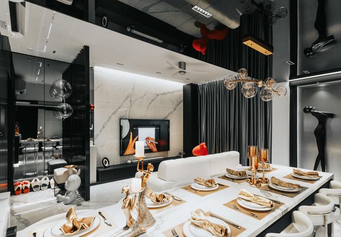
View this project by Earth Interior Design Pte Ltd
As these were big tiles, we ended up ‘wasting’ quite a few just to do this. My workers also made a lot of noise because of it (laughs). But the end result was good, so I definitely don’t regret it.
About the dining area and entertainment room
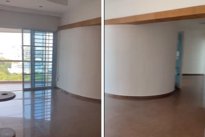
The original curved study room wall in the middle of the communal area
MO: There used to be a curved wall in the middle of the house, but I hacked it to create a more square-ish layout.
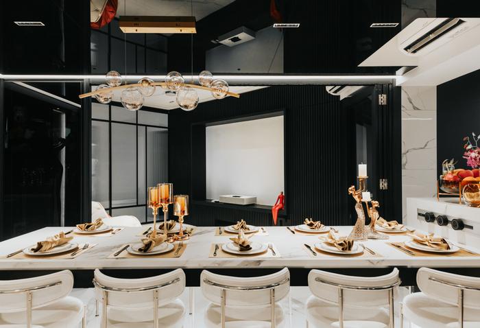
This allowed us to open up the space and include a large 10-seater dining table connected to our kitchen island. We couldn’t fully hack it, though, as there’s a structural beam above. But because we thought it would look out of place, we decided to lower the entire ceiling above the dining table to hide it.
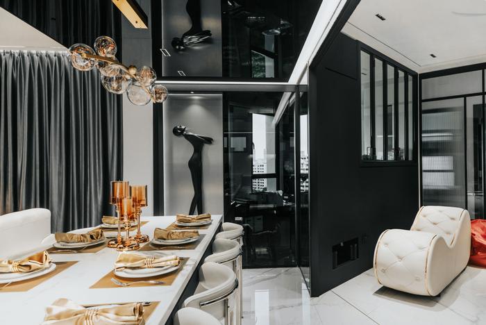
And because we didn’t want this area to feel cramped, we cladded the lowered ceiling with mirrors to visually heighten the space.
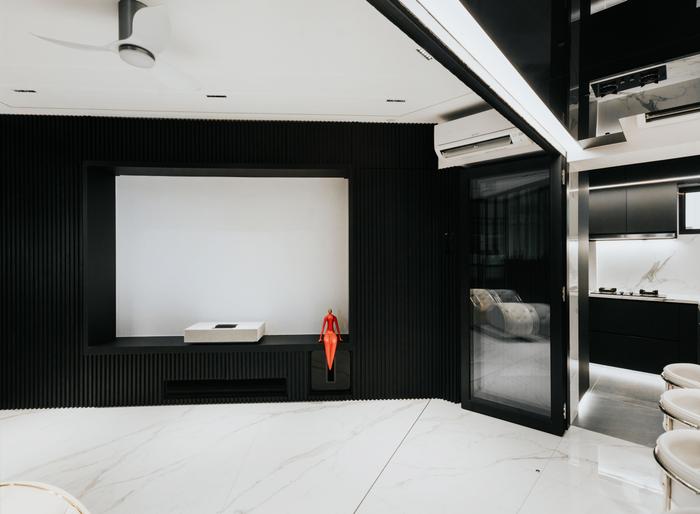
We also have the entertainment room in the middle of the communal area. The reason why it’s situated here is because it allows us to contain the sound within the home. There are no windows for the sound to escape, and because it’s enclosed within the confines of our home, there was no need for us to soundproof the space.
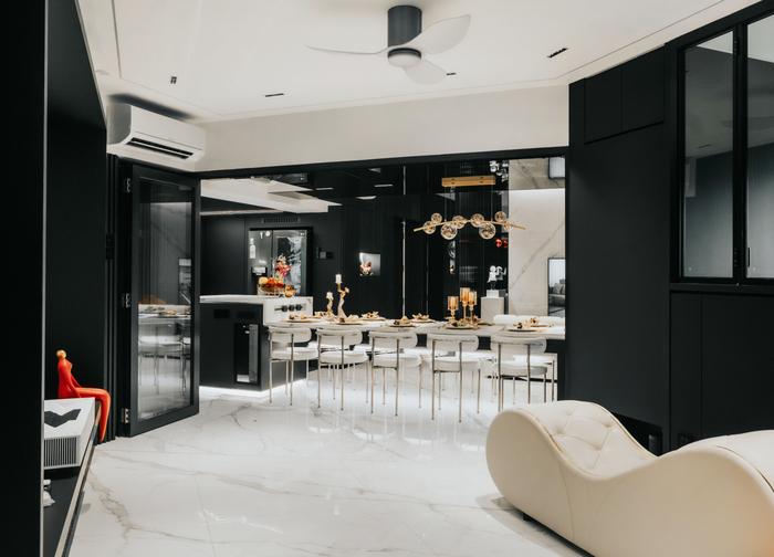
Because it’s enclosed, different people can enjoy the different spaces without being interrupted by one another. During gatherings, the kids usually watch movies together while us adults can sit at the dining table and talk amongst ourselves.
At the same time, we’re still able to keep an eye on them through the foldable glass door. It works well for everybody.
About his daughter’s and guest bedroom
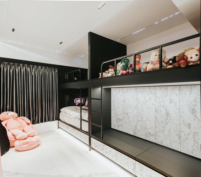
MO: Our daughter also likes to host, like us. She’s at that age where she wants to go out with her friends more often, but because the house has a conducive environment for everyone, they end up just hanging out here instead.
One of her requests during the renovation was to have multiple bunk beds in her room. She often invites her friends over for sleepovers, so we renovated her bedroom in a way that allows her to accommodate all her friends comfortably. It’s not like the usual bedroom with a bed, wardrobe, and study table.
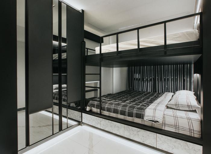
One of the other junior bedrooms was turned into a guest room, as we sometimes have our relatives from Malaysia staying over.
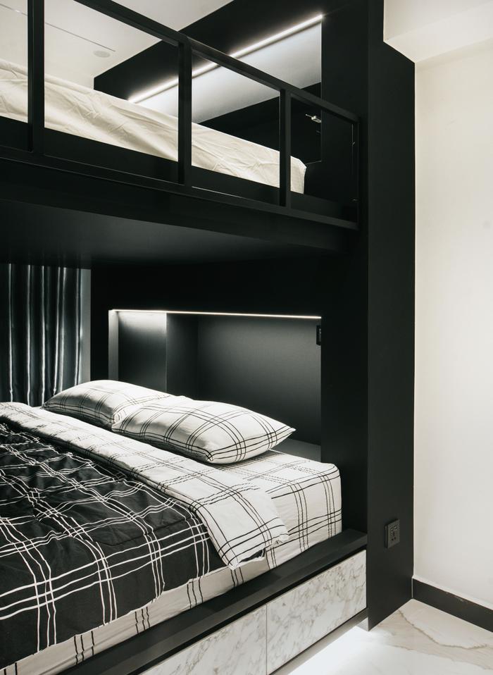
Usually, you’d only see bunk beds with single-sized beds – like the one in my daughter’s room. But as we wanted to create as much bed space as possible, we decided to do a king-sized bunk bed instead. If we put another mattress on the floor, I think this room itself can fit up to 10 people.
About the master bedroom and ensuite
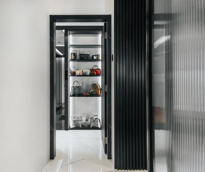
MO: As soon as you enter the master bedroom, you’ll see this sleek, backlit walk-in wardrobe. But when you walk further in, you’ll realise that it’s also a sort-of ‘corridor’ leading into the ensuite.
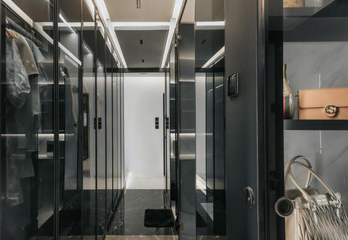
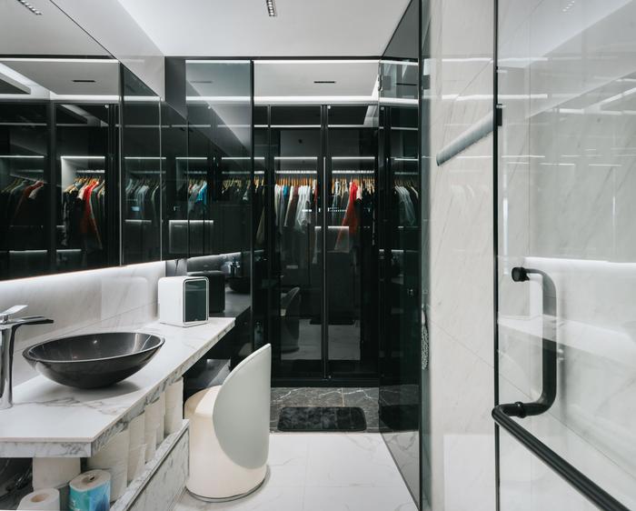
As we wanted a bigger bathroom, we used some of the bedroom space to lengthen it. So, what you get is this long vanity area that has more than enough space for my wife’s skincare and makeup products. We even have the space to include a chair so that she can sit down while getting ready for the day.
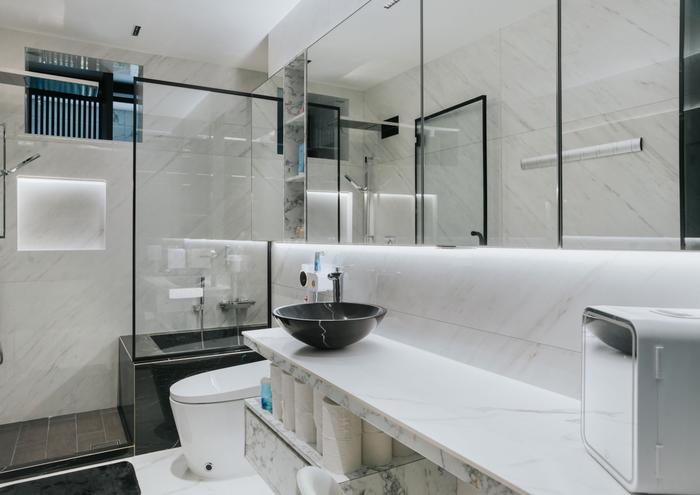
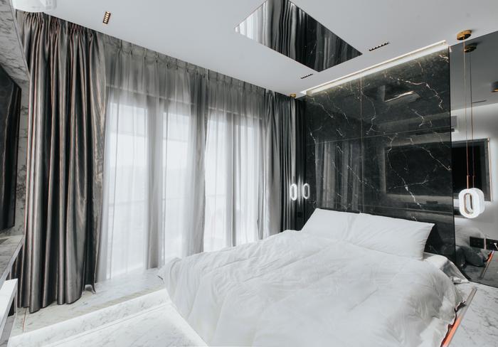
The master bedroom has its own balcony, which is quite rare for HDB flats. So, we installed collapsible doors that allow us to open up the bedroom whenever we want – which is usually when we want to have chill chit-chat sessions with our guests.
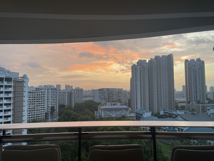
I also personally love sitting here after a long day at work to watch the sunset – it’s very relaxing. Honestly, I think this is my favourite part of the house.
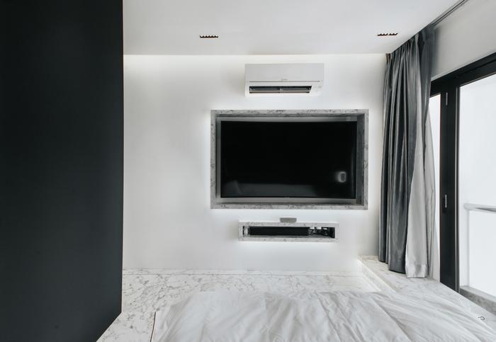
However, the disadvantage of this type of door is that it tends to allow the air-conditioning to seep out. That’s why we had to include two sets of curtains, one of which is a blackout curtain, to contain the cool air, while also helping to block out wind and sound.
To sum up

View this project by Earth Interior Design Pte Ltd
MO: Recently, I managed to host my entire extended family for Chinese New Year. About 20+ people came over, and the large dining area made it very easy for hotpot. I was very happy to see that everyone was comfortable and having fun here.
To us, we’re definitely here to share. We want to be able to share a space because now, houses are so small, and it’s rare to have a home that can accommodate so many people. Being able to do so really makes us feel blessed.
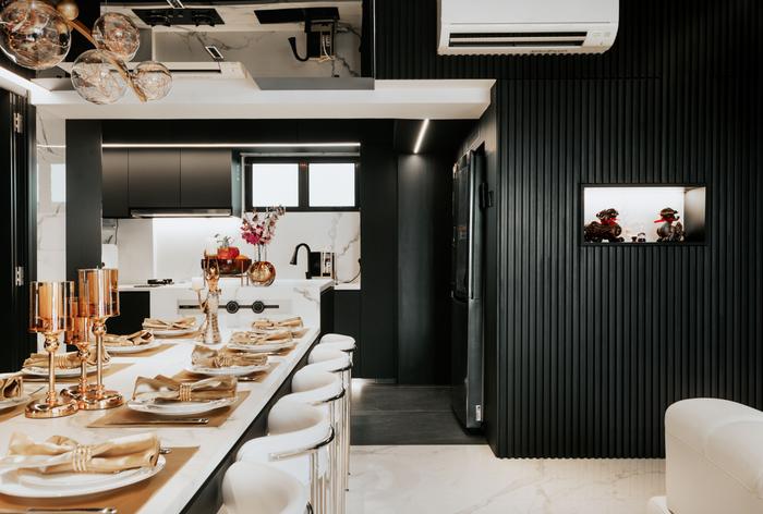
View this project by Earth Interior Design Pte Ltd
At least at home, you can interact with your loved ones without worrying about restrictions like closing times. So, this home lets us spend quality time with all our friends and family — and if they’re happy here, we’re also happy. Overall, I think their happiness is proof that we did a good job.

 Get a budget estimate before meeting IDs