With a home they can now call their own, this couple went all out with colours, tiles, and more!
While renting a home gives you the freedom to live on your own, your expression as an individual is also limited by your landlord’s rules – like being unable to paint walls or hang up artwork. Homeowner Pei Shan and her husband James were unfortunately all too familiar with it.
“Previously, James and I were living in London, where we were renting our home,” she explains. ”As renters, you aren’t allowed to paint the walls or do anything crazy – so when we secured this 2-bedroom condo in Tampines, we took this opportunity to express ourselves.”
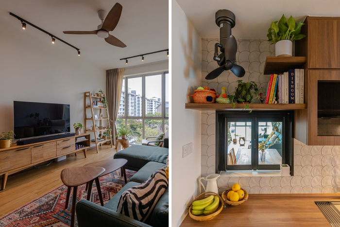
View this project by Swiss Interior Design
Blessed with a newfound flexibility to design the home the way they wanted, Pei Shan and James went all out, taking in elements of British interior design to create a home that their friend described as “a marvel of colour and style coordination.”
Keep reading to see a full breakdown of their home, which was tastefully done by Candice from Swiss Interior Design.
About the homeowners and their home
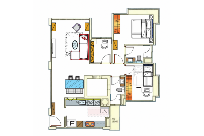
The current floorplan of Pei Shan and James's home
Pei Shan (PS): We bought this home around the end of 2021, and got the keys in January 2022.
One thing we weren’t too keen on was the modern-luxe look, which a lot of condos had. We preferred something warmer and cosier.
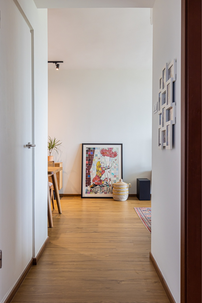
James (J): We also weren’t too keen on the usual minimalist look – it somewhat reminded us of an Airbnb home that doesn’t feel like someone’s put their mark on it. And that’s kind of what we wanted – a home that feels lived in.
PS: I wouldn’t say we’re maximalist people, but we do like having things out on display, and we also like the clash of colours and textures. That’s what you would see in British homes, where they tend to favour colours and clashing elements. So, that’s what we found ourselves inspired by.
About searching for an interior designer
PS: I’m a project manager by trade, so I approached our renovation like how I would for a client briefing (laughs). I actually created a brief and wrote down what each room should look and feel like, our storage requirements, and what we need from that particular space.
While we were planning, I came across an article featuring a home that I really liked, and it just so happened to be done by Swiss Interior. So, I got in touch with them as well as several other IDs – but even from the meet-up stage, Candice (our ID from Swiss Interior) gave us a good feeling.
J: We had good chemistry with her, which I thought was really important as a renovation is a long and intense process.
You’d want to work with someone you can get along with on a personal level, and we got the feeling that Candice was someone we’d be happy to work with for a long period of time, and that she was someone who could be trusted.
About revamping the living room
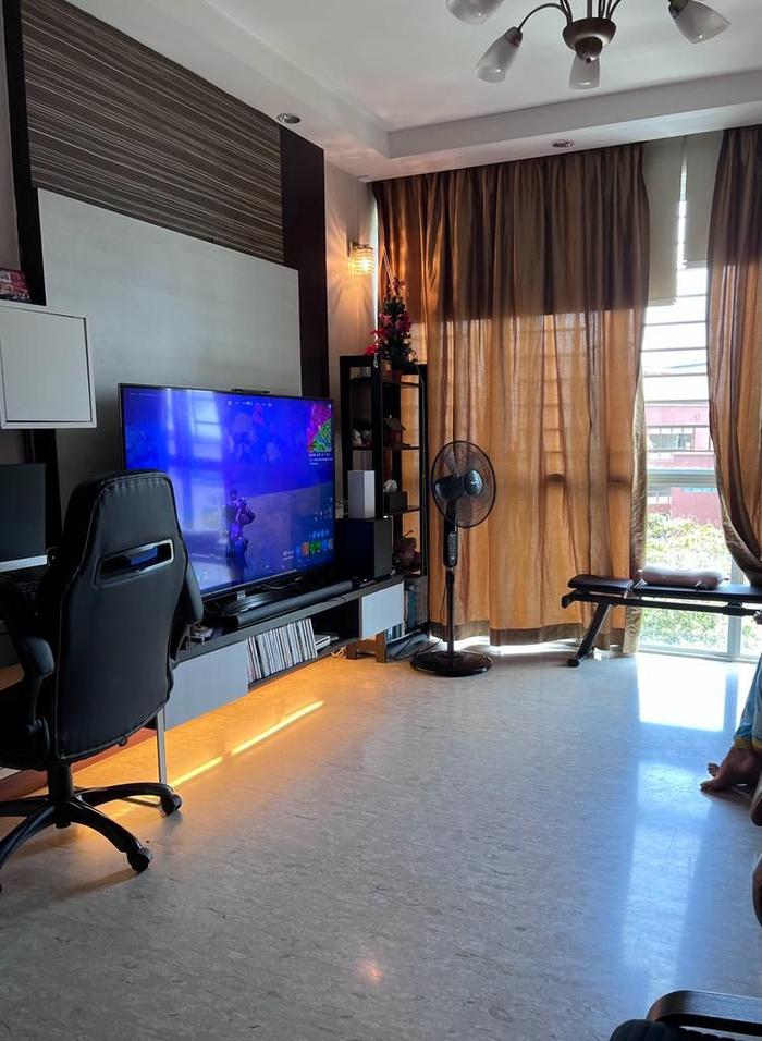
The living room, pre-renovation
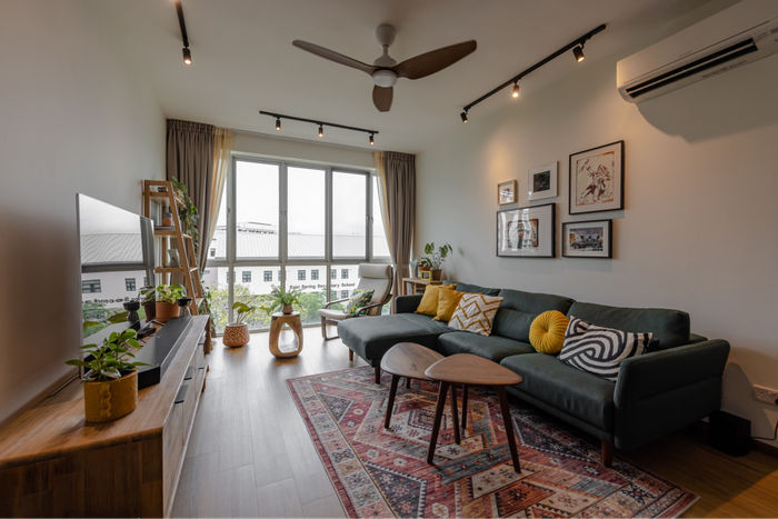
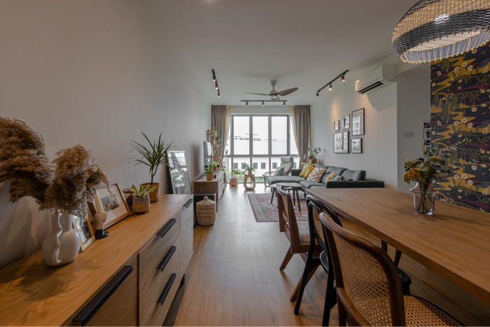
PS: In my brief, I indicated that we wanted the living room to be warm and colourful. We were looking for a combination of warm tones and bright pops of colour – for example, green and mustard yellow, which I thought was a good combination of colours.
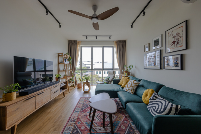
Other than implementing these colours, we didn’t have much work done here. Our main agenda was to remove what was already here, because there were a lot of built-ins, which wasn’t something that we liked as we were more keen on using loose furniture.
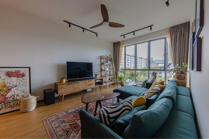
J: Most of our furniture was chosen after seeing them in person. We did try looking online, but it’s hard to gauge how it looks and feels from pictures alone.
That’s why we spent a lot of time looking around various stores and showrooms – if I remember correctly, we did three tours of Tan Boon Liat Building just to find the right pieces.
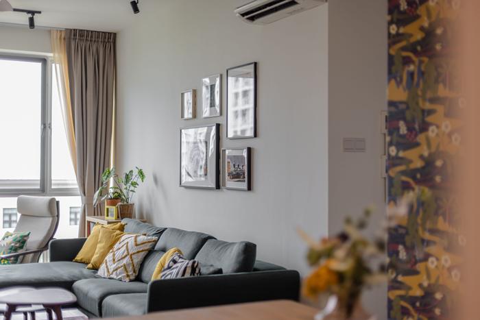
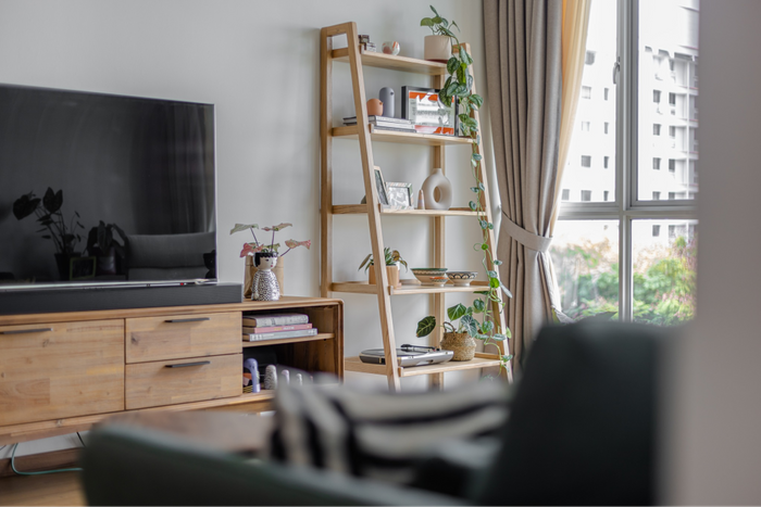
But apart from the furniture, what we really wanted was to display the things we’ve collected from our travels. When we were renting our home in London, it was very hard to hang or display them. So, when we finally got our own place, we were keen to take advantage of this newfound freedom to show off what we had.
About the dining room
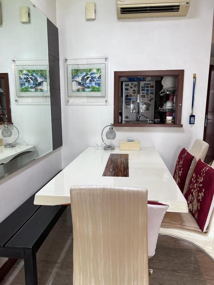
The dining area, pre-renovation
PS: Like the living room, you’ll see the green and yellow colours coming into play with the dining room feature wall, which is covered with a botanical-themed wallpaper.
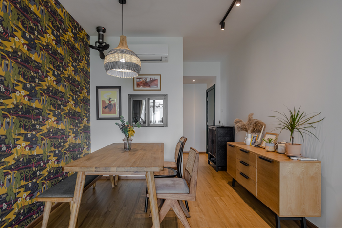
Initially, we were just going to paint the wall a mustard yellow, but we couldn’t help but feel like a solid yellow wall will look too overwhelming. As much as we were going for that clashing, colourful look, we also wanted to keep the look cohesive. Eventually, we decided to go with wallpaper, which is pretty common in British homes anyway.
On making over the kitchen
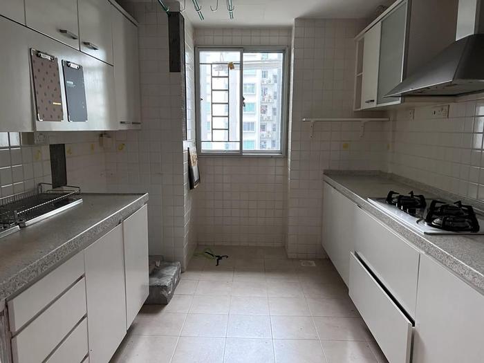
The kitchen, pre-renovation
PS: Both James and I cook a lot, and we often have to do a lot of prep work. So, our main requirement for our kitchen was to have ample counter space to accommodate this.
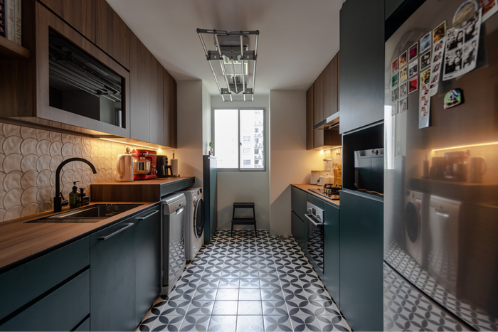
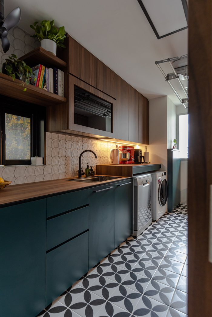
Along with counter space, we also needed lots of storage to keep our things – like our tubs, jars, and appliances. But at the same time, we didn’t want the space to be cramped up with cabinets, so we opted to break up the boxy look with open shelving, which we used to display our cookbooks and plants.
This little window (that looks into the dining area) was actually part of the unit’s original design. We talked about it for a bit, but we eventually decided to keep it as it’s actually pretty cute (laughs). It also makes it easier for us to pass food to our guests, as we don’t have to walk out of the kitchen to do that.
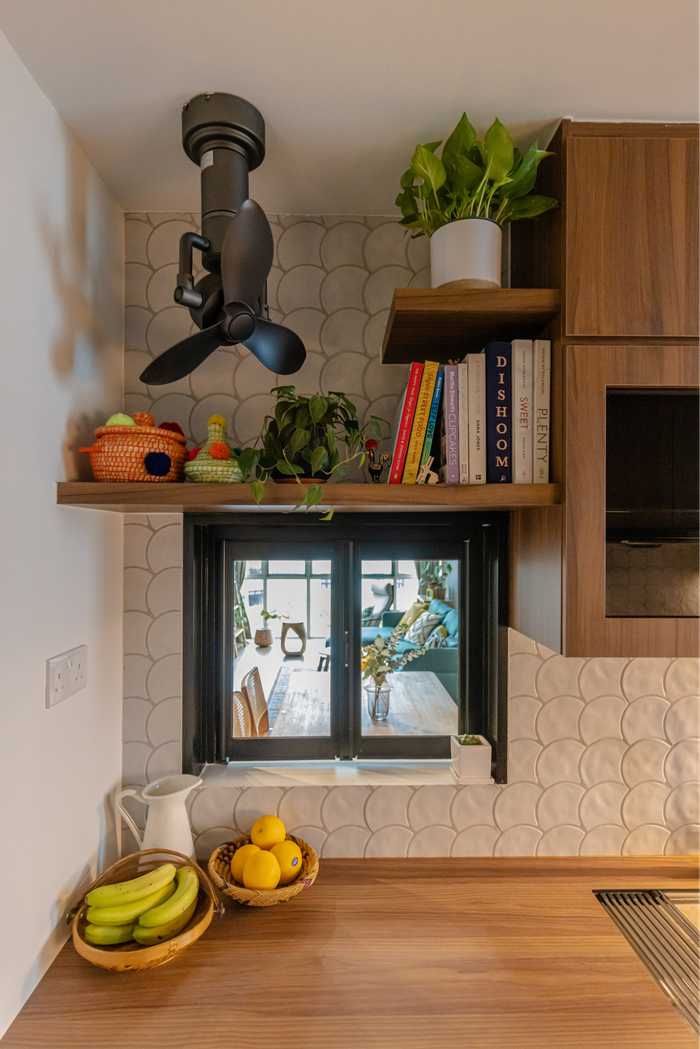
“The window also turned out to be a fantastic place to take photographs, which is great when we want to make sure that all our guests are in the shot,” says James.
Looks-wise, we were looking to play around with different types of tiles. The first ones we selected were the grey fish-scale tiles used in the backsplash, but then it became a challenge to find matching floor tiles that will also not overwhelm the look.
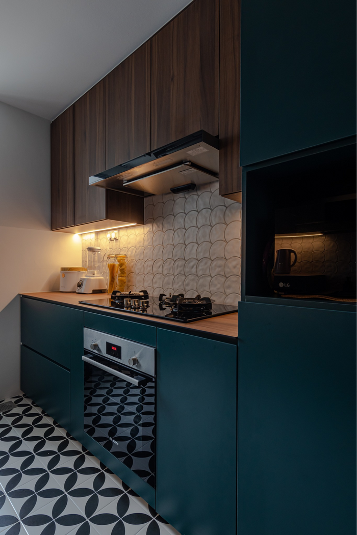
We eventually settled on these black-and-white tiles, as we thought it balanced out the dark green cabinets really nicely. The pattern was also simple, while adding some variety to the overall look.
On renovating the guest and master bathroom
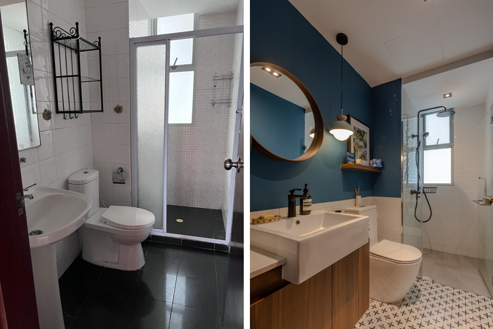
The guest bathroom, pre- (left) and post-renovation (right)
PS: We wanted different looks for each bathroom. For example, we wanted the guest bathroom to be a ‘cooler’ type of colourful, with a deeper shade of blue instead of the greens and yellows we had outside.
J: We also went with half-tiled walls, which is a pretty common thing in British bathrooms. Initially, we were going to tile the whole wall, but since we couldn’t find large-format tiles in the colours we wanted, we decided to paint the top half of the wall instead.
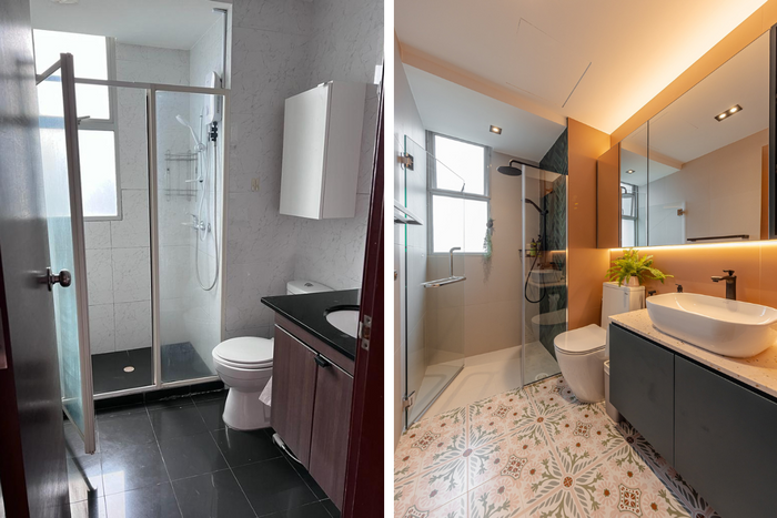
“By the way, the walls actually lean more towards a blush colour,” says James. “I believe the lighting just makes it seem like orange.”
PS: For the master bathroom, we decided to go with a more tropical feel, with the same moss green shades you saw in the communal areas. We also went wild picking out lots of different tiles – we particularly like the green and pink floor tiles, as they have a very vintage feel to them.
About the master bedroom and study
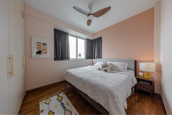
J: Like the living room, we mostly stuck to loose furniture in the master bedroom – mostly because it gave us the option to swap out certain pieces or move them around.
However, we still needed quite a bit of storage in the bedroom, so we opted to have our wardrobe built-in rather than buying it off the shelf to make the most out of the space.
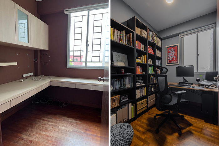
James’s study, pre- (left) and post-renovation (right)
PS: We briefly toyed with the idea of hacking the study and turning it into a walk-in wardrobe, but we didn’t go ahead with it for two reasons: it would give the master bedroom a weird shape, and because frankly, we needed a study (laughs).
Both of us have been working remotely, and as we both take calls quite frequently, we found that we needed a separate space to do our work. James, needs some space to keep his things, so he uses the study while I work in the guest bedroom.
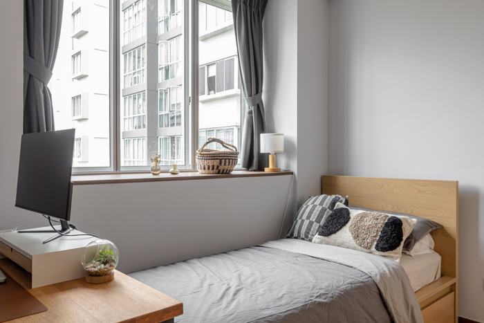
The guest bedroom
To sum up
J: At the very core of the renovation, I wanted our home to reflect our most authentic selves.
I also wanted it to feel like we’ve lived here for a long time. I know that sounds strange as we’ve only lived here for a year, but we wanted the space to feel like it had a history – not temporary or transitory, which is often how it felt when we were renting our home in London.
Overall, I think that the house feels quite different as compared to in pictures. A few friends mentioned that the colourful look wasn’t to their liking, but they were surprised by the warm and welcoming feel our home had when they saw it in person.
PS: One thing I wasn’t able to highlight earlier was how understanding and patient Candice was. Even though we had a lot of things on our plate, she really went out of her way to move things around to free up our time.
And even though we had very specific instructions about the renovation, we knew we could trust her to execute them the way we wanted it, which took away some of the stress. I really appreciated that.
I think she was a big part of the reason why the house turned out as well as it did. We couldn’t be happier, since we finally got the home we’ve always wanted!

 Get a budget estimate before meeting IDs