Featuring a soft, but vibrant palette of pastel colours, this Punggol HDB home belonging to a pair of Chinese expatriates is anything but bland.
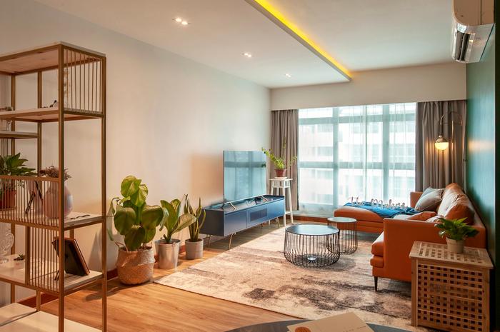
Soft colours – blue, green and pink – are everywhere in this charming 4-room Punggol HDB flat belonging to teacher Li Ping and her husband, Ze Nan, who worked hand-in-hand with The Makers Design Studio to build their lively home that features vibrant hues in every space.
View this project by [The Makers Design Studio](https://qanvast.com/sg/interior-design-singapore/the-makers-design-studio-punggol-place-10706/?utm_source=direct&medium=none&utm_campaign=article-image-caption)
As for what inspired the decor, Li Ping has this to say: “We are both into the retro look and we love colourful spaces that are subtle, but attention-grabbing. It really feels great to be able to fit all these (details) into our first home.” To find out all the nitty-gritty bits, we asked Li Ping about what took place behind the scenes of their renovation journey.
On her home’s look
Li Ping (LP): Well, looks-wise, I would say that our home is certainly not your usual apartment, but it’s quite humble too, especially if you were to compare it to those with bigger renovation budgets. We don’t like rooms that are too bland, so that’s why we tried to have a different colour in each one.

Other than browsing through Qanvast for vintage and Nordic-inspired homes, I also found inspiration from Becky Li’s home, who is a famous Chinese influencer and blogger.
On her must-haves
LP: We didn’t really have any special requirements, only the usual ones. For instance, we just wanted the storage fittings and fixtures in our house to be installed at the right height. Originally, we had plans for a fancier layout, but we stuck to a regular one in the end to keep things simple.
Also, because we aren’t fans of built-ins, most of the furniture we chose were loose pieces, like the living room’s TV console and partition shelf.
On changes made to her home
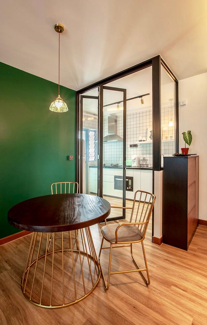
LP: For the living room, one highlight is the dark green accent wall behind the sofa. It’s the perfect shade and I think it works well with the rest of the decor in bringing out a classy, retro-modern look. We also made sure to include some greenery in the space to complement the tans in the space, such as the woody vinyl floor.
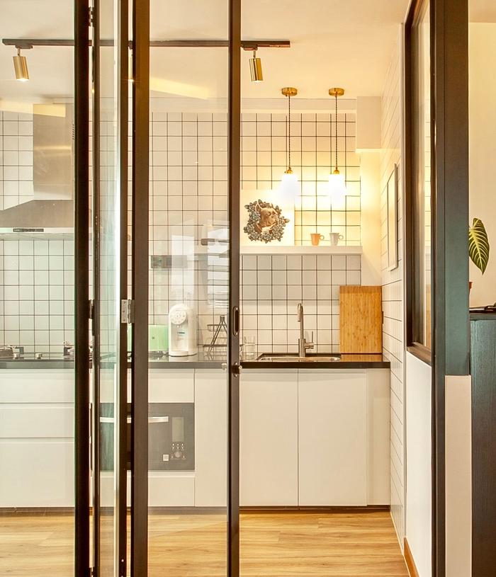
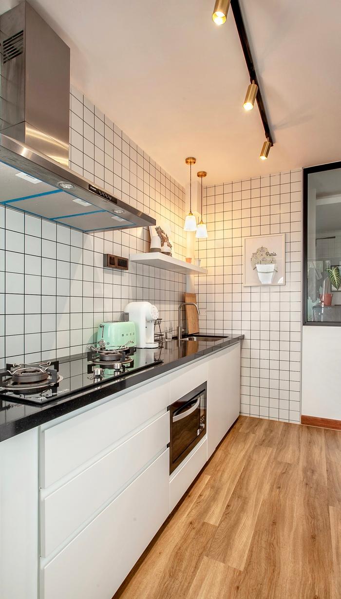
The kitchen walls are mostly tiled because I really like white mosaic, which is simple, but classic. Also, if you were to take into account that there’s an accent colour for each of the rooms, painting the kitchen would make the house look too noisy.
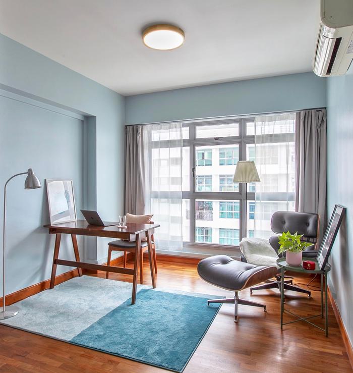
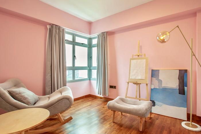
Both the study and the art room are hobby/work areas, and they were designed to be casual, but functional. We painted one blue (the study) and the other pink (art room) to create a his-and-hers look, even though my husband and I use both rooms. We got a recliner for the study, so it can be used as a break area and reading corner as well.
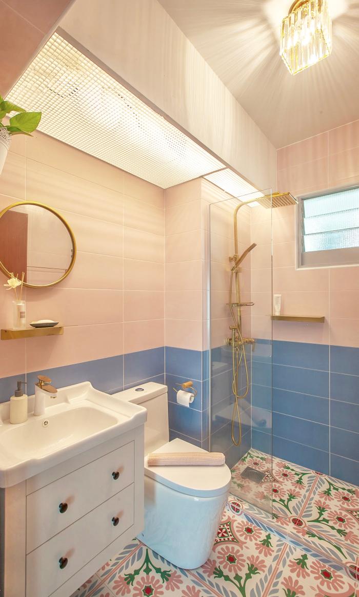
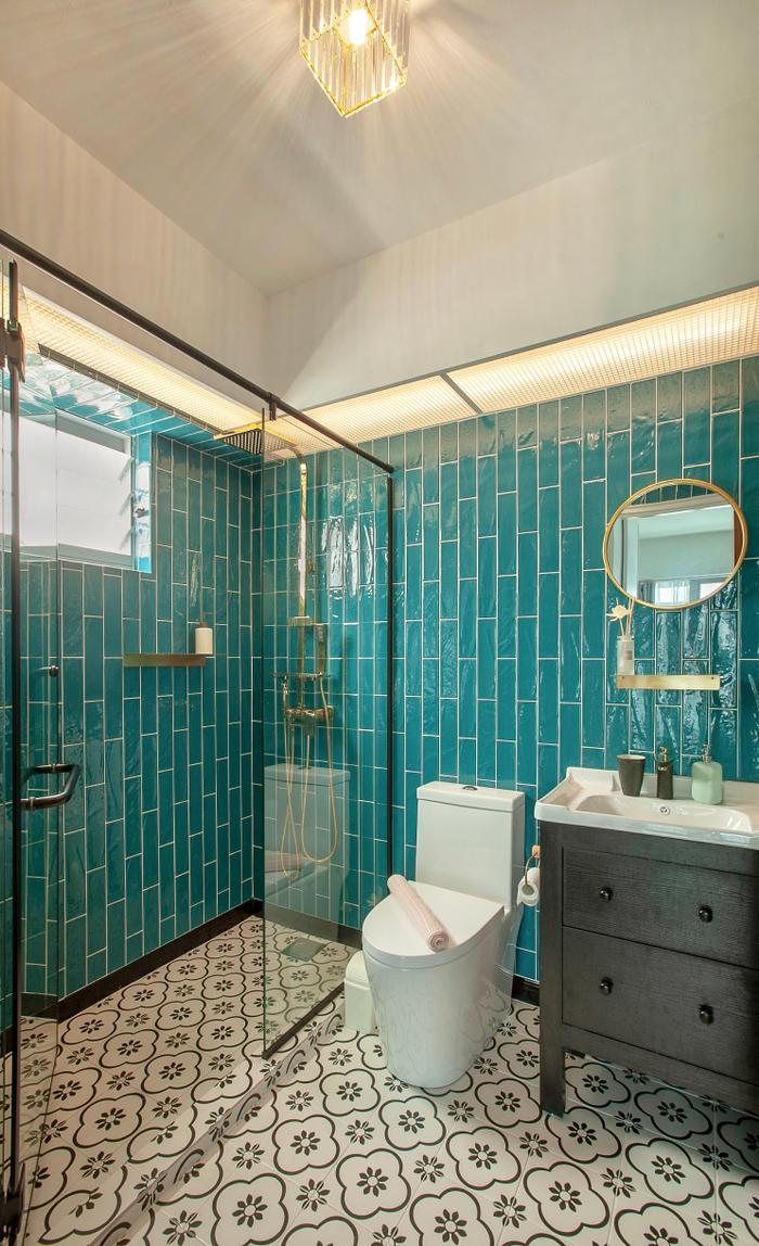
The common (pink) and master (green) bathrooms were decorated in a similar fashion too. I originally planned to have a bathtub in either bathroom, but they were both too small to fit one.
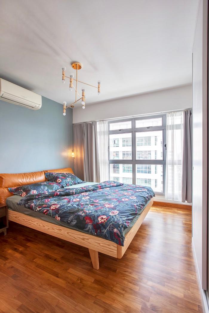
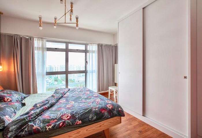
The bedroom’s design is relatively straightforward, and the only request I had was to include a small dresser – it has always been my dream to have one of my own, so I am really happy!
About renovation challenges
LP: There was a hiccup with the cabinets that we bought from IKEA, specifically with the measurements, and IKEA’s contractors had to rush to finish the job before we moved in on Chinese New Year. There was also an issue with a leaky custom showerhead that we had ordered for the bathroom.
That said, the biggest challenge was probably my inability to go on leave to address these issues, and we mostly had to rely on my husband to settle them.
On working with The Makers
LP: I am quite satisfied with The Makers and their work, there were no delays on their part and they were also very receptive to our requests. We didn’t come by to the site often as well, but The Makers would frequently update us by sending us photos. So in the communication aspect, they were pretty good too.
To sum up
LP: We’re just glad the renovation is completed. Not everything is perfect, but that gives us something to improve on, doesn’t it? It’s our first home and being able to accomplish this much really gives us a sense of achievement.
Looking for professional renovation help?
Submit your request for an interior designer via this link here and we can connect you with up to 5 design firms for non-obligatory quotes for free, based on your renovation requirements.

 Get a budget estimate before meeting IDs