Despite its aesthetic, the home’s unbelievably easy to maintain!
Becoming fur parents is not a walk in the park. A certain amount of vigilance comes with pet ownership. Naturally, you’d want to make it so that your home is safer for your four-legged friend.
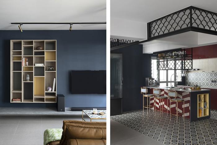
View this project by Versaform
And that was the same for Zhao Meng and her husband. “We wanted the house to be spacious enough for the both of us as well as our dog,” shares the homeowner. With that in mind, they sought out Versaform’s Vincent, who not only brought his technical expertise, but also provided creative proposals, to the table. The result? A 5-room flat in Tampines that’s industrial chic, vintage-oriental, and, most importantly, dog-friendly. Discover how they did it below!
About her household
Zhao Meng (ZM): Hi, I’m Zhao Meng, and I share this space with my husband and our pet dog! I work in HR, while my husband’s a professor in a university.
About the home’s concept
ZM: Like all dogs, ours tends to scratch and chew things up. That’s why pet-proofing the home became a widely discussed topic with our ID, Vincent. We tried, as much as possible, to use materials that are hardier like tiles and cement flooring, which we worked into the vintage-oriental meets industrial design that I preferred.
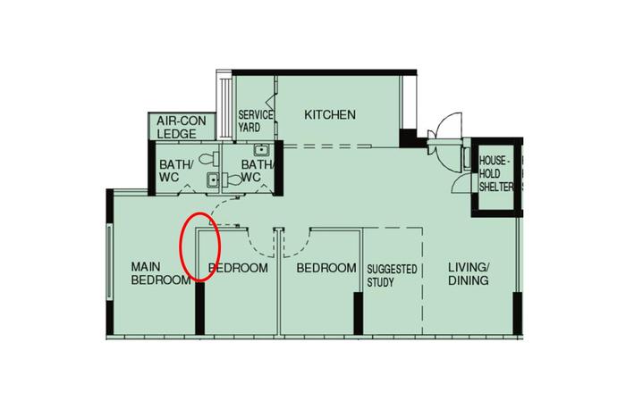
The home’s layout, pre-renovation. Red circle indicates where a wall has been partially torn down.
On changes made to the living room
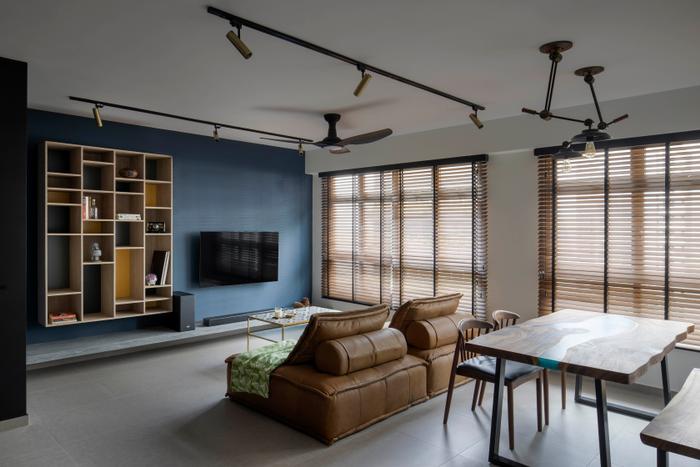
ZM: Neutrals make rooms look bigger, but at the same time we love colours. That was the other challenge that we gave Vincent – he had to create that sense of space while working different shades in.
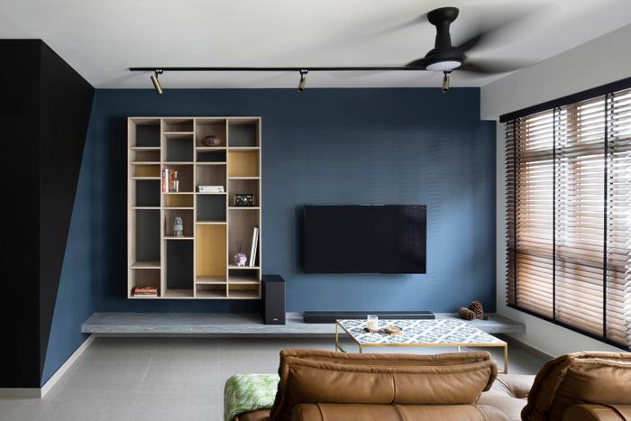
He proposed having a painted feature wall. Because it’s mostly blue, he introduced contrast through the open display unit. If you study it carefully, you’ll realise that there are differences in colours and shades at the back of the shelf. That was the only built-in we needed since we didn’t have a lot to store. The only other addition is a concrete slab for my speakers, which adds an industrial element to the space.
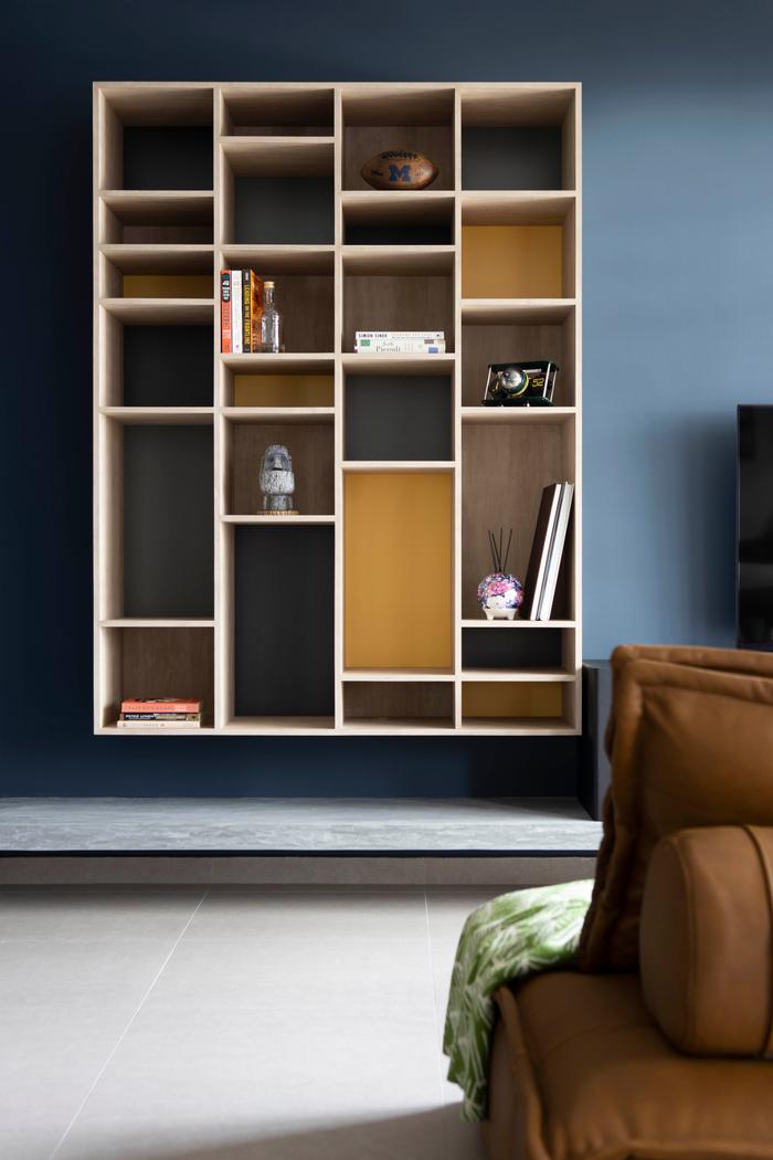
The display unit has asymmetric shelves because they’ve been specially customised to hold keepsakes of different heights.
I knew that my sofa and dining set would be brown, but I didn’t want all my furnishings to be in that one shade. That’s when I stumbled upon a post by Second Charm – it was a photo of another couple who had a table made from tiles that they brought back from Portugal. I thought that was a neat idea and decided to incorporate the Peranakan tiles (found in our kitchen) when we went to get a coffee table custom-made.
On changes made to the kitchen
ZM: The kitchen is where we spent the most time and money on. I’m the chef, while my husband’s the bartender at home, so we wanted it to be spacious enough for all our gadgets.
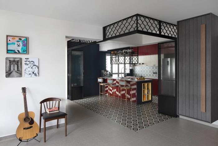
The design of the doors is partially inspired by old-school Chinatown shophouses, specifically the ones with shutters. We used glass panels, but they’re not full panes – the bottom one-third is just mild steel. If it were all glass, you’d see pawprints all over [laughs]. They’re collapsible too, but the only time that we close up the space is during heavy cooking, to keep the fumes contained.
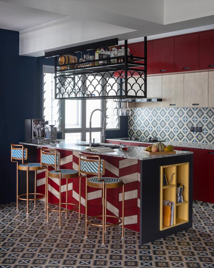
The little shelf they had built in on the side of the island was “added as an afterthought” for more storage space.
I wanted additional counter space for cooking, our coffee machine, and seating space for guests when they come over. Including a kitchen island just accommodated our cooking needs and provided us with an entertainment area for friends.
While we didn’t want something plain, we still had to make sure that the colour combination worked because we have loud floor tiles. Since we started off with solid red cabinets in the kitchen, we reintroduced it through the herringbone pattern on the island. There’s a hint of white to prevent it from being too heavy on the eye.
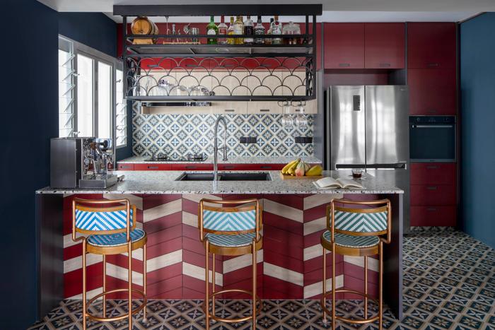
We thought a terrazzo slab would be a good fit and used it for our countertops. Because of this, they’re of a customised height. We went back to Second Charm and got bar stools adjusted to fit.
On changes made to the master bedroom
ZM: Despite it being a 5-room flat, the individual rooms themselves still felt small. That’s why we decided to rework the layout a little. First, we hacked the wall between the master and the adjoining room. We then had that area outfitted with glass windows and a door to retain that sense of spaciousness.
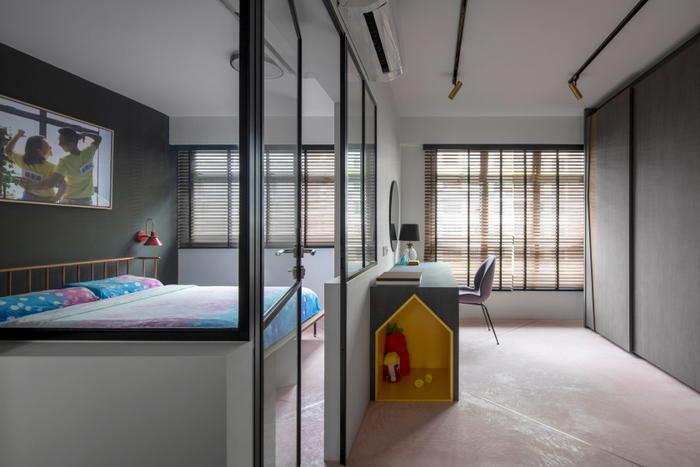
Vincent created a small doghouse within the vanity. “Unfortunately, our dog doesn’t use it much,” shares Zhao Meng.
Also, our dog sleeps with us. When it has to get out to pee, it scratches on the door. If it were anything but glass, it’d be scratched up way too easily and be hard to clean up – with glass, I can just wipe it down when it gets too dirty.
Vincent also advised us to switch up our bed placement because it won’t be a place where we spend much time in. That’s how the junior master became our bedroom, and then converted the original master and turned it into a walk-in wardrobe.
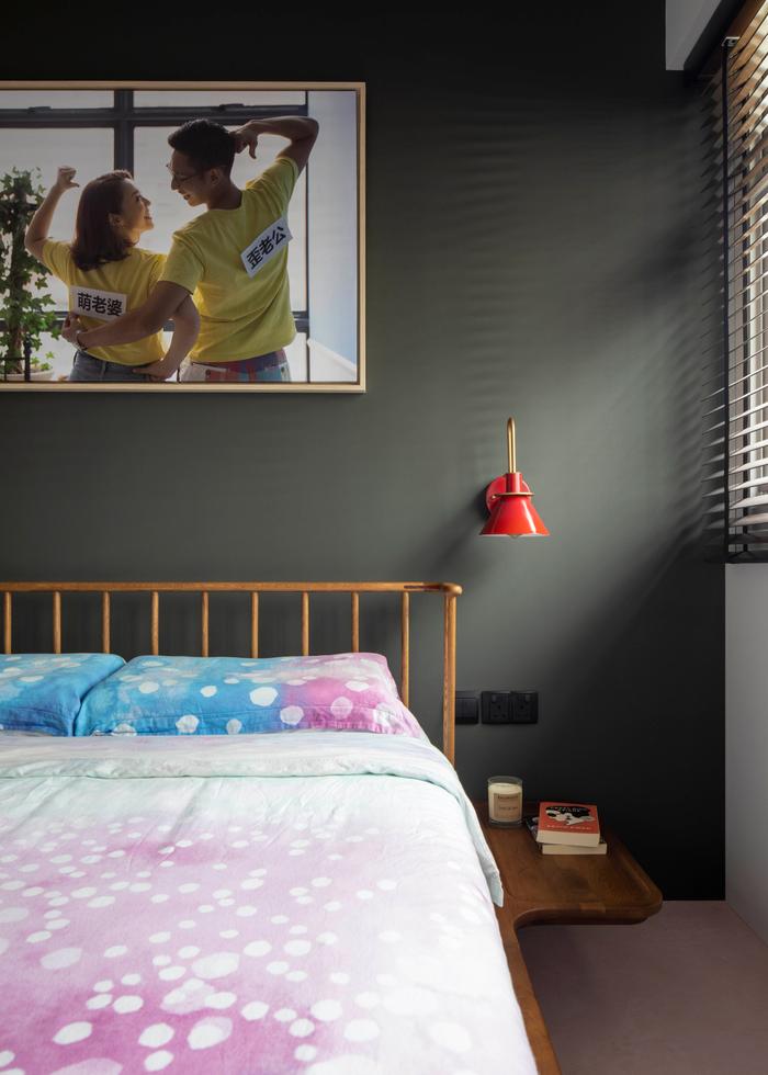
The bedframe is a special find from Journey East. “The good thing about it is that it comes with side tables attached,” shares Zhao Meng. “I didn’t have to go on another shopping trip to find tables that matched.”
And it made sense “flow-wise” too – I always wake up later than my husband. When he wants to get ready, he makes his way out and shuts the door behind him, without disturbing my rest [laughs].
Though we’ve stuck with paint cement flooring in both these spaces, the wardrobe area also features brass stripes. It adds touch of elegance, and clearly demarcates the rooms.
On changes made to the bathroom
ZM: As we were tile shopping at Hafary, we came across Italian tiles that reminded us of a rainforest – there were birds and florals on it, but it was really big. Vincent said that it’d look better if we were to use it on a larger surface, and not just as an accent wall. So, we looked around to look for alternatives that could replicate the effect, but were smaller in size, and got these hexagonal ones instead!
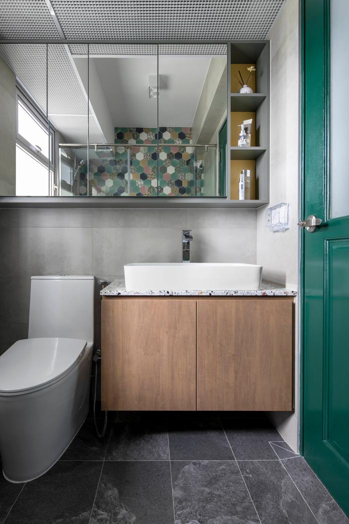
I drop a lot of hair, and dislike seeing it on white tiles, which is why we’ve chosen a darker option to use on the floor. It’s anti-slip too!
On working with Versaform
ZM: I was looking through the different ID profiles on Qanvast when I found Versaform. I know that they’re a small firm, but their designs really stood out for us. And the reviews, though few, seem pretty solid as well, with many of them speaking highly of Vincent. It just so happens that he was the ID who contacted us [laughs].
In total, we reached out to three firms. But working with Versaform seemed to be the most reassuring in any case: My husband has an engineering background, and Vincent was able to go toe to toe with him on the more technical aspects of the renovation. In fact, the first meeting with them lasted for a few hours, and we talked about a lot of ideas – I could tell that his brain was spinning, thinking about the possibilities, and that energised us as well. It felt like he’d do his best.
And then he came back with creative proposals – one of which was for the kitchen, he thought that’d make or break our relationship actually. When he first showed us the 3D design, he saved it for last because it was the boldest by far. He tried to prep us mentally for it, told us he had a Plan B in case it was really out of our comfort zones, which I really appreciated [laughs].
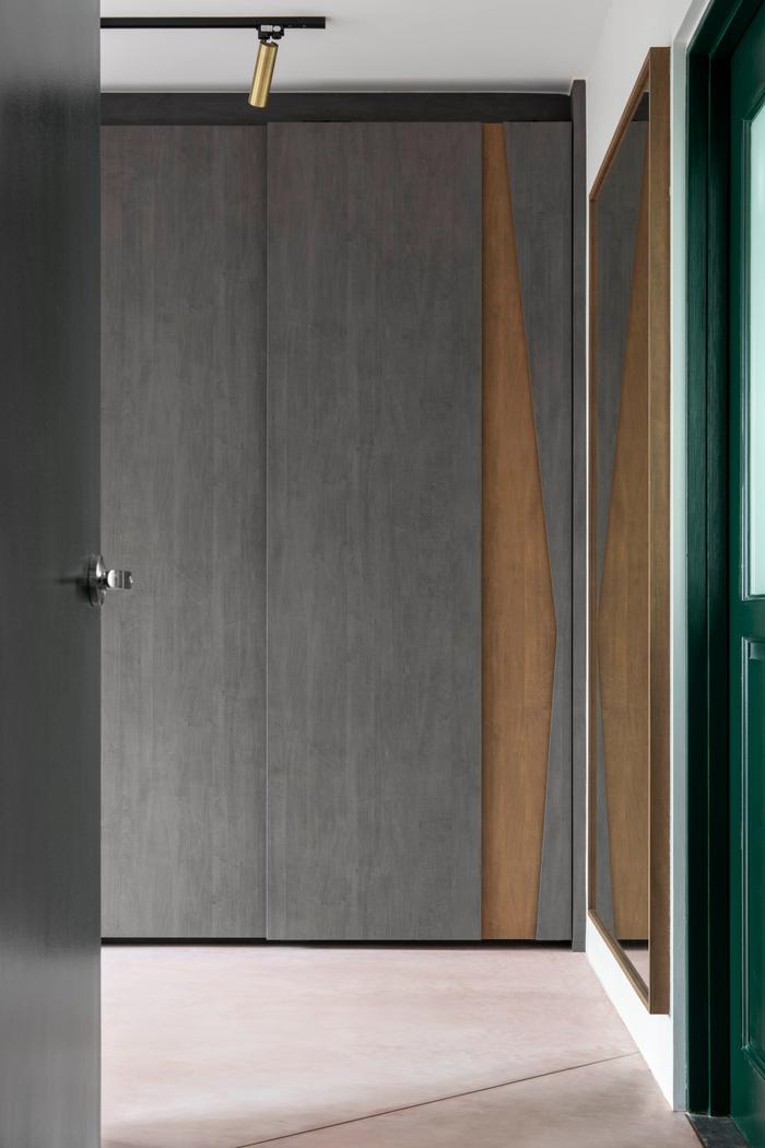
Because the wardrobe is largely grey, they added a hint of colour with the cutout.
If he rejected any of our ideas, he doesn’t let the conversation die there either – he’d refine it for us so that it’s feasible. We had one that incorporated ventilation blocks in the kitchen, but he said that it’d be too heavy. Instead, he fashioned the fish-scale effect with mild-steel, achieving the same industrial look we were going for.
It felt like we were very involved in the fun side of things, such as designing and shopping. On the flip side, the not-so-fun aspects were personally handled by Vincent, so we didn’t have to worry about inspection works and the following through.
While homeowners might have a lot of ideas for their home, I think we need to consider things from a functional, and also cost, standpoint. Overall, Vincent was a good professional who gave us some great insights into the whole process.
Looking to pet-proof your home?
Simply tell us your renovation requirements and we can get you personalised renovation quotes from five local interior design firms for free!
Also, when you engage an interior firm through our free recommendation service, you’ll enjoy attractive perks, such as the Qanvast Guarantee – a free initiative that safeguards up to $50,000 of your renovation deposits.
Yay, we're on Telegram! Follow us for the latest reno updates. 🙌

 Get a budget estimate before meeting IDs