White, black and tans. These are the colours commonly found in homes but lately, there’s been a shift in accepting bolder hues (not your typical muted pastels) for interiors – think zesty oranges, lush greens, moody blues and jewel tones. In turn, it’s given rise to many an iconic and IG-worthy abode.
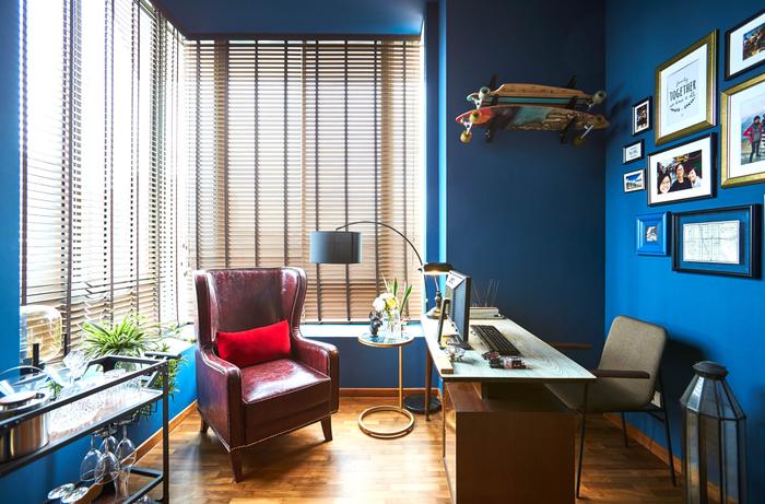
View this project by Bowerman
That said, just because colours are popular doesn’t mean it’s easy to work with. Building a design arounds vibrant shades requires an eye for detail, which led us to speak with three different interior designers to find out how they work around the trend:
Rachel from The Scientist
What are the trickiest colours to work with? And why?
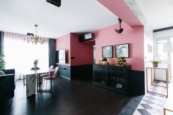
From a designer’s perspective, the “trickiest” colours to work with have to be bold, darker tones (like strong red, deep blue, rich green and etc.) – they make spaces look small and hotter.
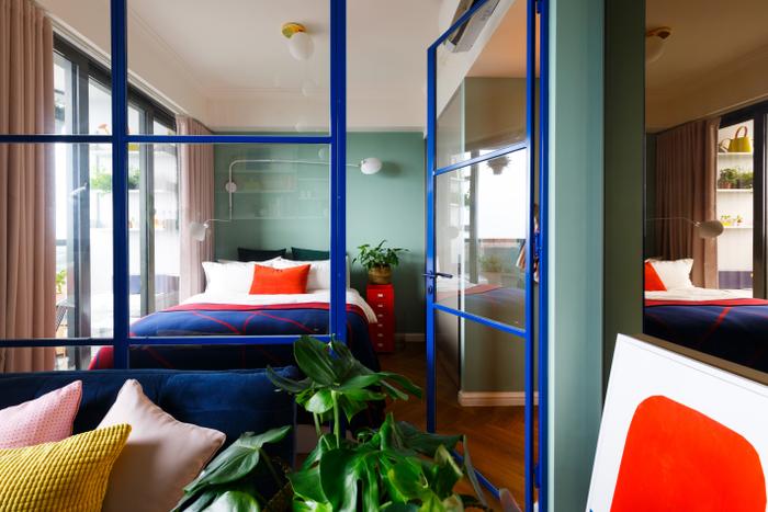
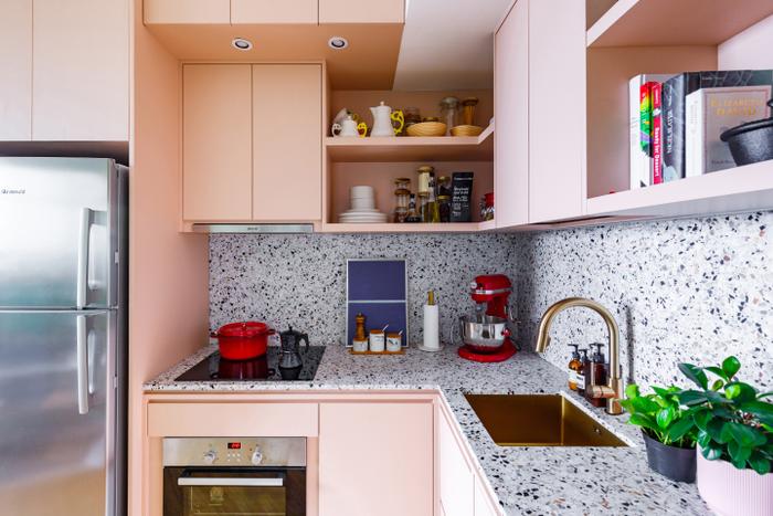
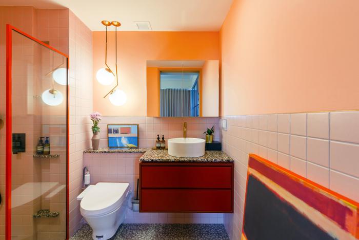
View this project by The Scientist
How would you go about integrating tricky hues?
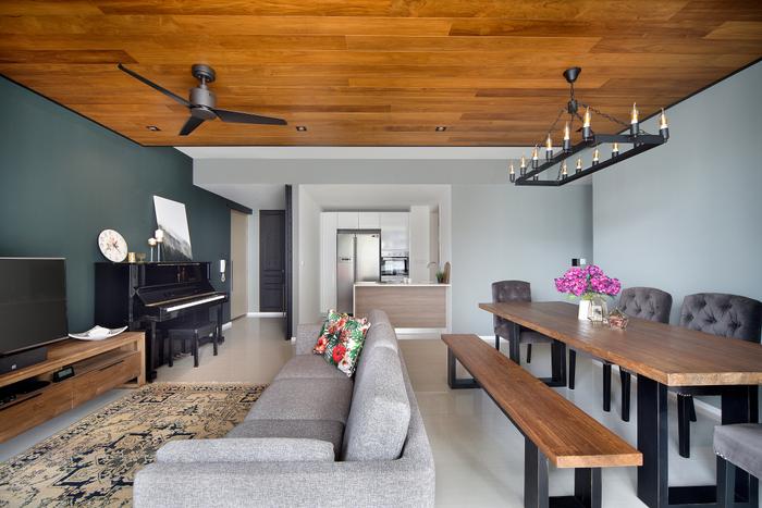
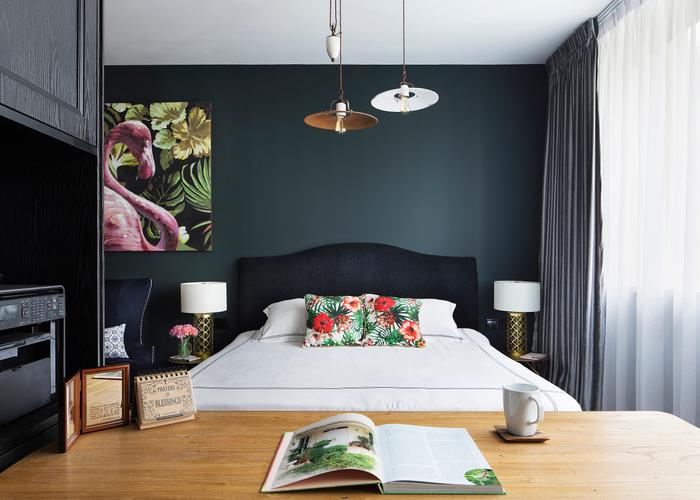
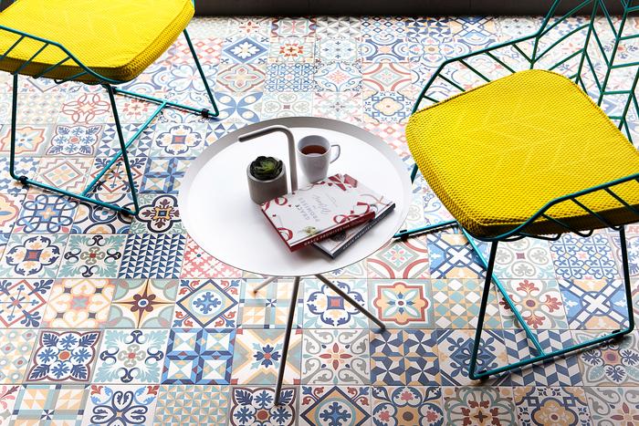
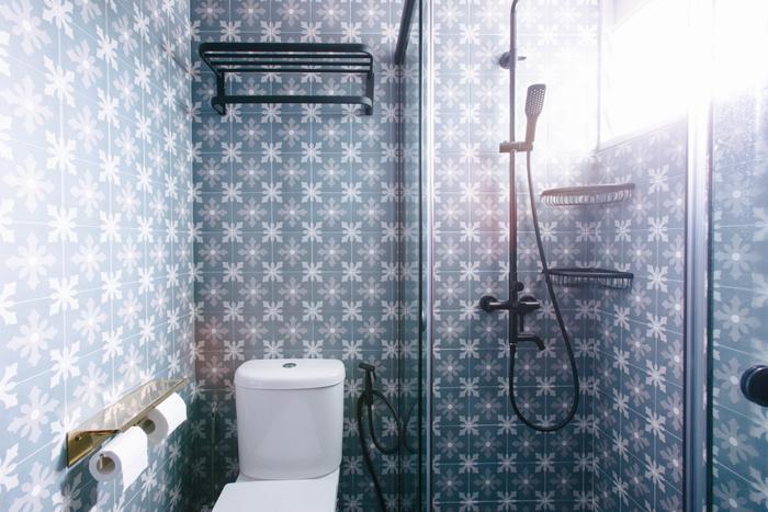
These colours have both its advantages and disadvantages. Majority of bold or darker tones achieves classic timeless look and imbues cosiness (great for homes in colder climates) but also shrinks a space down. Therefore, it’s important to match them with neutral or monochromes to prevent it from feeling too claustrophobic, for a more ‘balanced’ look.
View this project by The Scientist
What should homeowners consider (e.g. direction of the unit, orientation etc) when it comes to using certain colours?
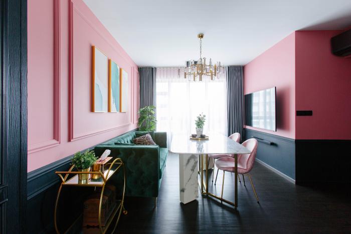
Balance and proportion are some of the main aspects a designer should take into account when it comes to proposing colours, since the effect and outlook of a shade may differ from day to night.
View this project by The Scientist
Marcus from Jubilee Interior
From a designer’s perspective, what would you say are the trickiest colours to work with?
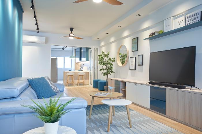
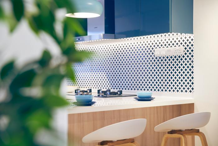
It isn’t really complex if we’re talking about décor – using colourful accessories helps bring out a home’s character. However, it’s a completely different matter when it comes to choosing wall colours. Red is probably one of the trickiest since it’s hard to complement.
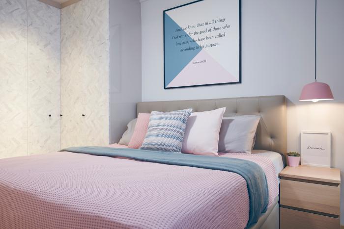
View this project by Jubilee Interior
How would you advise homeowners who are looking to use these hues in their abode?
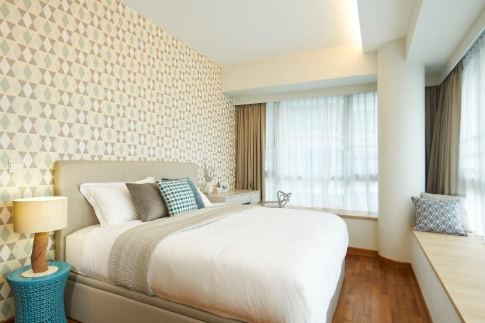
Dark colours aren’t the easiest to cover up, even if you try to repaint. That’s why they should always paint a small area to make a feature wall first, then accent the home with decorative items or furnishings in the same shade.
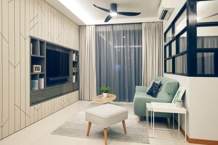
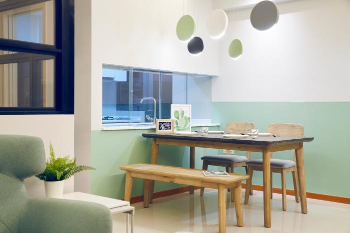
View this project by Jubilee Interior
What about people who are still trying to decide on a colour palette?
Try not to go for trends. It may look great now, but fads have a short lifespan. I think it’s best for homeowners to constantly ask themselves if the colours they chose are reflective of their personality. I always advise my clients to choose a hue that best suits their personality as it should still spark joy through the years.
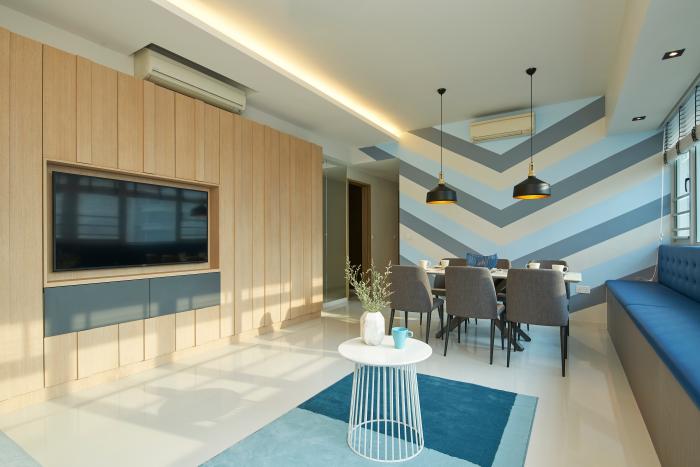
View this project by Jubilee Interior
Chris from Bowerman
From a designer’s perspective, what would you say are the trickiest colours to work with?
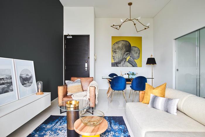
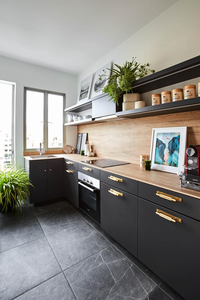
Off the top of my head, purple, green, brown and white. Depending on the shade that you choose, the first two hues can be slightly dated, which make your home feel less appealing. Likewise, there are a wide variety of browns, some of which are less flattering for interiors because of how ‘muddy’ they can come across.
While white is universal and seems like the perfect backdrop, there’s a chance it could wash-out spaces or make your home look plain and sterile when it’s used liberally.

View this project by Bowerman
Any advice on incorporating bold colours at home?
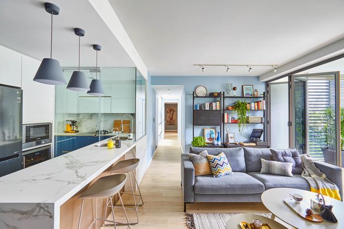
Start off small. Instead of painted feature walls, try introducing them through a variety of mediums such as soft furnishings and furniture. This way, you can break it up and stop it from becoming too overwhelming. You could also use colour-blocking – outstanding shades can be toned down with neutrals for contrast.
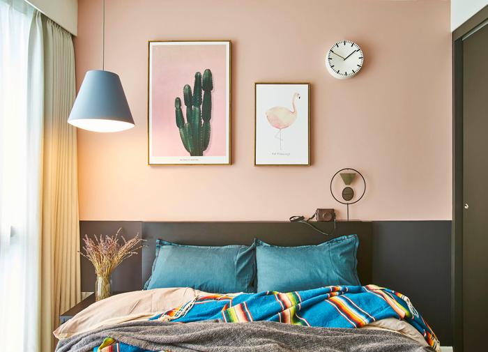
View this project by Bowerman
In your opinion, are there any colours that are unsuitable for certain areas in the home?
If possible, try to avoid using red in the kitchen – it’s already a very hot space, there’s no real need to make it feel even ‘hotter’ with such a warm shade.
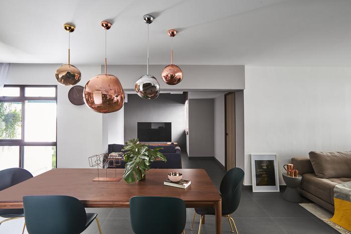
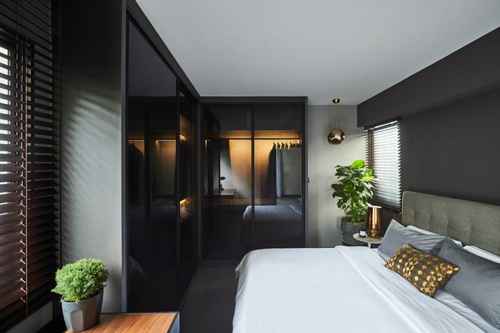
View this project by Bowerman
Need help in creating a home with bold colours?
Talk to our professionals. Simply fill up the form below and we'll shortlist 5 interior designers with a creative flair for you!

 Get a budget estimate before meeting IDs