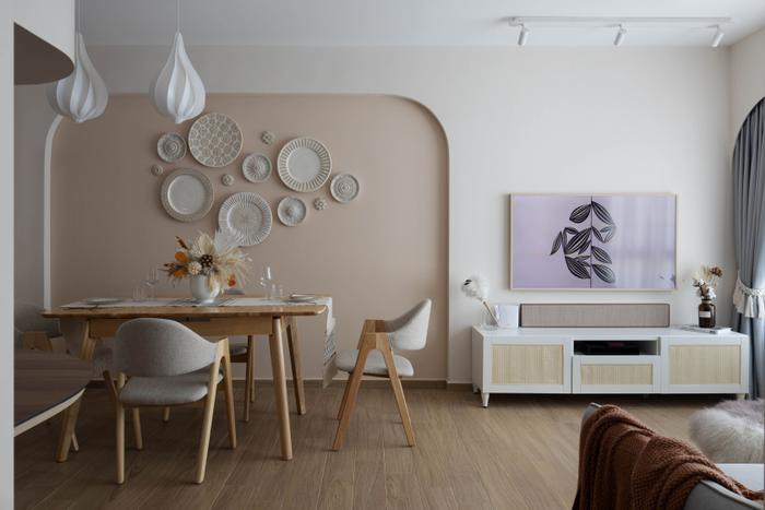
Mixing and matching.
We’ve heard about white-and-wood, dark monochrome, and beige homes – and while these are tried and tested, you’re probably looking elsewhere if you’re keen on making your home stand out with various pops of colour.

Well, look no further, because these colour combination ideas are bound to give you a home that’s both chic and stylish:


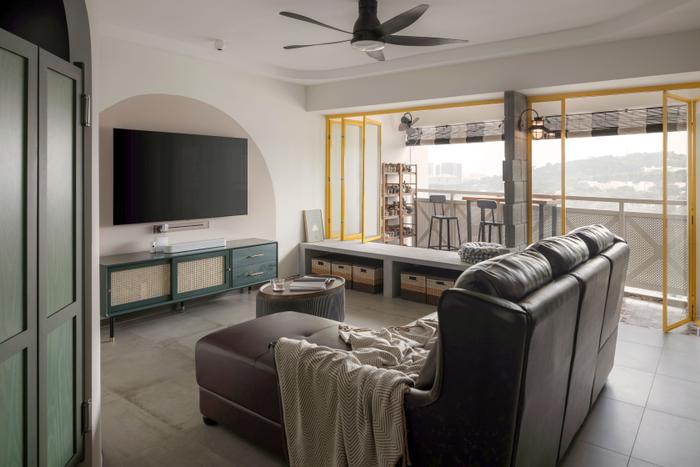
1. Green, white, and brown

View this project by The Local INN.terior 新家室
If this combination works in the natural world (i.e. earth tones), why can’t it work in your home? A timeless yet trendy way to create a soothing, nature-inspired home, this colour palette is versatile enough to work for different interior design styles – from nostalgic, retro homes to contemporary ones.

View this project by Editor Interior
2. Blue and green

While it’s not common in Singapore, it’s proven to work in homes overseas! | Source: Decorpot
Bringing blue and green into your home is an easy way to evoke calmness and relaxation – likely because these colours are reminiscent of the sea and forest.
They’re perfect for bedrooms, living rooms, or just about anywhere you see yourself unwinding – creating a sanctuary that feels soothing, grounded, and close to nature.
 Find IDs
3. Blue and white

View this project by Anhans Interior Design
Beyond breezy beach houses, blue and white shine in minimalist, modern, or resort-inspired interiors as well. The white keeps the interior bright and airy, while the blue introduces a level of visual depth that’s striking enough without being overwhelming.

View this project by Starry Homestead
Together, they create a crisp, timeless palette that feels fresh and elegant.
4. Green and yellow
View this project by Authors • Interior & Styling
You may be surprised with this colour combination, but according to colour theory, they’re analogous colours (that is, they sit next to each other on the colour wheel). And as they share a common base (yellow), they tend to look harmonious when put together.

View this project by Fifth Avenue Interior
In that same vein, green grounds yellow’s brightness, while yellow uplifts green and prevents it from looking overly muted. The result? A lively, balanced look that instantly brightens up the space.

View this project by Free Space Intent
5. Blue and yellow

View this project by Third Avenue Studio
Blue and yellow is yet another unlikely colour pair, but as they actually sit opposite each other on the colour wheel, they’re actually a complementary duo that create a striking contrast when used together.
When used in interior design, they create a dynamic, balanced space that feels both lively and unique.
6. Orange and yellow

View this project by Ascend Design
Want a home that feels vibrant and cheerful? Perhaps an orange and yellow interior is the colour palette for you.
As seen in this home, they radiate positivity and warmth when put together. If you’re concerned about potentially overwhelming the home, pair this combination with white or neutrals to ground the look.
7. Pink and green

View this project by Le Interior Affairs
Giving off playful, chic vibes, pink and green is yet another unconventional pair that work surprisingly well together.
For those who prefer subtler shades, muted tones like blush and sage (like the home above) create a softer, yet still fresh look. But for the ones who favour a bolder look, hot pink and emerald green is one high-contrast pair that feels both energetic and stylish.

Source: Edward George via Pinterest
8. Pink and brown

View this project by The Interior Lab
Pink and brown together are like strawberries and chocolate – indulgent, warm, and timeless. When put together, the pink adds a soft layer of visual contrast, while the brown grounds the overall look. Truly a chic, comforting look!
View this project by A Blue Cube Design (ABCD)
9. Black and white

View this project by Butler Interior
Black and white is as classic as it gets. The stark contrast of these two colours create a striking, dramatic look, while still keeping the look sleek and timeless.

View this project by Butler Interior
This iconic pairing shines in many forms, nothing screams ‘statement’ like black-and-white tiles – a detail that works just as well in modern homes as it does in retro or colonial-inspired ones.
10. Grey and beige

View this project by Comuna Interiors
Grey and beige – or ‘greige’ – is the modern era’s neutral colour palette of choice. Loved by interior designers for its balance of cool sophistication and warmth, this palette exudes style without being over the top.

View this project by Fifth Avenue Interior
When layered with different textures, the overall look goes from simple to rich and luxurious – adding depth and contrast without needing to rely on bright colours.
Haven't found the right colour palette for your home?
It's time to talk to an interior designer. Click on the button below to tell us your renovation requirements and preferences, and we'll get you renovation quotes from local interior design firms – free of charge!

 Get a budget estimate before meeting IDs