The homeowners found inspiration in various industrial-style cafés as well as the Harry Potter fantasy series.
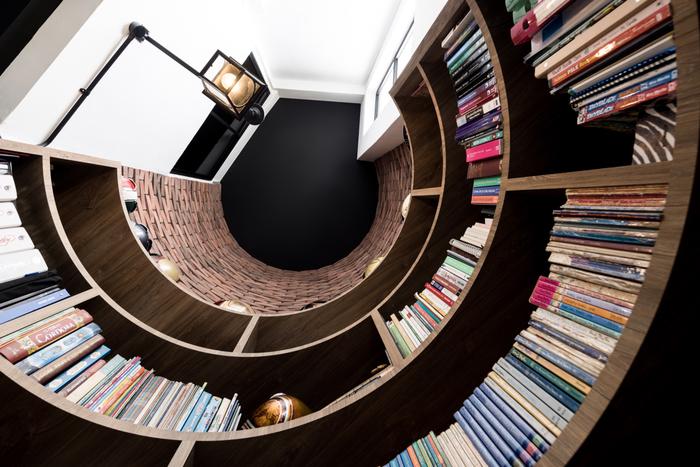
As far as HDB homes go, executive maisonettes are a unique flat type that can only be found on Singapore’s resale housing market. But Kamal and Sri’s (@acupofteaatlas) recently-renovated home at Lorong Ah Soo stands out even amongst these rare properties that are no longer built by HDB – all thanks to a unique curved-nook-turned-home-library.
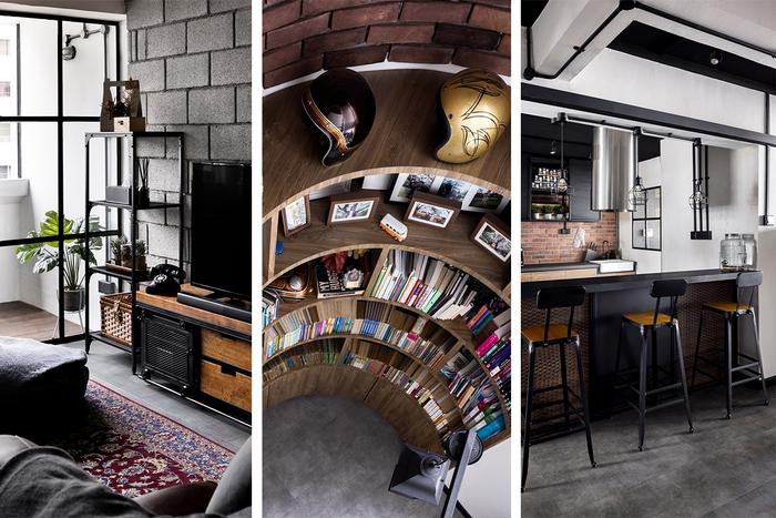
“Most of the maisonettes that we viewed didn’t have this feature, and I think most homeowners when they see a curved corner, they’ll hate it, but we saw it as an opportunity to create something special,” shares Sri. “The first thing we thought we could turn it into was a reading area because my daughters and I read a lot.”
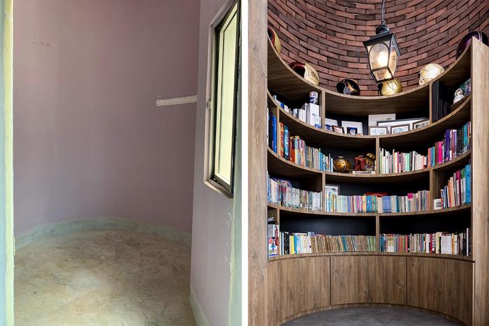
The home library before (left) and after (right) the renovation.
Subsequently, at Sri’s request, an extra-large bookcase was constructed by The Local INN.terior to fit the confines of the 5.5m tall space, turning it into a cosy library that perfectly fits Kamal and Sri’s vision of a “family-centric home that accommodates everyone”.
To find out more about the entire renovation process as well as how each space in Kamal and Sri’s maisonette has changed, we asked them to give us a before-and-after home tour!
About themselves and their home
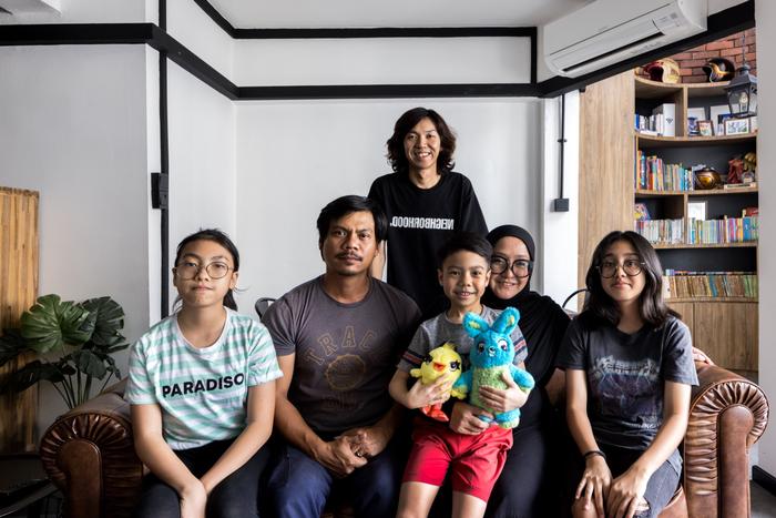
Homeowners Kamal, Sri and their three children with The Local INN.terior designer Vincent Tan.
Sri (S): In total, there are 5 people living in our home. There’s my husband, myself, our two teenage daughters and one very active young boy. My parents also stay over here, but they only come by every two weeks or so; there’s a guest room for them on the ground floor that’s specially built for them.
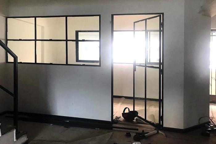
The guest room which was previously the home’s original dining area (photo credit:@acupofteaatlas)
To tell the truth, this maisonette wasn’t the one that we fell in love with at first sight. There’s another unit on the second floor that was left unoccupied because the owners were often overseas; we had expressed our interest in it, but the transaction fell through, so we ended up purchasing this unit in the same block.
WATCH: The Local INN.terior designer Vincent Tan shares more about the maisonette’s renovation.
Before the renovation, some areas of the house were quite closed off, like the living room and the entryway. The kitchen entrance was also fairly tight, and it was barely wide enough for us to fit through. There were also plenty of overhead structures and cornices, and they gave the house an ‘over-renovated’ look.
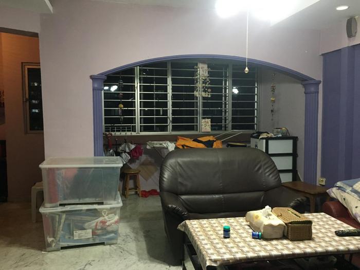
The living room, pre-renovation.
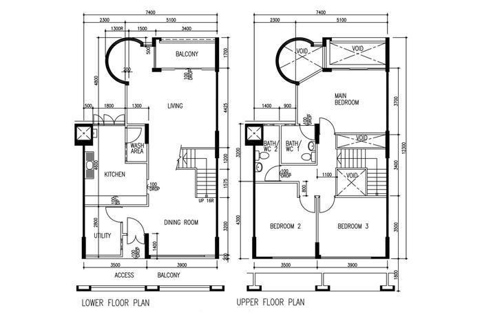
The original floor plan of Kamal and Sri’s home.
Kamal (K): Basically, our goal for this renovation was to open up the house and create space where possible. It ties in with our main objective of upgrading from a 4-room BTO flat to a maisonette, which is to give everyone more space.
Both Sri and I come from big families, so when our relatives came over to our old home, everyone would be cramped into one space. Now, with a home that has two levels, we’re able to keep the communal and personal areas separated.
About the dining area’s makeover
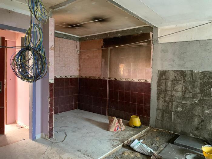
The entryway dining area was previously occupied by a utility room that was demolished.
S: The dining area is the first space that you’ll see on your left when you come into the house, it used to be a storeroom that had a thick wall surrounding the entire area. We had the option of keeping it as a guest room, but the space wouldn’t be comfortable at all because there’s only one small window for ventilation.
So, we had the utility room demolished and turned into our current dining area; this change also makes our dining area look more spacious because it’s no longer separated from the kitchen.
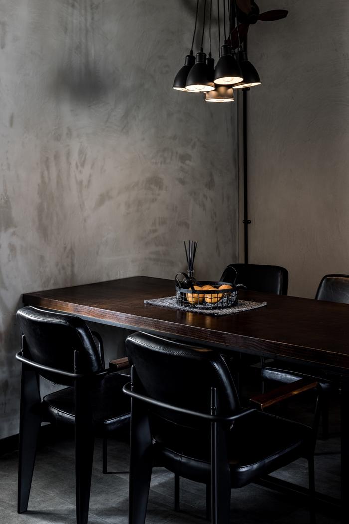
The dining area’s walls were given a cement screed treatment to create an industrial vibe.
On renovating the kitchen
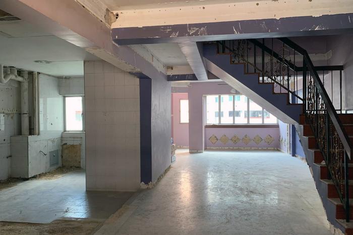
The kitchen and living room, mid-renovation.
K: The [kitchen’s] entrance used to be facing the staircase, and on the inside, there were walls of full-height cabinets, so it was fairly squeezy. All of that is gone, and we want to keep it that way – now there are only a couple of bottom cabinets and aluminium shelves for storage.
Another change we made was to separate the utility yard from the cooking area, just like in new BTO flats; we wanted a half-height partition with black-framed windows because it would hide our washing machine, but still let natural light enter the kitchen.
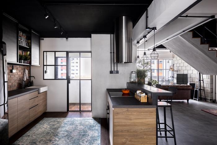
S: Also, we had initially wanted to use green subway tiles for the kitchen’s backsplash and in other parts of the house, like the library’s walls, but Vincent changed our minds.
He showed us different mock-ups of our home and convinced us that raw bricks were a better-looking alternative that would still let us achieve the industrial-style aesthetic of our favourite cafés like Starbucks, Coffee Smith, and dal.komm. We used to accompany our daughter on her social gatherings to these cafés, so we ended up getting inspired by them.
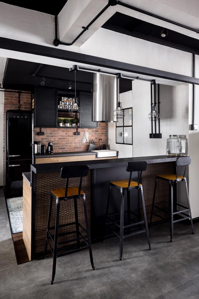
The kitchen’s island cooker hood was purchased from COURTS. “They don’t usually display this type of hood in their showrooms and will only bring it out of their warehouse if you ask,” says Sri.
On the living room and cosy corner’s makeover
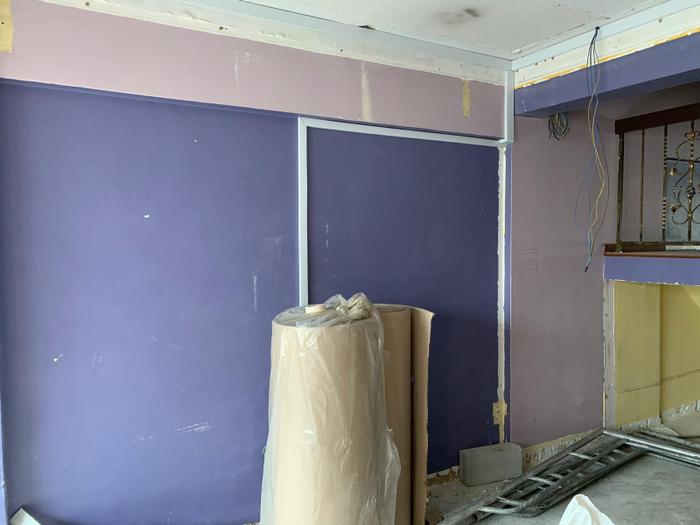
The living room, mid-renovation.
S: The look of our living room’s feature wall was actually inspired by Vincent’s office – we had popped by to finalise some details during the initial planning phase and that’s when we spotted the cement blocks at the office’s doorway.
We took a liking to these blocks almost instantly, so we ended up using them in our living room as well as our master bedroom. They also pair well with the industrial-style trunking – which by the way, helped us save a few thousand dollars. Because this is an old house, it had to be completely re-wired and if we had chosen to conceal the wires in a false ceiling, our renovation would have costed more.
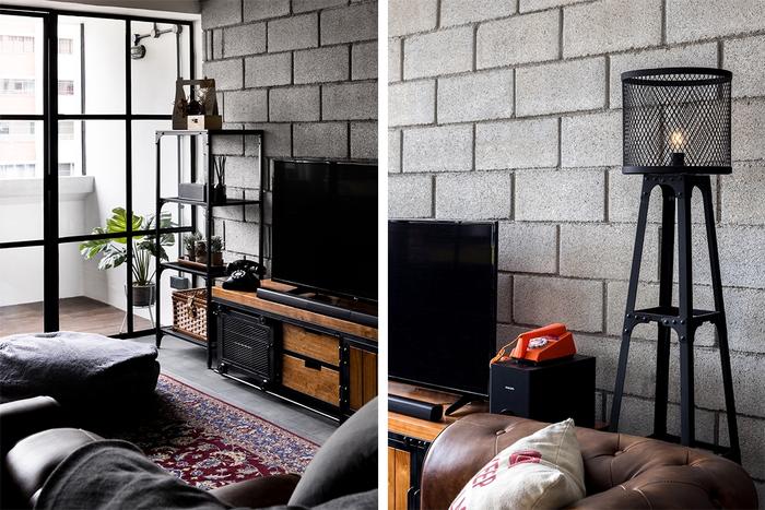
The living room’s TV console is from Loft Home, whereas the tufted leather sofa was purchased from FortyTwo.
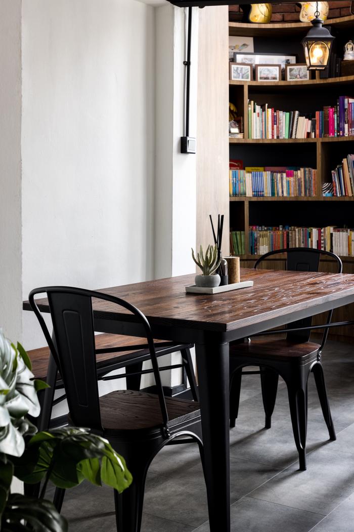
K: There’s also another dining table at the back of the living room, and I mainly use it for tabletop gaming sessions with my friends. We’re into games like Warhammer Quest and Warhammer Underworlds, so it’s necessary that there’s sufficient room for our miniatures. The more table space, the better! (laughs)
About the home library’s makeover
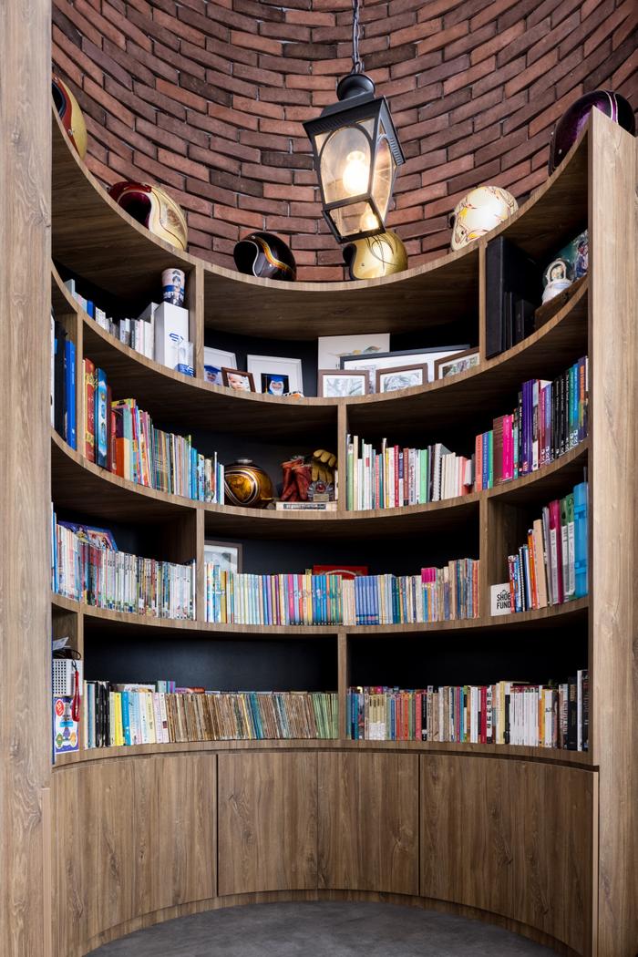
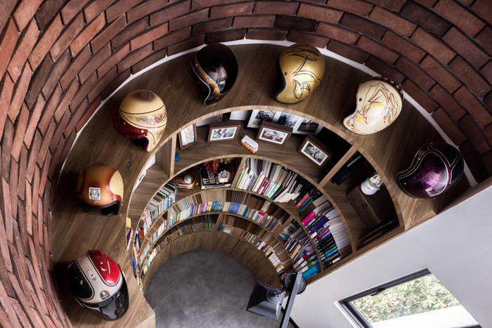
Features such as raw brick and a streetlamp-style pendant were chosen to create an ‘English street’ look for the home library. “We were inspired by the Harry Potter books and movies,” says Sri.
S: This corner is definitely the most unique part of our home; it’s located behind the living room right beside the balcony. I believe only the maisonette units in this block as well as those in the three closest blocks have this feature, and it’s why we really wanted to find a home in this neighbourhood.
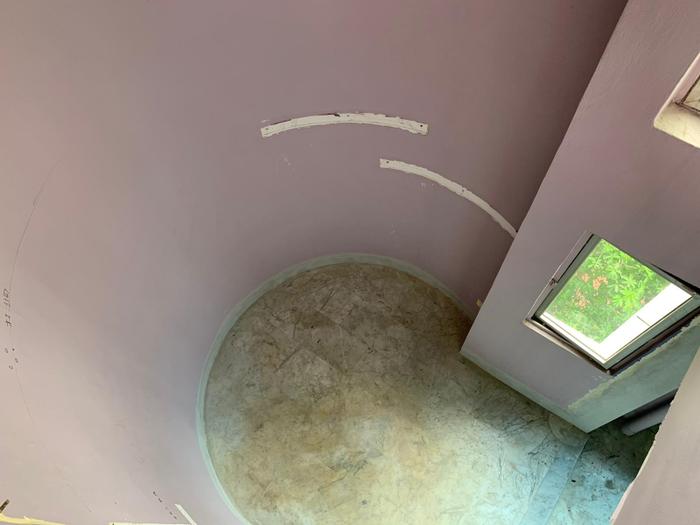
The home library, mid-renovation.
The ceiling here is about 5.5m high and it goes all the way up to the second floor, but for safety and practical reasons, it wouldn’t have been possible for us to build the bookcase the whole way up.
Also, we definitely needed a sturdy custom bookcase for our home library, both because of the shape of the corner and the weight of our book collection. We were impressed by what Vincent and The Local INN.terior managed to create – initially, we thought the bookcase would turn out to be squarish, but it ended up fitting perfectly into the curvature of the space.
About the stairway’s new look
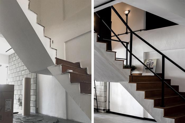
The stairway before (left) and after (right) the renovation.
K: The staircase leads to the upper floor where the children’s bedrooms and master bedroom are. Except for the handles and a storeroom below that was demolished to create more space, most of the staircase’s original structure was kept, including the parquet steps which were re-polished. To match the parquet, we also installed wood-look vinyl flooring in all the bedrooms.
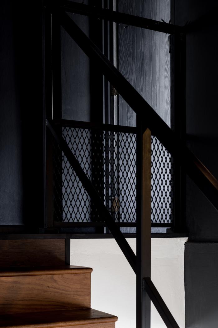
The original staircase handles were replaced with black-powdered steel ones to match the industrial theme; there was also limited lighting before that, so we asked for warm lamps to be installed along the walls.
On the common bathroom’s renovation
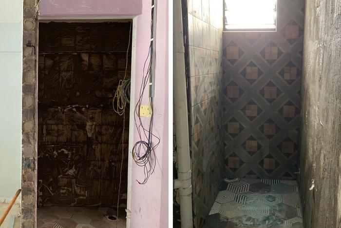
The entrance and interior of the common bathroom, mid-renovation.
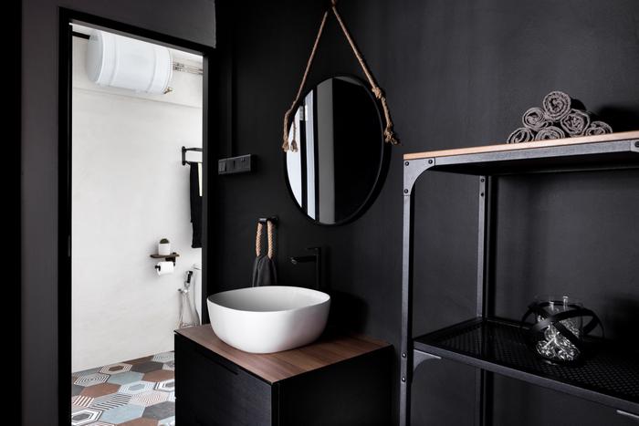
K: For the common bathroom, we chose to move the vanity outside because it’s quite narrow inside; Vincent proposed this idea so that the bathroom looks and feels bigger.
S: The common bathroom is mainly used by our children, so we wanted it to look more fun. The colourful floor tiles were chosen because of this. And to match the industrial theme, we stuck to black fittings and accessories with hints of brown that we got off Lazada.
On renovating the master bedroom
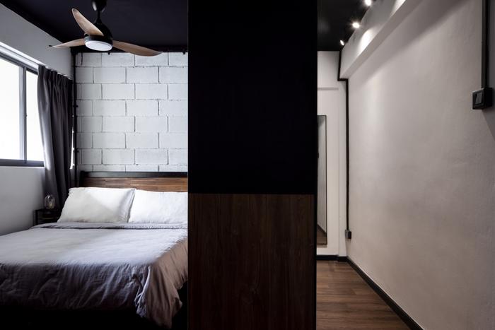
S: Before the renovation, the master bedroom was also quite cramped because there were quite a number of wardrobes in it, including a mini walk-in closet that partitioned off the master en suite from the sleeping area.
Although it’s much bigger than the bedroom of our previous flat, the built-ins made it feel smaller. So, one thing that we definitely wanted to do when we renovated the master bedroom was to open it up.
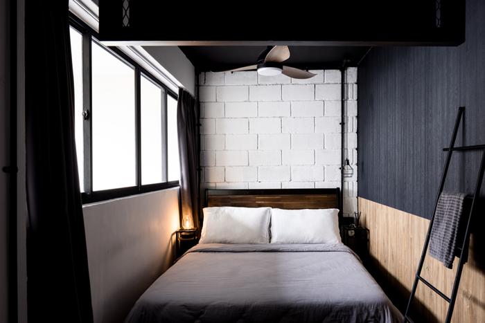
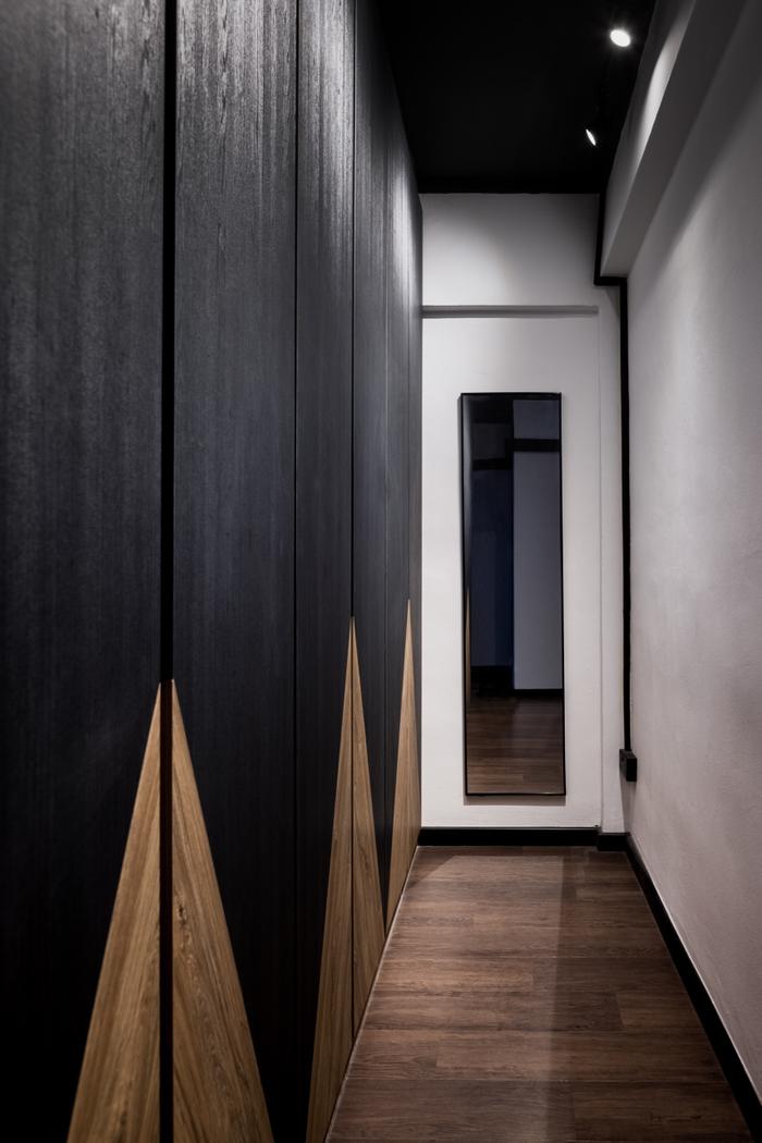
K: There were only two things that we asked for in the master bedroom’s design brief – one, for it to have enough storage space, and two, to incorporate the same cement blocks used for the living room’s feature wall.
Both of these requests were fulfilled by Vincent. He created a walk-in wardrobe beside our bed and included a dressing mirror at the end of the space. The cement blocks were also turned into a feature wall, but they were painted white to better match the surroundings.
About changes made to the master en suite
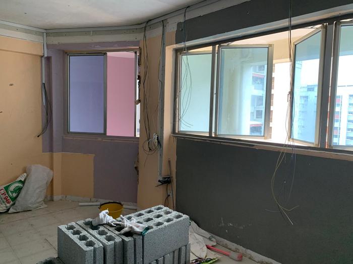
The front of the master bedroom, mid-renovation.
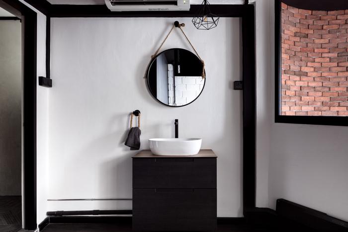
S: The previous owners’ walk-in wardrobe used to be where the en suite’s vanity is now, so after it was torn down, the vanity could be installed outside. We chose to have drawers rather than a regular cabinet so it’s easier for us to see what toiletries we have stored inside.
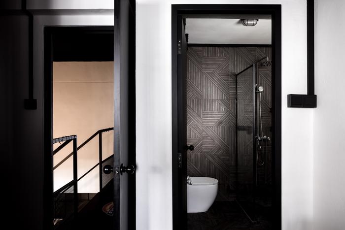
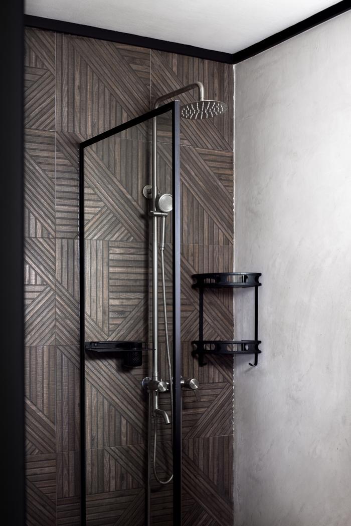
As for the inside of the en suite, we wanted to give it a rustic look, so it’s decorated with criss-cross tiles that look like a rattan weave. Also, because it’s entirely a wet area, we didn’t need a full-sized shower enclosure; there’s only just a compact minimalist screen at the side, which looks more aesthetically pleasing.
To sum up
K: On a whole, I’d say that our renovation went quite smoothly. Except for a long delay in getting HDB’s approval for the hacking of the utility room, everything went according to plan.
The timeline was also a bit tight, so we had some difficulty finding furniture that would match the whole look of the house. There was a short period of time when we had to make do with sitting and sleeping on the floor, but at the end of the day, we’re very happy because there’s plenty of space for our kids to run round and play in.
S: All I just want to say is that this place is a godsend. Compared to Sengkang which is always bustling, Lorong Ah Soo is a really serene and quiet neighbourhood and that makes living here a lot more relaxing. If you were to ask us, I don’t think we’ll ever be selling this house because it’s definitely going to be our forever home.
Your dream home is just a few clicks away!
Simply tell us your renovation requirements and we can get you personalised renovation quotes from five local interior design firms for free!
Also, when you engage an interior firm through our free recommendation service, you’ll enjoy attractive perks, such as the Qanvast Guarantee – a free initiative that safeguards up to $50,000 of your renovation deposits.
Yay, we're on Telegram! Follow us for the latest reno updates. 🙌

 Get a budget estimate before meeting IDs