Fans of desert chic décor, this couple’s home WILL quench your thirst for good design.
When it comes to finding an interior design theme, countries are often a great source of inspiration – and going by the enduring popularity of Nordic and MUJI-inspired HDB flats in Singapore, it’s probably safe to say that Scandinavia and Japan are the top favourites of local homeowners.
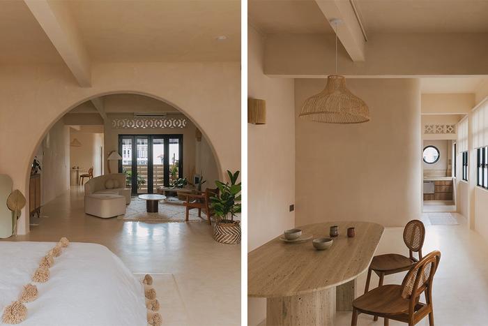
However, first-time homeowners Siddiq and Hui Qi chose to buck the trend by having their walk-up apartment in a Joo Chiat shophouse renovated to look like a riad or a traditional villa in Morocco.
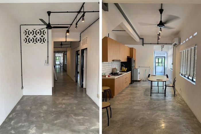
The communal area (left) and kitchen/dining area (right) before the renovation. (Image credit: Homeworks Consultancy)
“The idea for our home came about when we went to Morocco for a holiday,” shares Siddiq. “During our trip there, we visited a couple of riads, and we stayed in two of them, which were very nicely designed.”
In particular, the couple were charmed by Riad 42, a restored guesthouse with calm, minimalist interiors in the heart of busy Marrakesh. To find out exactly which décor elements contributed to the look and feel of Siddiq and Hui Qi’s own modish home in the East, we got the couple to show us around their apartment!
About themselves and their home
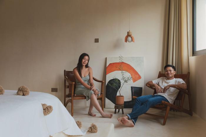
Siddiq (S): As you can probably tell, both Hui Qi and I enjoy travelling, and although our trip to Morocco was what influenced the look of our home most, I’d say that it’s a mish-mash of influences from all over the world. There are touches of Bali with the rattan accents, and a lot of people have also told us that they get Santorini vibes from the soft curves and arches, even though we haven’t been there yet.
We bought this walk-up apartment in 2018 and it was only a year and a half ago that we started thinking about what we wanted to do with it. During that period, we visited Morocco, and that’s where we became inspired to create this home.
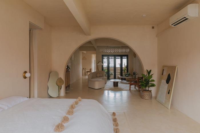
An archway between the living area and bedroom frames the private and public spaces of Siddiq and Hui Qi’s home on both sides perfectly.
Hui Qi (HQ): Joo Chiat is a neighbourhood with plenty of walk-ups, and I think there’s some genuine interest in these homes these days. Sometimes, we’d kaypoh as well and check out new listings down the road. (laughs)
In a way, our home is like an alternative resale HDB flat. Most people don’t have the best impression of walk-up apartments in shophouses because they aren’t exactly the newest properties on the market, but the fact is that they’re freehold, plus you can turn them into something different.
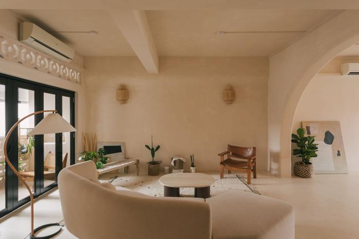
S: Yup, to be honest, I’m not a fan of condos in general. I grew up in an HDB flat, so I didn’t mind getting one, but for all their perks, most condos aren’t freehold these days, and I don’t enjoy dealing with the red tape.
Whatever you do (for your renovation), you’ve got to ask the condo management for permission. Here, we’ve the freedom to make the changes we want, so long as it’s nothing foolish like knocking down a structural wall.
Furthermore, Joo Chiat is a great location; there’s the upcoming Thomson-East Coast MRT line, nice cafés, hawker centres, shopping malls, and so much more happening here.
On the living room and balcony’s makeover
S: We started renovating the apartment last October. Immediately after the Circuit Breaker, we hired a contractor called Homeworks Consultancy, and they were really good and fast. The renovation was completed around mid-January this year and Homeworks re-configured the entire space to our liking by taking down the walls around every single room.
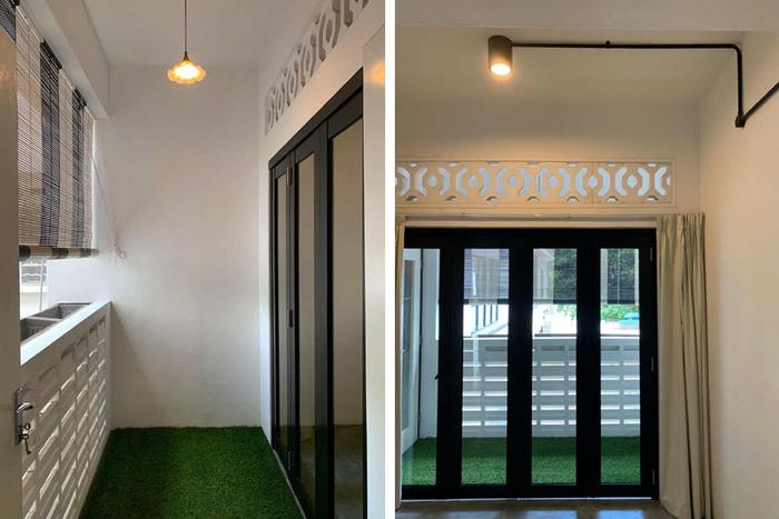
The balcony (left) and living area (right) before the renovation. (Image credit: Homeworks Consultancy)
We didn’t like the idea of being boxed into small rooms because it’s just the two of us living here. We also wanted an open and airy space where people can just come and mingle. Last but not least, we’re actually very messy people, so having an open-concept home forces us to be neat. (laughs)
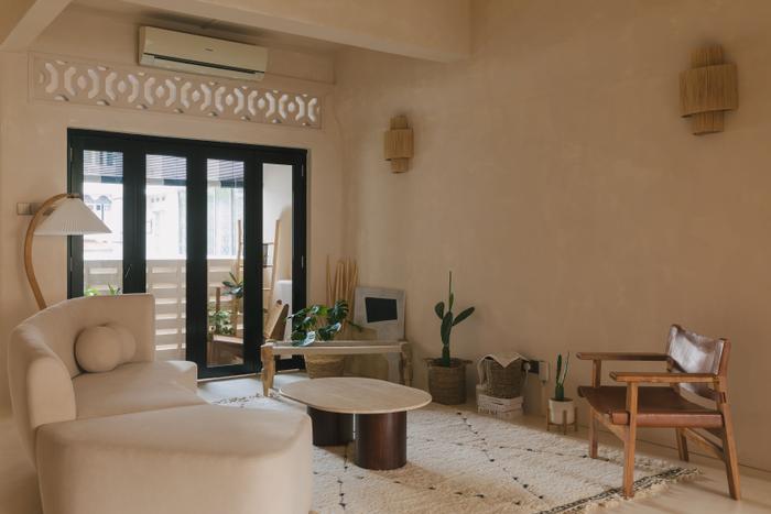
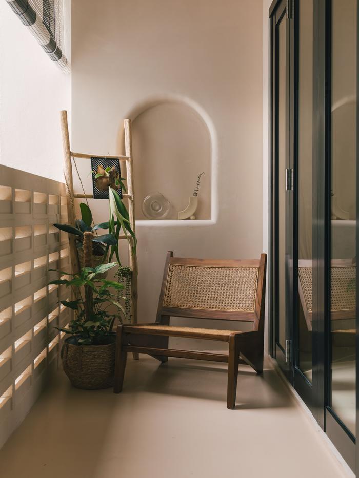
HQ: Our living room was previously a bedroom that came with its own balcony. Although the balcony is still intact, the walls surrounding the bedroom were all torn down because they created a narrow passageway on the outside, which doesn’t feel welcoming at all.
We furnished the living room with only loose pieces to give it a cool, casual vibe. In fact, except for the sofa, everything is from a side business that we started called Kult Maison (@kultmaison).
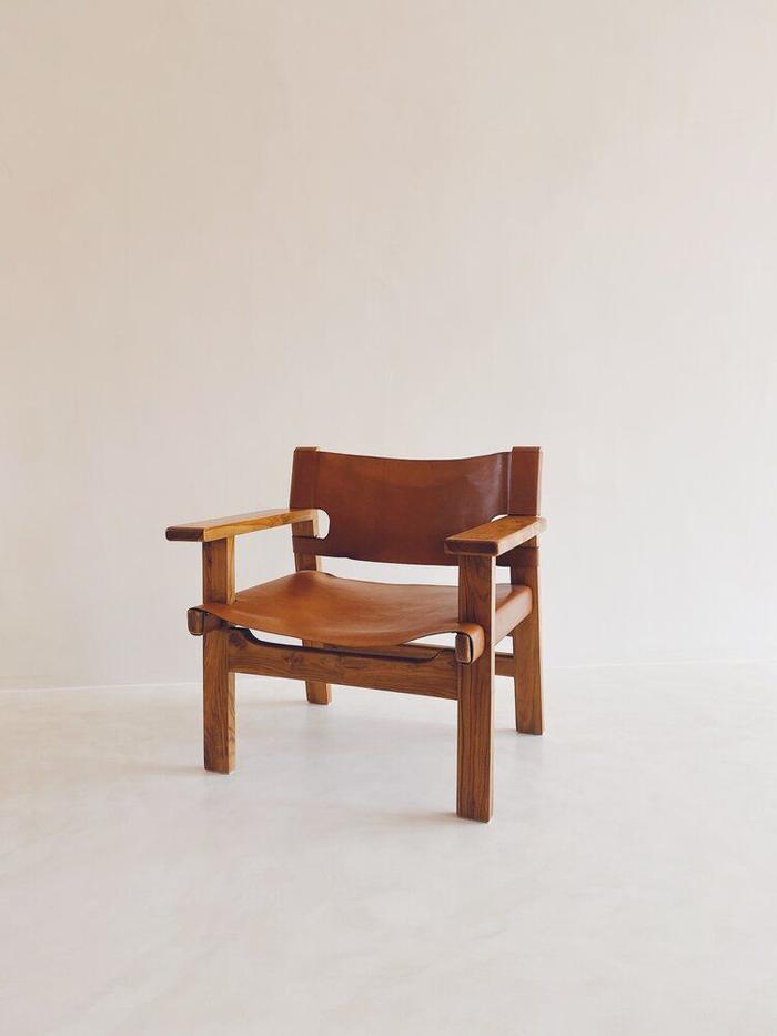
The Souk Chair from Kult Maison
S: We started Kult Maison because we felt that we could offer statement furniture in Singapore at fairly reasonable prices with the help of our supplier. The materials we use are natural and authentic, like for example, solid teak, travertine marble, and cowhide leather.
On the master bedroom’s new look
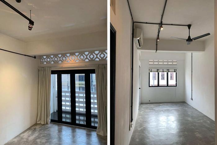
Both halves of the master bedroom before they were combined during the renovation. (Image credit: Homeworks Consultancy)
S: Like our current living area, the master bedroom used to be separate spaces; it was a balcony, a bedroom and the original living room, which were all merged together. Initially, we wanted to keep the balcony, but after building the platform for our bed, we realised that the structures looked quite awkward together.
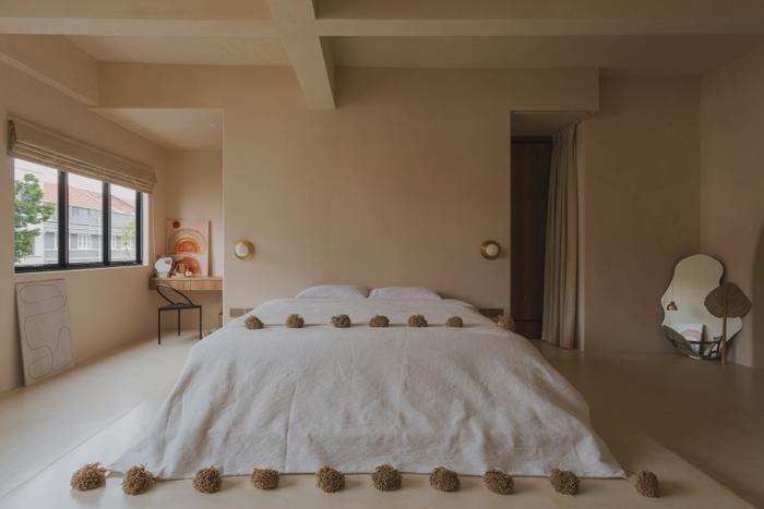
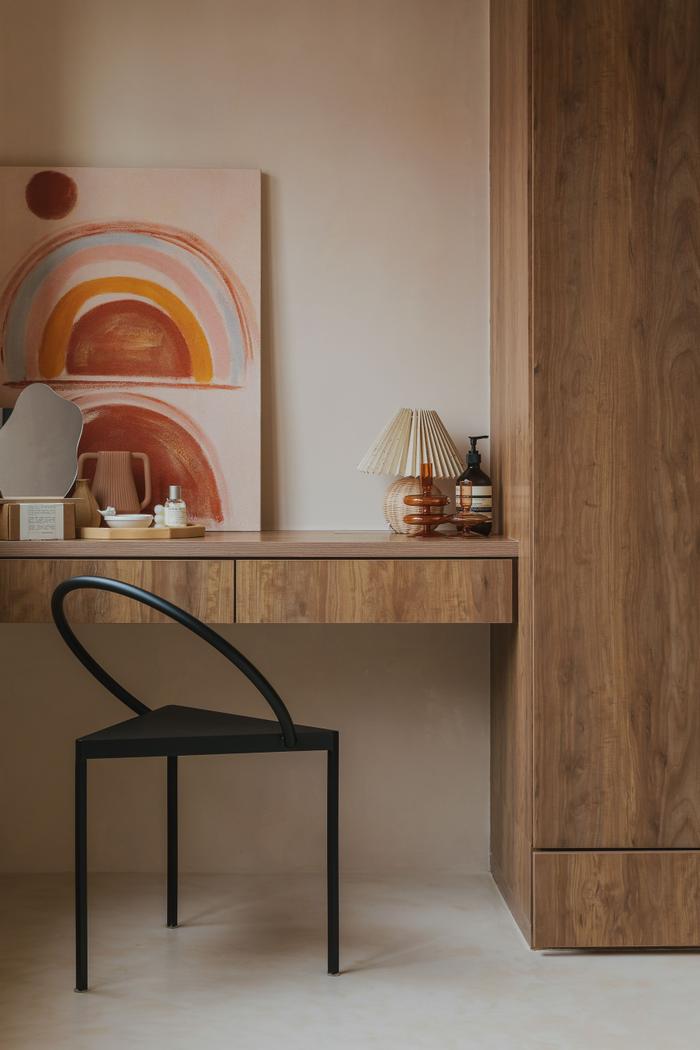
HQ: Basically, the whole design of the bedroom is centred around this platform. We were inspired by the Casa Cook hotel rooms in Rhodes, which have a similar set-up where the headboard also functions as a partition for private changing spaces.
Our mini walk-in wardrobe is located behind the headboard, along with a vanity table that’s close to the windows for natural lighting. On the other hand, the front of the bedroom, which is where the old balcony used to be, is now a cosy corner with just two statement chairs, but it’s also slowly turning into a place where we grow our plants.
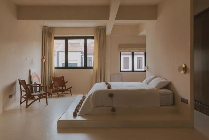
S: Overall, the contractors did a great job here. I think the only challenge we encountered was with the flooring. To mimic Riad 42's colour palette, both the floor and walls were covered in off-white micro-cement, but because there were some slight differences in colour tones between both surfaces, we had a bit of a back-and-forth to ensure the final result came out right.
About renovating the dining area
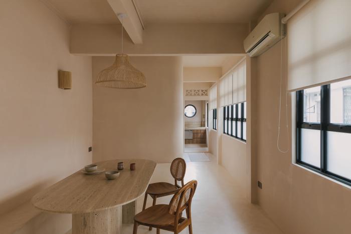
S: This was the kitchen previously, so the contractors broke down everything and rebuilt it. The old kitchen was actually quite long, it started from one end to the other, and it would have stayed this way if we hadn’t expanded the confines of the storeroom and the bathrooms.
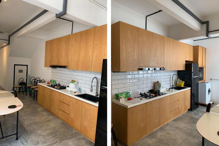
What used to be a kitchen became Siddiq and Hui Qi’s dining area after the renovation. (Image credit: Homeworks Consultancy)
HQ: The seats at the side of the dining area were moulded by hand and are topped with the same micro cement used for the floor and walls. We wanted them to have this organic, flowing shape because it helps to soften the entire look of our home, just like the archway and the rounded edges of the wall outside the main bathroom.
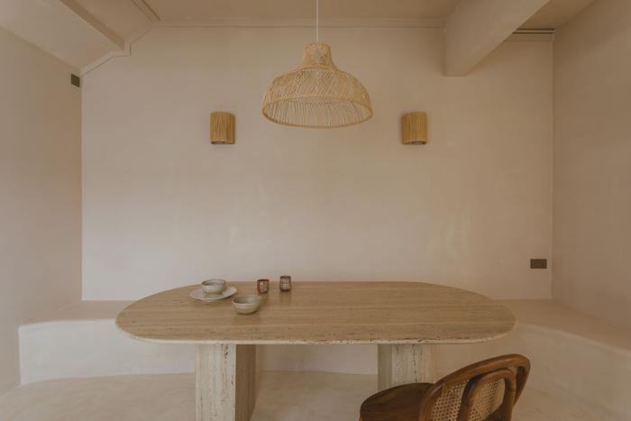
S: Our dining table is from Kult Maison as well, and it’s made of solid travertine stone. The unique thing about travertine is that it’s porous and has visible natural holes in it, so it isn’t a super popular material among Singaporean homeowners.
Also, because of this, our supplier had a few slabs in their warehouse that hadn’t been touched for years, and they were like, “Are you sure?” when we asked for them. The funny thing is that it’s the opposite situation in countries like Australia and the U.S. where travertine is quite a sought-after material.
On the new look of the main and guest bathrooms
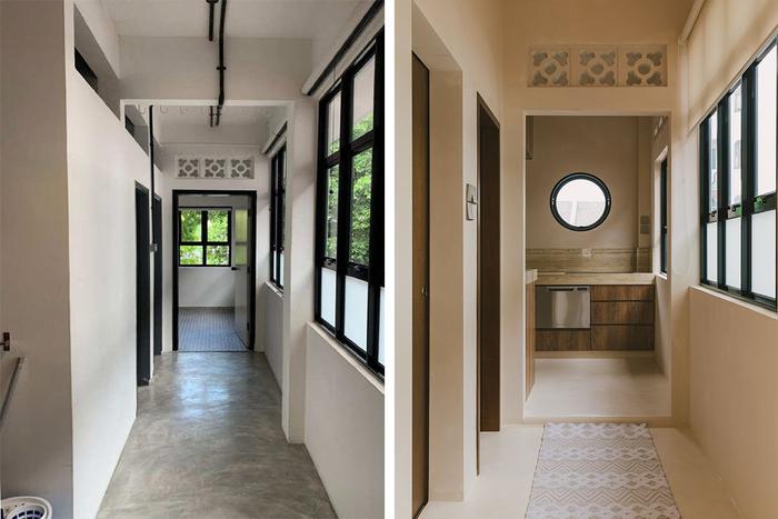
The walkway outside the bathrooms before (left) and after (right) the renovation.
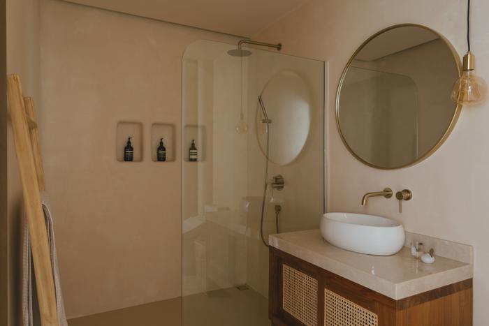
The main bathroom, designed for Siddiq and Hui Qi’s personal use.
S: I think the only bad thing about walk-up apartments is that the bathrooms are all located at the back of the house. Because both of ours are side-by-side, we thought about merging the two bathrooms together to create a larger one. But we eventually scrapped this idea as we felt more comfortable keeping our personal space and the guest bathroom separate.
Aside from customising the bathrooms with rounded niches, we also swapped out the original fixtures for new ones. For instance, we got ourselves a bidet from TOTO. We used one in Japan and liked it, so we decided to have one here too.
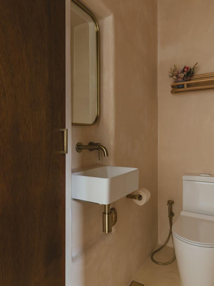
The guest bathroom, which is located further into the house.
About the kitchen’s renovation
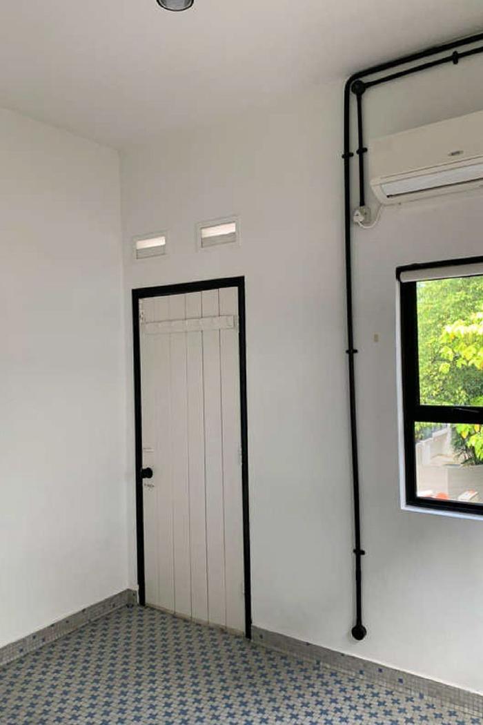
The kitchen, pre-renovation. (Image credit: Homeworks Consultancy)
HQ: Our kitchen is located all the way at the back of the house; it’s pretty small but sufficient for our needs. We don’t enjoy doing housework in general, so we also decided to outfit the kitchen with some useful appliances like a dishwasher and a dryer, which are both installed underneath the counters.
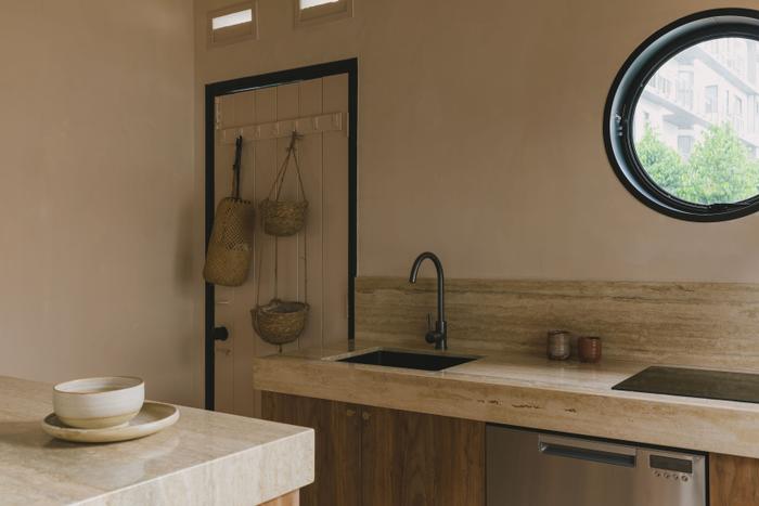
Appliances aside, new additions to the kitchen also include sealed stone countertops as well as metallic cabinetry knobs from local home hardware store Lavavella.
The door beside the kitchen leads to a shared space where there’s an old-school spiral staircase that goes all the way to the ground floor. Although we kept the back door as is, we did swap out the window beside it for a rounded one. I got the idea from Pinterest, and I like how it adds a bit of fun to the kitchen because it looks just like a ship’s porthole!
To sum up
HQ: I’m super happy with the final result, because I think we really pushed the idea of open-concept spaces in a very extreme way.
Also, this renovation definitely paid off because we don’t feel like we’re in Singapore whenever we’re at home. In an odd way, being inside sort of takes me elsewhere, and I think it’s because the interior is so heavily inspired by our travels.
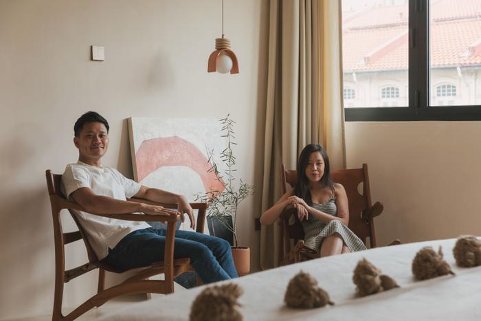
S: One thing I’d like to highlight to first-time homeowners is that it’s important to be involved in the renovation process as much as possible. It’s okay to rely on your interior designer if you don’t feel confident but taking a hands-on approach will help you to spot and sort out anything off before it’s too late.
Finally, we’re very grateful to the workers who helped make our dream home a reality. They’re quite stretched now because of the current situation. If you can, do something nice like pack some food over when you visit the site. Be kind, that’s the bottom line.
Your dream home is just a few clicks away!
Simply tell us your renovation requirements and we can get you personalised renovation quotes from five local interior design firms for free!
Also, when you engage an interior firm through our free recommendation service, you’ll enjoy attractive perks, such as the Qanvast Guarantee – a free initiative that safeguards up to $50,000 of your renovation deposits.
Yay, we're on Telegram! Follow us for the latest reno updates. 🙌
© Qanvast, 2021. No part of this site may be reproduced in whole or in part in any manner without permission.

 Get a budget estimate before meeting IDs