We got an interior designer to answer ALL of our questions about tile buying, coordination, and trends – and also, to share some key design tips.
If you’ve been paying close attention to our home feature column, this Telok Blangah HDB home might have caught your eye with its top-to-toe bathroom makeovers that used a (whopping) total of seven different tile designs.
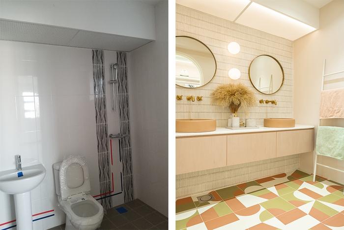
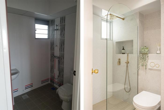
Well, if you’re feeling inspired, we won’t stop you from putting your own renovation plans into action. But perhaps, it might be prudent to first hear from 19EightyThree designer Bow (the brain behind these beautiful bathrooms), whom we quizzed about tile selection techniques as well as the latest design trends!
Would it be hard for a first-timer to mix and match tiles on their own?
View this project by 19 Eighty Three
Bow (B): I think it’ll definitely be hard for a first-timer. It’s just tough to figure out where to start from, especially when you get confronted by all the options available! I often see confused homeowners at showrooms, and most of the time, it’s because they’re on their own for tile selection.
In fact, I’d say that mixing and matching tiles can be tough, even for a novice designer, due to how hard it is to visualise colours and combinations.
What challenges would homeowners encounter in selecting tiles?
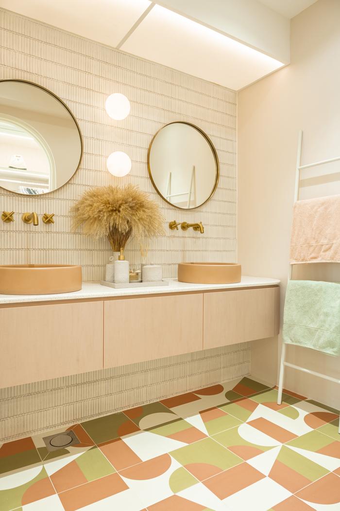
B: I think the challenge lies mostly in finding the right combination for the right home theme; there’s a risk of ending up with a rojak look when you’re dealing with too many patterns or if you can’t resist the temptation of mixing-and-matching tiles.
View this project by 19 Eighty Three
For instance, if you’re at a tile showroom, it can be quite tempting to purchases some colourful geometric/Peranakan/graphic tiles that caught your eye but they might not be the best options for the modern-luxe bathroom or home which you originally planned for – so unless you know what you’re doing, do exercise some self-control in your choices!
From a technical perspective, what are some common challenges of designing spaces with tiles?
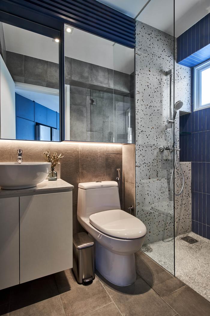
B: Room size is a challenge, especially for older HDB flats where the shower and WCs are in two separate spaces – that makes it harder to work with larger wall tiles, such as those that are 600mm x 600mm or even 150mm x 90mm. In such cases, we’ll definitely need to coordinate with our contractors, whether it’s to explore alternative laying methods or finding ways to cut the tiles down to size.
View this project by 19 Eighty Three
It’s less of a challenge, but getting the number of tiles right also takes a bit of skill. In most cases, we’d try to calculate a precise figure so that there’s no tile wastage but occasionally, we’d order a box of spares, which is typically about 6 - 12 pieces extra. While that might seem like unnecessary expenditure, I feel that it’s advisable to do so, just in case of future wear and tear.
As a designer, what do you take note of when coordinating tile designs?
B: I’d take special note of tile finishes, especially when I’m designing a bathroom/kitchen in a home where there are elderly/young occupants. I’d pick non-slip tiles and also options that are less dark because they suit conventional design tastes better.
Personally, I find that black tiles are a no-no for family homes because they tend to require more upkeep to maintain their look.
View this project by 19 Eighty Three
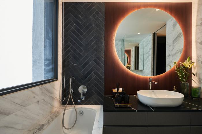
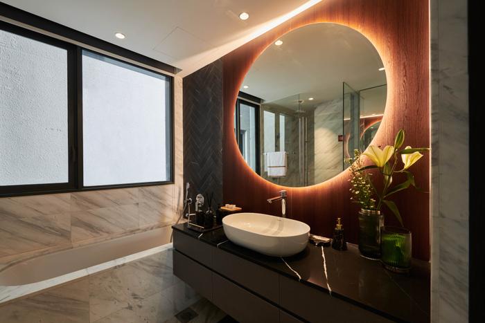
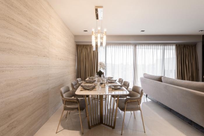
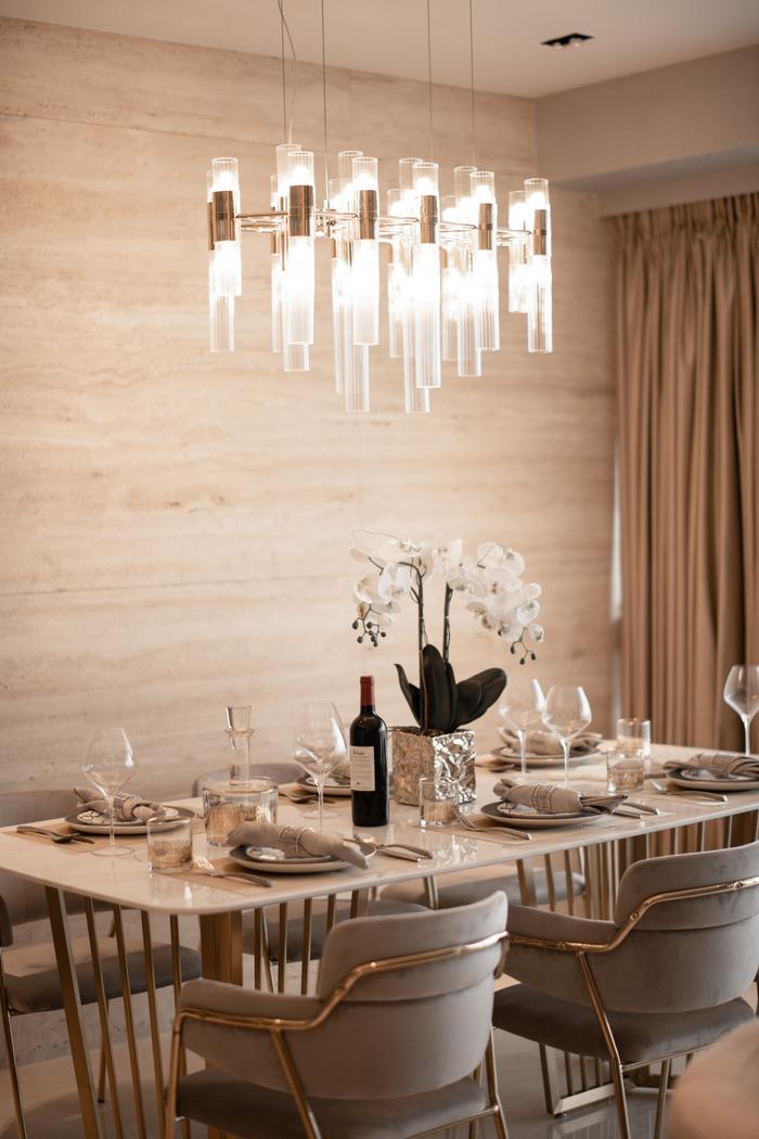
Another aspect that I’d take note of is the overarching theme of the home’s design. For example, if it’s a modern-luxe themed interior, I’d use marble tiles with flowing grains to bring out a more elegant vibe. Or if it’s a Scandinavian-style home, I’d work with vibrant geometric tiles to create fun-looking spaces.
What design principles/rules do you follow when mixing and matching tiles?
B: An important rule which I follow is that there should only be one tile finish on a single surface. For example, if a homeowner wishes to have an accent wall in their bathroom’s shower area, I’d stick to using either all glossy or all matte tiles – mixing tiles with two different finishes would just create a clashing look. Moreover, by sticking to one finish, it’ll make it easier to accommodate a wider range of tile shapes on the same wall.
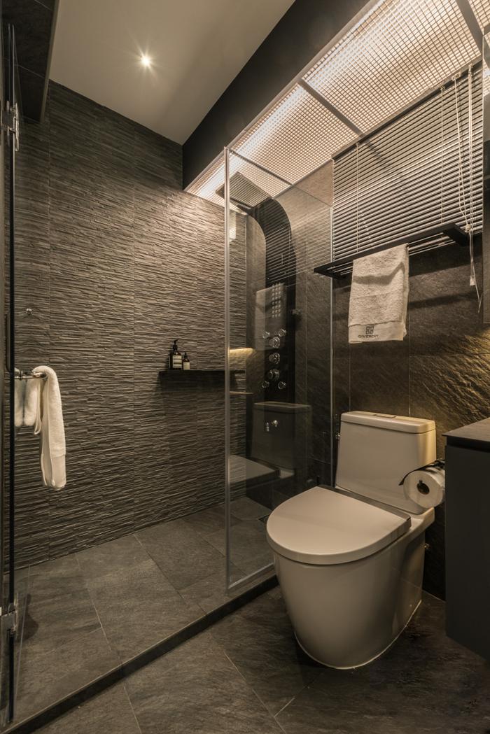
View this project by 19 Eighty Three
At the same time, it’s important not to go overboard with shapes and colours because having too much of either creates visual clutter. Unless you’re feeling adventurous or have a good eye, leave the mixing-and-matching to a designer!
Apart from shape and colour, what other details matter?
B: It’s might seem like a tiny detail, but the corners and/or edges of a surface will make or break the look of tilework, so it’s important to get them right.
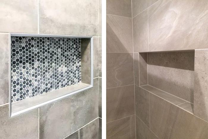
A wall recess that uses corner beads (right) for its edges and one that doesn’t (left).
Most contractors will use corner beads (an accessory which creates a smooth finish on the sides of a surface/recess) to even out the joint lines, but I prefer using mortar to create 45-degree edging. Although this technique requires extra workmanship, it ensures that the edges blend in beautifully with surrounding grouts.
Last but not least, what tile trends/designs are popular right now?
B: Feather tiles, for sure! I think they’re quite popular now, and so are skinny rectangular tiles in a vertical lay. Large format tiles – like those measuring 300mm by 600mm – are also trending now because they create an illusion of space when laid horizontally.
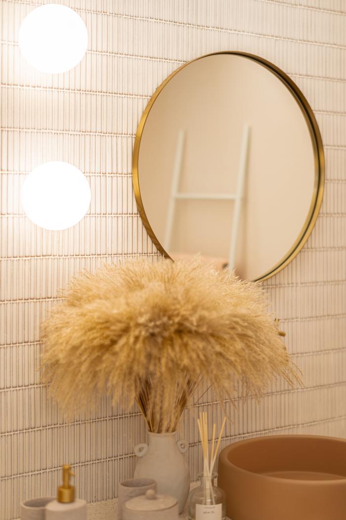
View this project by 19 Eighty Three
Recently, I have also noticed white tiles being used in conjunction with coloured grouts – I think this combination is quite interesting because it creates a subtle contrast that still pops.
Finally, for tile colours, I highly recommend going for neutrals, like ivory and beige, because they look natural in a matte finish and will probably still be in style years down the road.
Creating your personal retreat has never been this easy!
Simply tell us your renovation requirements and we can get you personalised renovation quotes from five local interior design firms for free!
Also, when you engage an interior firm through our free recommendation service, you’ll enjoy attractive perks, such as the Qanvast Guarantee – a free initiative that safeguards up to $50,000 of your renovation deposits.

 Get a budget estimate before meeting IDs