1 / 14







Project Details
The Big Revamp
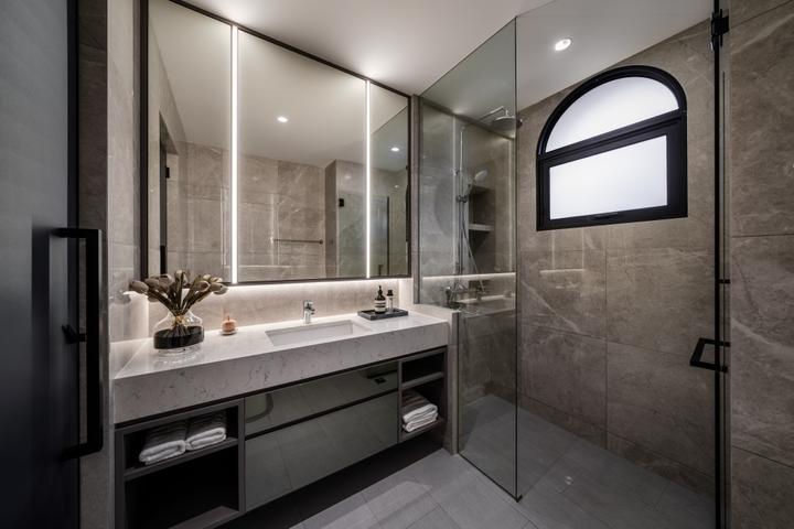
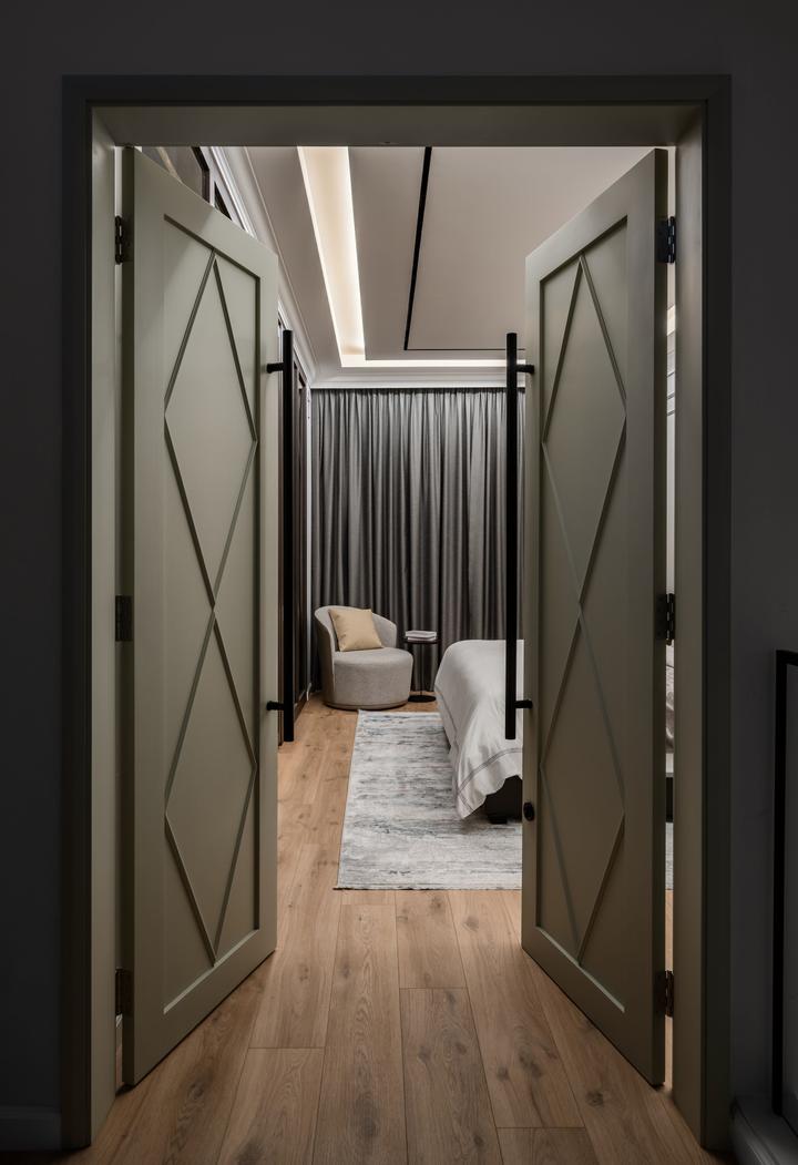
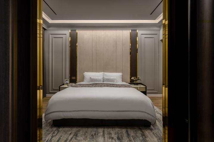
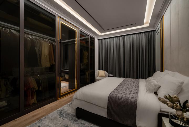
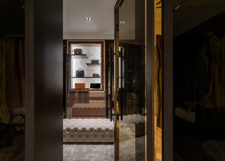
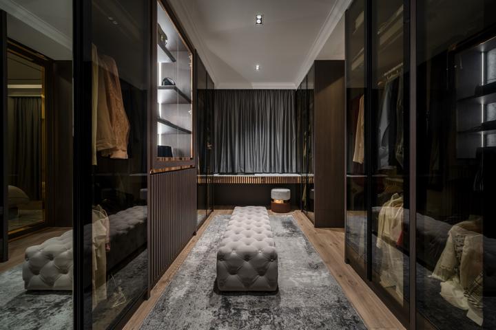
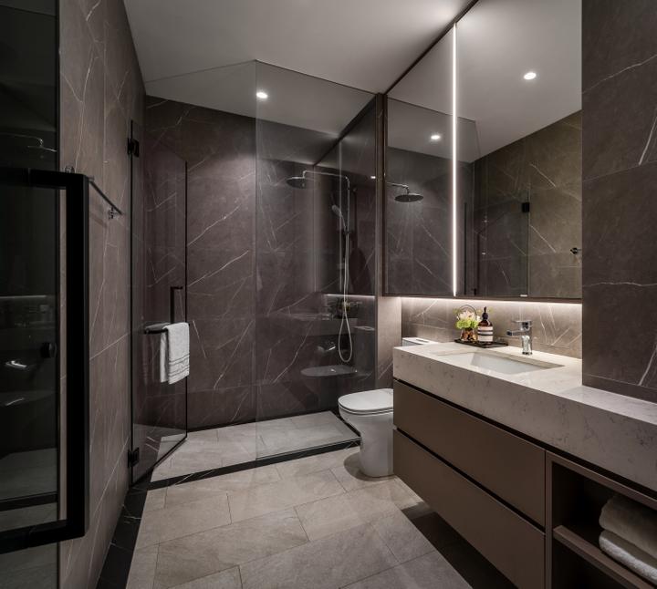
“Modernize a 30 year old house” - A simple brief with endless possibilities. The team at Summerhaus D’zign was tasked to breathe a new lease of life into this once tired looking 30 year old house. With close communication and free hand given, the interior architecture was largely altered, customized to meet the needs of the new homeowners.
The design intent was clear - To create a sleek, modern interior with hints of luxurious touches. Aside from the interior finishes that were all replaced, some non-structural walls were removed to make way for a more spacious, expanded flow.
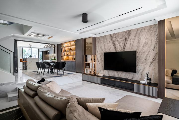
Stepping into the house, the foyer is decorated with an oversized painting paired with a matching armchair and a contrasting bordered black and white floor greets guests. Slabs of book-matched marble was used in the living area, accentuated by the dark walnut tones surrounding it and contrasted by the whitish flooring.
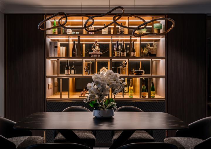
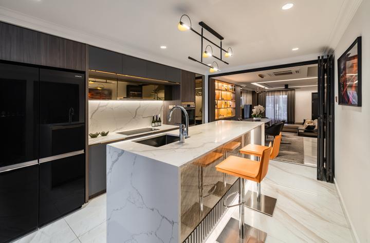
All built-ins were intentionally aligned along one side to expand that overall space, leaving all other areas decorated by loose furniture. What was originally an odd shaped shaped kitchen, has been reconfigured to become a guest room by regularizing the walls and is also home to a dry kitchen with an island counter which lines up nicely with the dining display and TV cabinets.The Big Revamp
“Modernize a 30 year old house” - A simple brief with endless possibilities. The team at Summerhaus D’zign was tasked to breathe a new lease of life into this once tired looking 30 year old house. With close communication and free hand given, the interior architecture was largely altered, customized to meet the needs of the new homeowners.
The design intent was clear - To create a sleek, modern interior with hints of luxurious touches. Aside from the interior finishes that were all replaced, some non-structural walls were removed to make way for a more spacious, expanded flow.
Stepping into the house, the foyer is decorated with an oversized painting paired with a matching armchair and a contrasting bordered black and white floor greets guests. Slabs of book-matched marble was used in the living area, accentuated by the dark walnut tones surrounding it and contrasted by the whitish flooring.
All built-ins were intentionally aligned along one side to expand that overall space, leaving all other areas decorated by loose furniture. What was originally an odd shaped shaped kitchen, has been reconfigured to become a guest room by regularizing the walls and is also home to a dry kitchen with an island counter which lines up nicely with the dining display and TV cabinets.Read MoreHide
Area Size
222m²
Year of Completion
2022
Interior Style
Modern
Works included
Carpentry
Feature Wall
Flooring
Hacking
Tiling
False Ceiling
Aircon
Electrical Rewiring
Plumbing
Painting
Wallpaper
Lighting
Decorations

