1 / 4



Project Details
Ministry of Design (MOD) has been commissioned by CEL Development to strategise, brand and design a creative epicenter for the emerging black collar creative class. The design will provide an environment tailored to the preferences and needs of the contemporary creative workplace or studio. In recent years, commercial offices open to conducting their businesses in somewhat non-traditional settings have been migrating out of the urban centers and CBD areas towards more affordable light industrial or warehouse districts, all with larger floor plates and higher ceilings.
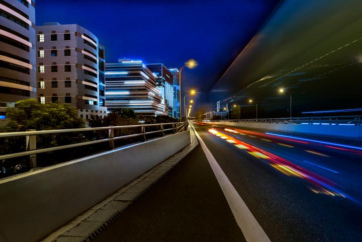
MOD chose to exploit the sea-fronting context of the site, by introducing a series of stepped balconies across the different floor levels, so the building appears to be shifting away from the busy elevated highway fronting the building. Shifting the building laterally creates a sense that it comprises a series of dynamic blocks, stacked one above the other, rather then a static singular block. This allows the building to create a unique profile against the skyline, creating an iconic presence.
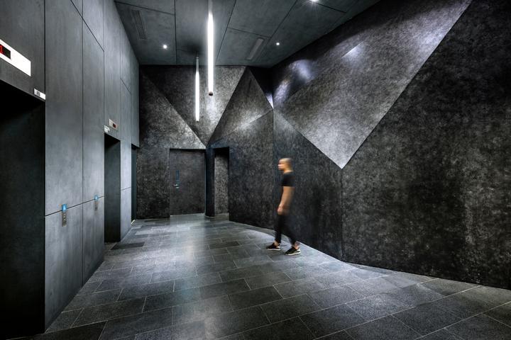
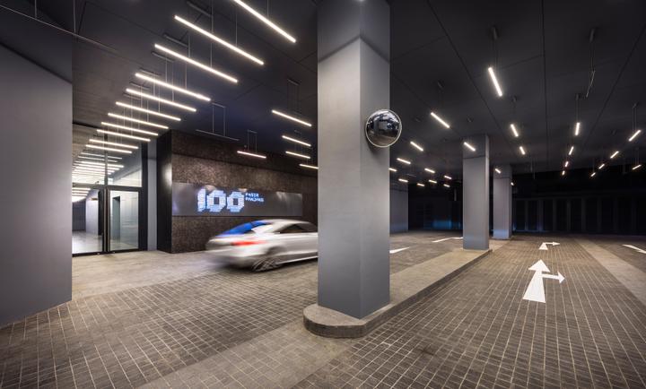
The facade comprises windows, balconies and air-condition ledges, but we intentionally blurred the definition of each element by layering a series of horizontal stripes throughout the facade. The stripes generate horizontal visual movement across the building and emphasize the "shifting and stacked" nature of the different volumes. A palette of varying grays is employed to generate the variety of tones required for the "horizontal banding". This horizontal striping is also applied consistently to the landscape and hardscape elements surrounding the building. The interior experience celebrates a stylized industrial aesthetic through the bold use of feature lighting, materials and environmental graphics across the different floors. Key interior spaces include the lift lobbies and passenger drop off point and the building also boasts a roof top garden space overlooking the sea.
When experienced in totality, the project blurs the boundaries between the predictable commercial space and the gritty industrial space, creating instead a hybrid space, which offers an exciting alternative for the creative workplace in the 21st century. Derived from abbreviating the address 100 Pasir Panjang to 100PP, the name is both informative (of the address) as well as evocative of an energetic and contemporary environment. Symbolically, the number '100' alludes to perfection and completeness.
Finalist: World Architecture Festival 2015, SingaporeMinistry of Design (MOD) has been commissioned by CEL Development to strategise, brand and design a creative epicenter for the emerging black collar creative class. The design will provide an environment tailored to the preferences and needs of the contemporary creative workplace or studio. In recent years, commercial offices open to conducting their businesses in somewhat non-traditional settings have been migrating out of the urban centers and CBD areas towards more affordable light industrial or warehouse districts, all with larger floor plates and higher ceilings.
MOD chose to exploit the sea-fronting context of the site, by introducing a series of stepped balconies across the different floor levels, so the building appears to be shifting away from the busy elevated highway fronting the building. Shifting the building laterally creates a sense that it comprises a series of dynamic blocks, stacked one above the other, rather then a static singular block. This allows the building to create a unique profile against the skyline, creating an iconic presence.
The facade comprises windows, balconies and air-condition ledges, but we intentionally blurred the definition of each element by layering a series of horizontal stripes throughout the facade. The stripes generate horizontal visual movement across the building and emphasize the "shifting and stacked" nature of the different volumes. A palette of varying grays is employed to generate the variety of tones required for the "horizontal banding". This horizontal striping is also applied consistently to the landscape and hardscape elements surrounding the building. The interior experience celebrates a stylized industrial aesthetic through the bold use of feature lighting, materials and environmental graphics across the different floors. Key interior spaces include the lift lobbies and passenger drop off point and the building also boasts a roof top garden space overlooking the sea.
When experienced in totality, the project blurs the boundaries between the predictable commercial space and the gritty industrial space, creating instead a hybrid space, which offers an exciting alternative for the creative workplace in the 21st century. Derived from abbreviating the address 100 Pasir Panjang to 100PP, the name is both informative (of the address) as well as evocative of an energetic and contemporary environment. Symbolically, the number '100' alludes to perfection and completeness.
Finalist: World Architecture Festival 2015, SingaporeRead MoreHide
Area Size
12600m²
Year of Completion
2014
Interior Style
Minimalist

